


Summary
- Hedgewise posted strong performance in 2019, with year-to-date returns of 21% and 20%, respectively, in the Risk Parity and Momentum frameworks (at the Max risk level).
- While these gains are consistent with expectations, they were purposefully limited to some degree by various risk management techniques.
- Longer-term, these methods are powerful expected drivers of performance, yet that can be confusing when they appear at odds with the short-term.
- By linking every point-in-time decision to the bigger systemic picture, what appear to be small immediate costs are reframed as strategic foundations.
- We'll examine precisely how Hedgewise has been applying this trade-off to every asset class in 2019, and why that creates such a positive environment for future returns.
Introduction: A Great Year, For Now and For Later
From a risk management perspective, this year has been pretty stellar, but for reasons different than you might expect. Absolute performance was intentionally lower than it might have been due to a number of factors:
- Bond weighting has been consistently under historical averages, and especially so prior to the ~15% rally in August.
- Energy has been a recent drag on performance, and commodities have broadly underperformed for the better part of this decade.
- Equity exposure was relatively low during the whipsaw recovery of the first quarter.
On first glance, these factors all appear negative, but the opposite is true: the same risk management mechanisms driving these decisions are also directly improving future expectations. It's helpful to explain this with a hypothetical example. Imagine you could have a lower realized return this year in exchange for a higher realized return over the next five. This is the direct trade-off being applied in each of the cases mentioned above, but it can be difficult to grasp intuitively.
The key to the approach is not to avoid negative events, but rather to ensure their relative cost is insignificant relative to their benefit. 2019 has been a great outcome because despite all of the circumstances mentioned above, clients still managed to achieve over 20% annual returns! The small opportunity costs incurred this year were all made to significantly improve future return expectations, but like everything with systematic investing, it takes a little patience and understanding to allow it all to play out.
With that in mind, let's examine the story in each individual asset class, with a particular focus on how Hedgewise decisions this year have been intelligently optimizing for what might come next.
Bonds: Understanding the Zero Bound
I want to start with the bond market for a couple of reasons. Clients frequently wonder whether Hedgewise carries excessive interest rate risk, since its strategies usually hold more Treasuries than traditional portfolios. Now seems like an excellent opportunity to explain why this isn't the case and how Hedgewise accounts for a very low interest rate environment. Second, bonds are a perfect illustration of the kind of trade-offs at work in systematic investing because interest rate movements quite literally shift gains between now and the future.
How Future Bond Profit Shifts with Interest Rates
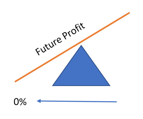
As interest rates approach zero, you've moved all your potential gains to the present, since you are receiving 0% interest by definition. Presuming interest rates can go no lower, you can now only lose money if you remain invested. It wouldn't make sense to continue passively holding this asset (which, by the way, raises a number of problems for traditional passive models if/when this level is reached!)
The problem is that no one knows precisely where the bottom is. It's more of a probability distribution that looks something like this:
Probability of Interest Rate "Bottoming"
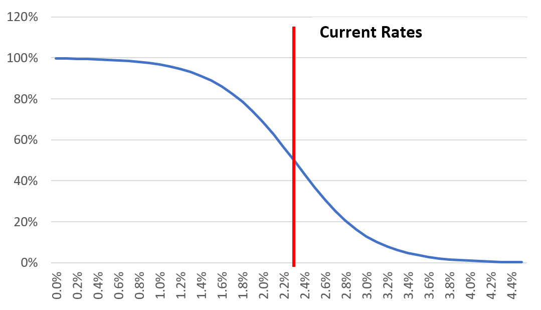
The red line highlights our current level of interest rates, and it's important to account for the possibility that we have already reached a bottom here. If you could know this with certainty, you'd already want to divest all bond exposure. If you were wrong, and interest rates were going to dive all the way to 0%, you'd be missing out on significant gains.
This presents a thorny scenario for passive and active managers alike. If you don't try to time anything, you will wind up with bond exposure when you can only lose money on that position. If you do try to time it, then you risk getting out too early or late.
Fortunately, when you view this curve through a lens of risk, it is straightforward: you hold less as risk goes up and vice versa, much like any asset. In this case, you get an added level of certainty because of the zero-bound (i.e., in most markets, you still might have gains in a period of heightened risk, but there's little chance of this if interest rates are at zero). Functionally speaking, this means you sell some bonds as rates go down, and buy some back if rates go back up, and you increase that proportionally until rates approach more normal levels (Note that "normal" levels are a matter of some debate, but the Fed is using all of its tools to try to get it back above 3% or so).
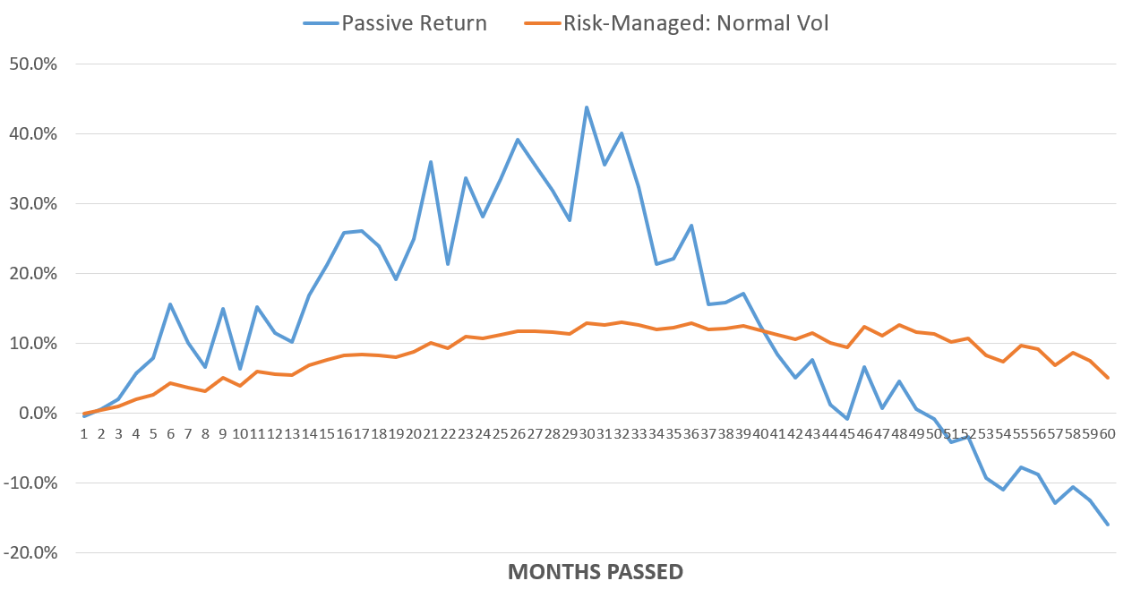
The wonderful part of such a method is that you can accrue gains simply from interest rates bouncing around. Here's a look at a performance simulation which compares a passive bond investment to this risk-managed strategy over five years, with the horizontal axis representing the final level of interest rates. Note that I've chosen 2% as the lowest point initially to align with the Fed's stated goal of 2% inflation. This first model assumes that interest rates move linearly between current rates and the ending state, with a random level of chop determined by the volatility level. (We'll get to why this matters in a moment)
I've included risk-managed performance in both "normal" and "high" levels of bond volatility to emphasize the unique manner in which this framework accrues benefits.
5 Year Bond Performance Simulation: Passive vs. Risk-Managed Investment
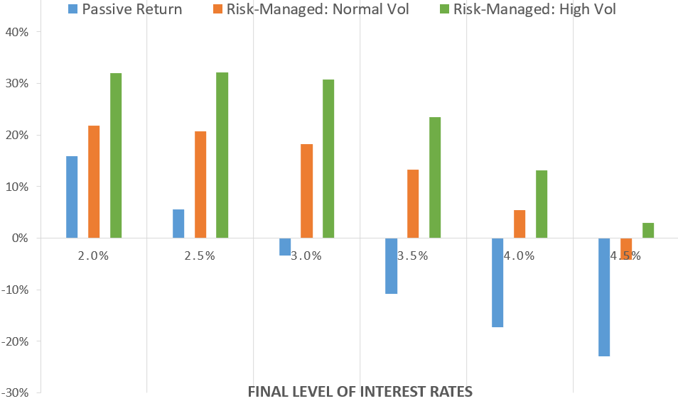
The risk-managed approach accrues positive returns even if interest rates jump to 4%, which highlights why Hedgewise isn't particularly worried about interest rates going back up.
The story becomes even more interesting if you consider a scenario in which rates fall below 2% in the middle of the five year period. In other words, imagine rates drop to 1% after two years, but then go back up by the end of five years.
5 Year Bond Performance Simulation, Rates Fall to 1% at Halfway Mark
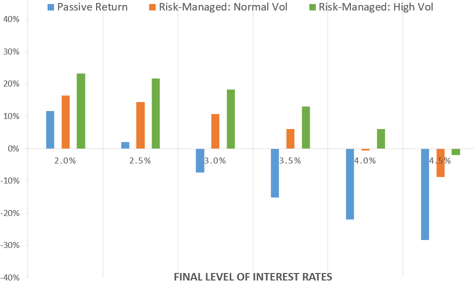
The overall results are similar, though slightly lower across the board because interest rates spend a longer time at a lower level (so less net interest is paid out). This belies a strikingly different view if you look how performance varies along the way. Here's a look at simulated performance over time when rates end at 3.5%.
Full Return Curve When Rates Fall to 1%, Then Return to 3.5% After Five Years
Even though you are better off using the risk-managed model by the end of this period, you have to forgo about a 30% gain right in the middle. By doing so, you eliminate the eventuality of a 50% loss. This is a precise example of accepting a lower return over the short-term in exchange for a higher one over the long-term, which is the heart of a risk management trade-off.
Returning to this year, here is how the fully operational Hedgewise risk model has performed.
Return Attributable to Bonds, Passive Investment vs. Hedgewise, 2019 YTD
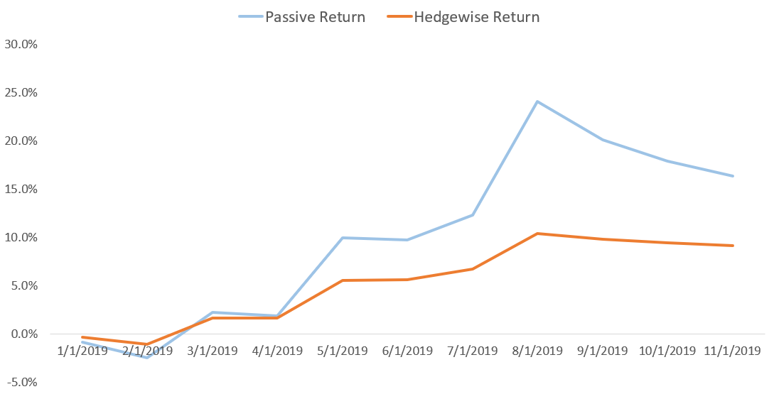
Much like the simulation, in August you might have gained an extra 15% in your portfolio when 30yr interest rates dipped below 2%. This would have felt pretty nice, and it would have also made Hedgewise returns exceed those of the S&P 500 year-to-date. Yet if you step back to the last time that 30yr rates got close to these levels, in mid-2016, you start to see the bigger story at work.
Return Attributable to Bonds, Passive Investment vs. Hedgewise, 2019 YTD
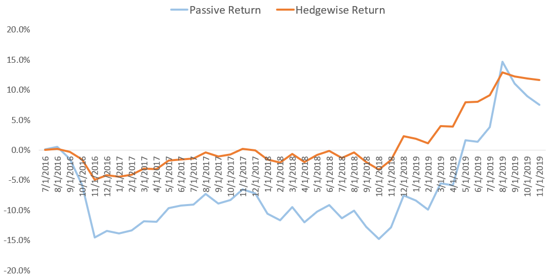
Even if you include the substantial rally of this year, Hedgewise has still yielded overall higher returns from fixed income than a simple passive approach since 2016. Given the possibility that rates continue to go up, the risk-managed approach holds a significant advantage. Even if rates re-touch their lows or fall again in a recession, the story will remain the same: better to give up gains in the short-term to protect your outlook over the long-term.
Commodities: What Are They Good For?
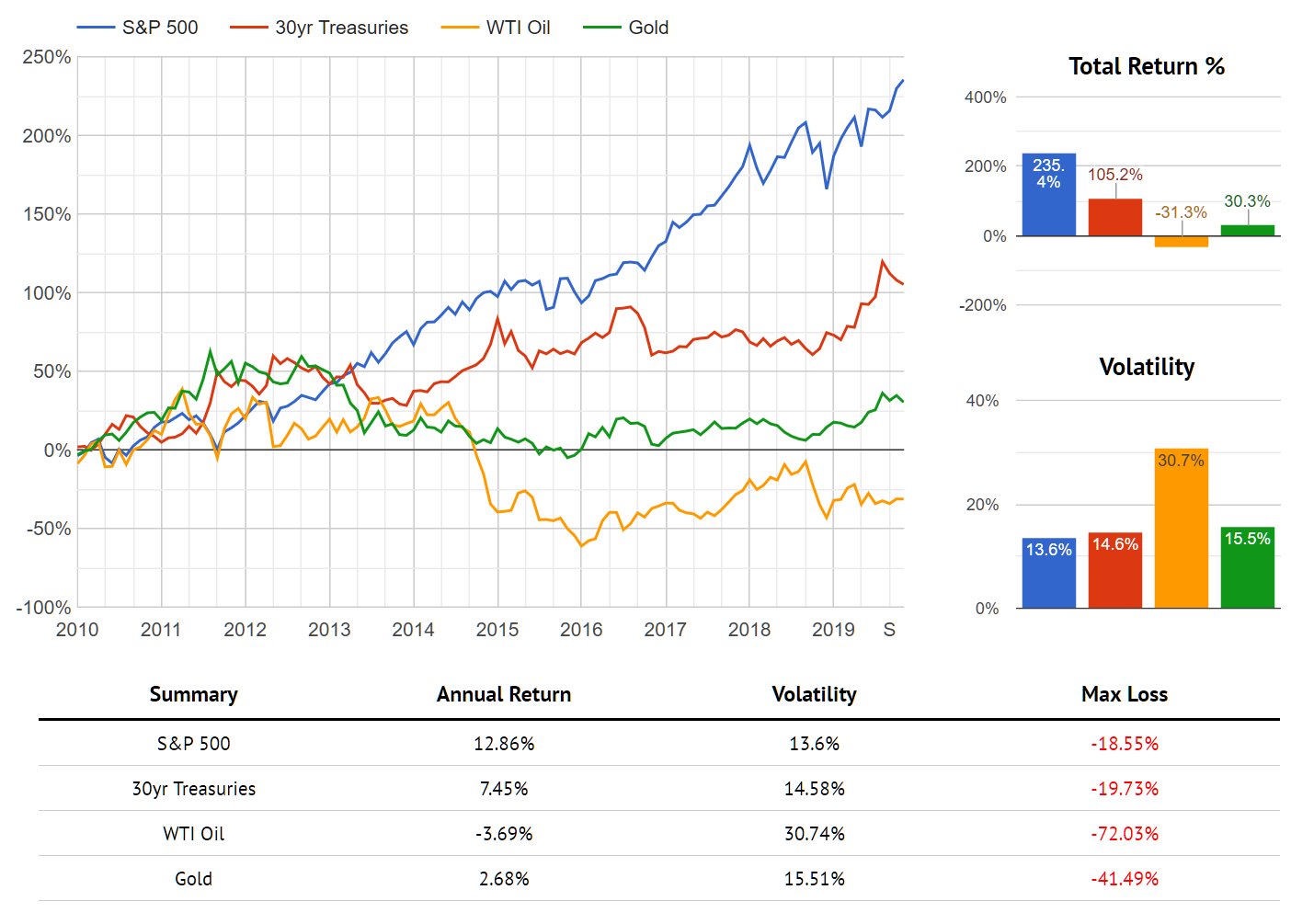
While oil has had a small resurgence in the past few weeks, it has done pretty badly relative to the overall recovery since 2018.
Performance of WTI Oil vs Other Asset Classes Since October 2018
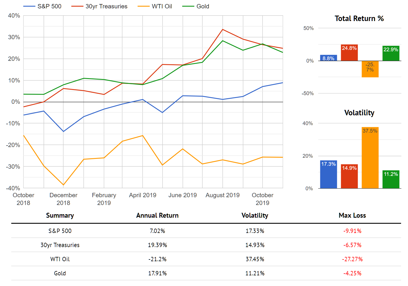
This pattern has been even more pronounced for this entire decade.
Performance of WTI Oil vs Other Asset Classes Since January 2010
You might find it surprising to hear that there's nothing particularly surprising about this performance, nor is does it provide any evidence that energy should be excluded from the portfolio. How can this be?
The answer is that this is precisely how diversification is supposed to work. The decade since 2010 has been highlighted by consistently lower than expected inflation. Interest rates were near zero for a majority of the time, and the Fed has been frequently mystified by the ability of various global forces to keep price levels steady. Since a primary purpose of including energy in the portfolio is to protect against higher than expected inflation, its performance is about what you expect in a decade like this one.
The reason you accept this kind of outcome is because some assets are supposed to do well while others do poorly. On net, you are stabilizing your overall return and reducing expected volatility. A diversified portfolio that includes a mix of all assets (even poorly performing ones) should still keep up with a less diversified portfolio of only the better performing assets, assuming both portfolios are set to the same level of risk.
To test this, we can compare two Risk Parity portfolios set to equivalent levels of volatility. The first includes only stocks, bonds, and gold, while the second contains those same assets plus energy. Both portfolios utilize the exact same underlying Hedgewise algorithms.
Performance of Risk Parity Models With and Without Energy Exposure Since 2010
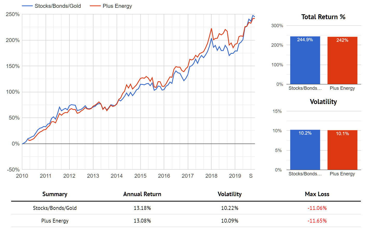
Just as expected, you can hold what appears to be a vastly underperforming asset with no negative impact to your portfolio! This is because you are reducing the overall risk inherent to your portfolio by always including assets that balance in various environments.
The full benefits of this approach are difficult to appreciate when you look only at a decade of low inflation. The real question is what kind of protection you are afforded when the opposite occurs. Unfortunately, the last prime example of higher than expected inflation occurred in the 1970s, when reliable oil data was not available. However, we can substitute in gold as our inflation-protective asset to get a sense of how you shift your expected outcomes across various macro environments. The comparable portfolios become a Risk Parity model of only stocks and bonds compared to a second that also includes gold.
To set the stage with a decade similar to the 2010s, we can use the 1980s, when the Fed successfully stemmed inflationary pressure. Much like oil recently, gold had a terrible decade as interest rates went down, but that still had a minimal impact on a diversified portfolio.
Performance of Risk Parity Models With and Without Gold Exposure, 1980-1990
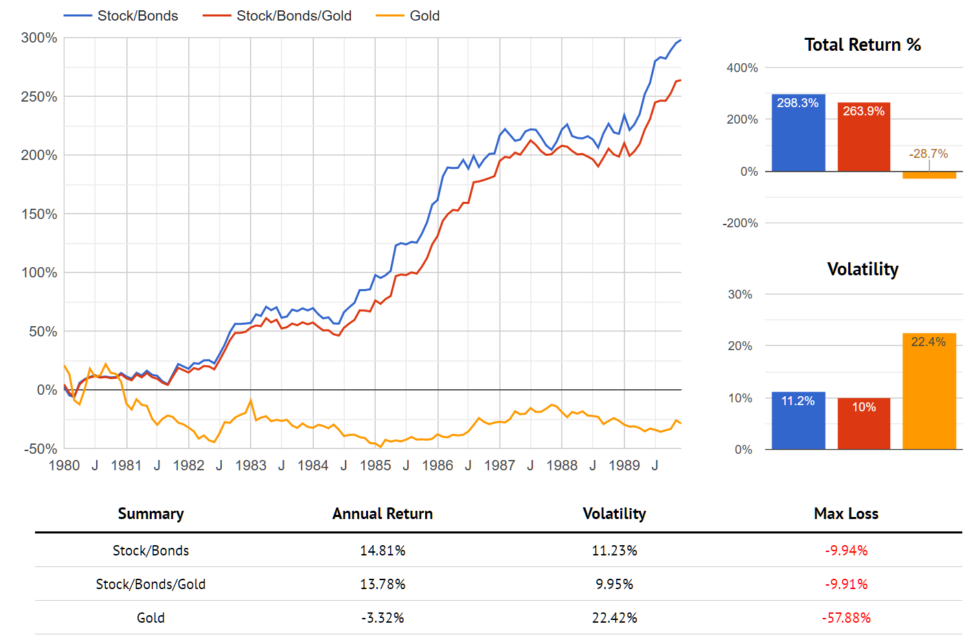
Note that the portfolio with gold did do slightly worse, but not nearly to the degree you might expect when you held an asset that lost 30% in a decade. On the other hand, the protection you gained can be seen clearly when you expand the view to include performance during the 1970s, a decade of higher than expected inflation.
Performance of Risk Parity Models With and Without Gold Exposure, 1972-1990
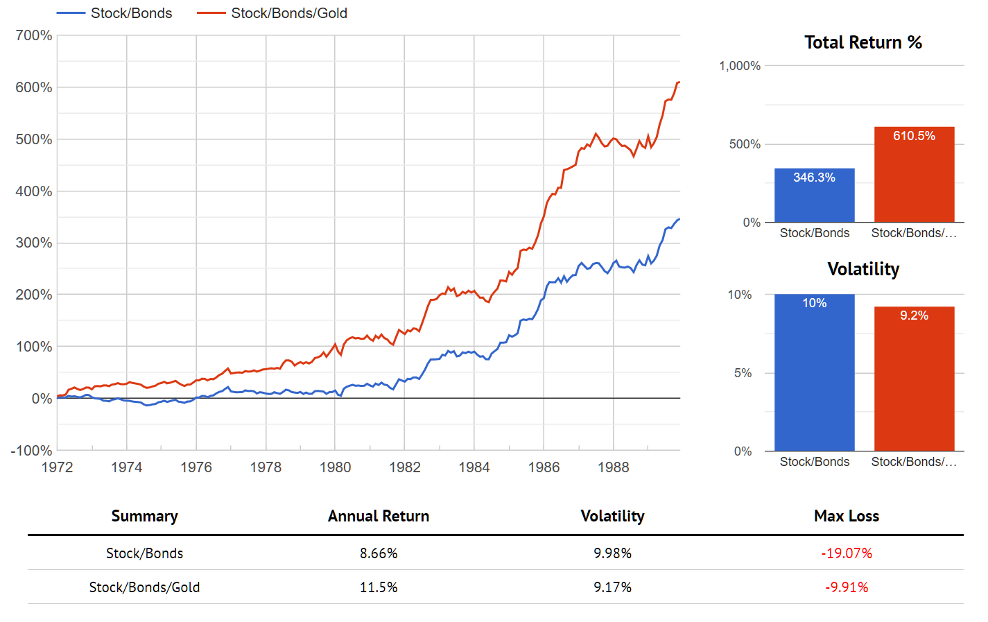
In the 2010s, intuition would suggest that energy has been a drag, but that's essentially untrue. You've done about as well as a portfolio excluding energy because you still increased your ongoing risk-adjusted return through diversification. Should the 2020s wind up being a decade of higher than expected inflation, the benefits of this approach will become even more dramatic, just as they did with gold during the 1970s.
Equities: The Risk Conundrum
Part of the Hedgewise methodology is to dynamically adjust asset exposures based on real-time measures of risk. The underlying idea is that you can further stabilize returns by removing some of the extreme outliers, whether positive or negative. Even if you achieve the same overall average level of monthly returns, you still reduce volatility if you can do so with fewer big swings. Hypothetically, you expect something like the following diagram of monthly returns. The blue data points are all of your model returns, the orange data points are the ones categorized as "high risk", and the grey data points are what remain after excluding the high risk points.
Expected Model Result for Removing High Risk Exposures
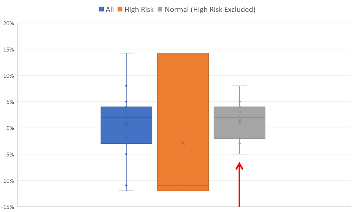
The red arrow has been added for emphasis on the desired outcome: you'd like to squeeze all of your data points inward - especially the large negative ones - such that you have a more stable positive return.
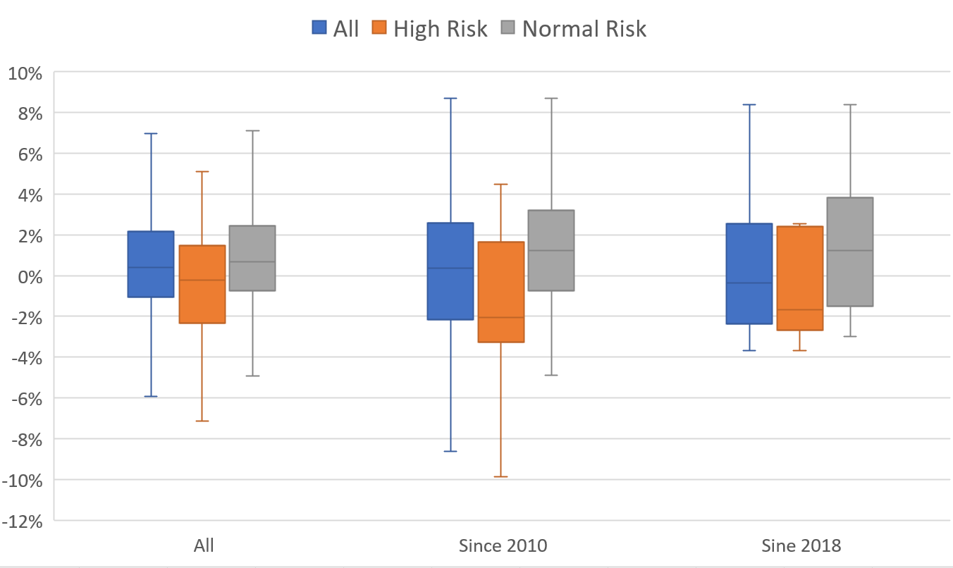
Now let's look at this actual diagram for a few asset classes. These graphs are selecting all actual months categorized as high risk using the Hedgewise algorithm over various timeframes, and then removing those data points from the distribution to see how this impacts your outcome. If the theoretical model is correct, the graphs should all look something like the above.
Treasury Bond Return Distribution, High vs. Normal Risk
Energy Return Distribution, High vs. Normal Risk
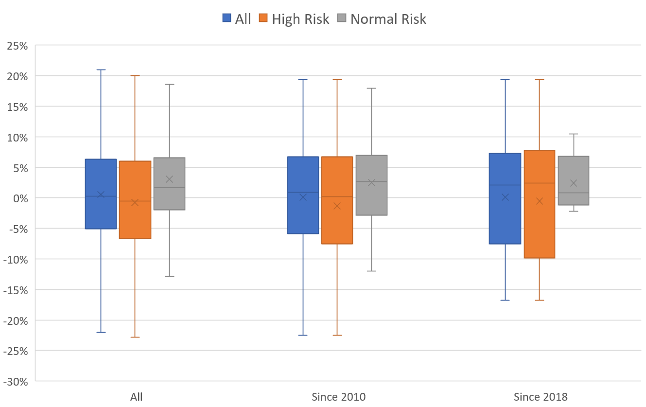 So far so good. In both these asset classes, the "negative" tail has consistently shifted upward by removing your high risk environments. Strangely, the S&P 500 has been a little different this decade.
S&P 500 Return Distribution, Normal vs. High Risk
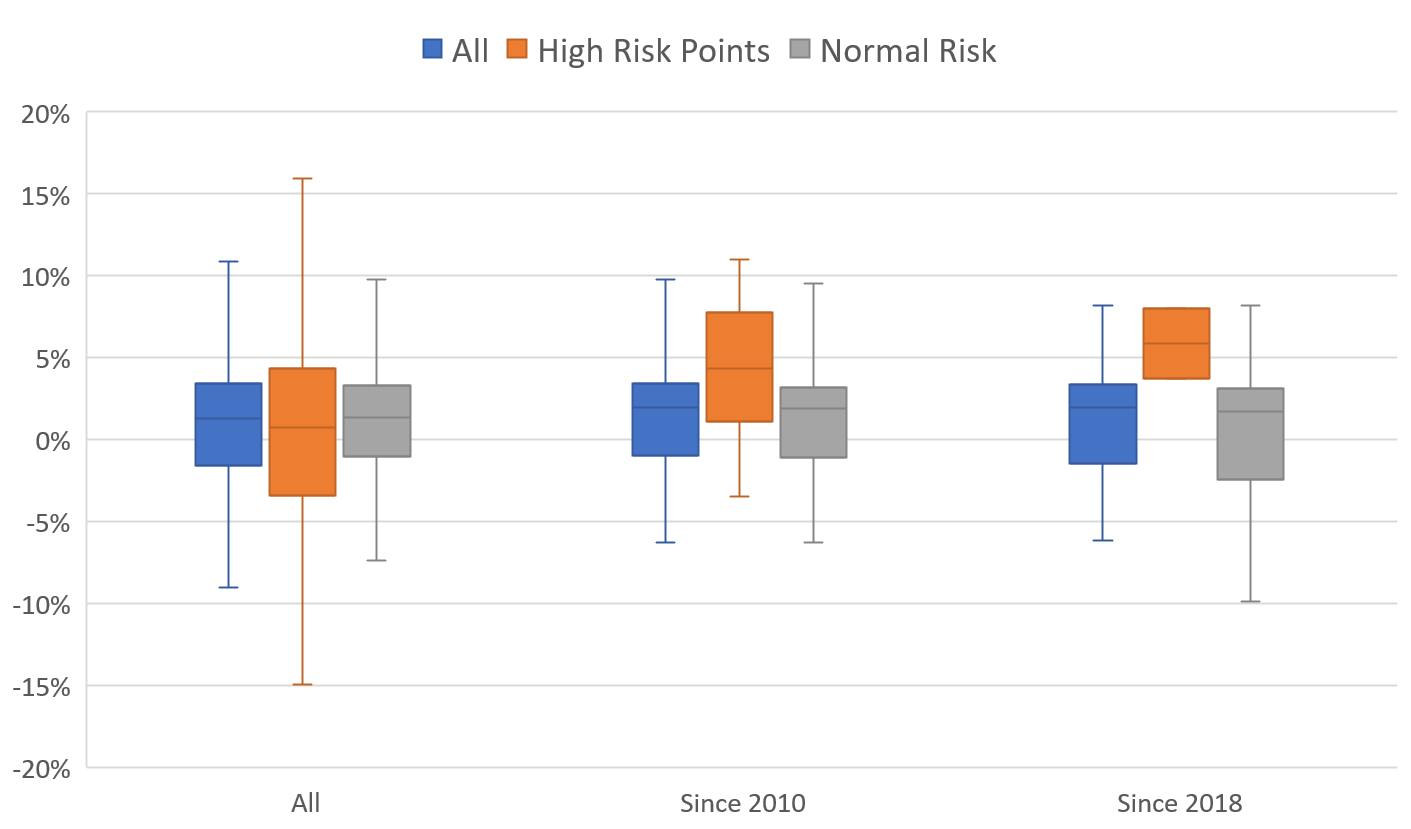
It appears that recent high risk environments have resulted primarily in positive returns and removing those data points has not had the desired effect. What does this mean? Has something about risk in the S&P 500 changed? Do these results suggest a problem with the financial theory?
It's worthwhile to provide some additional real-life context about what is happening. A "high risk" month generally means that investors are pricing in the potential for a large market swing in either direction. If market fears come to bear, you incur losses, and vice versa. During a stretch where the consistent outcome during these months is positive, it must either mean that investors were badly pricing risk, or that events are luckily resolving despite a real chance that they might not have.
Anecdotally over the past couple of years, it's difficult to argue that the trade war had little chance of escalating, or that the Fed could not have made some irrecoverable mistake. Even if you were to claim that investors were truly overreacting in these particular cases, that doesn't suggest that some fundamental factor has shifted to make that more likely moving forward.
A more believable explanation is that we've basically gotten lucky. The Fed nearly broke the economy, but backed off just in time. Trump nearly blew up global trade, but mended things just enough to avert disaster. Low employment and higher than anticipated consumer strength provided a nice boost this year that many doubted would materialize. We've also avoided any nasty geopolitical blow-ups like wars or recessions.
To further test this theory, we can look at history to analyze how our current environment of risk compares to historical trends. The following shows the percentage of "high risk" months that occurred in every ten year rolling timeframe since 1954, as well as what percentage of those months resulted in a negative return (i.e., The orange bar shows about how often markets were in a risky state, and the blue line shows how often that risk wound up resulting in a loss).
S&P 500 Historical Risk Environment & Hit Rate, Ten Year Rolling Timeframe, 1954 to Present
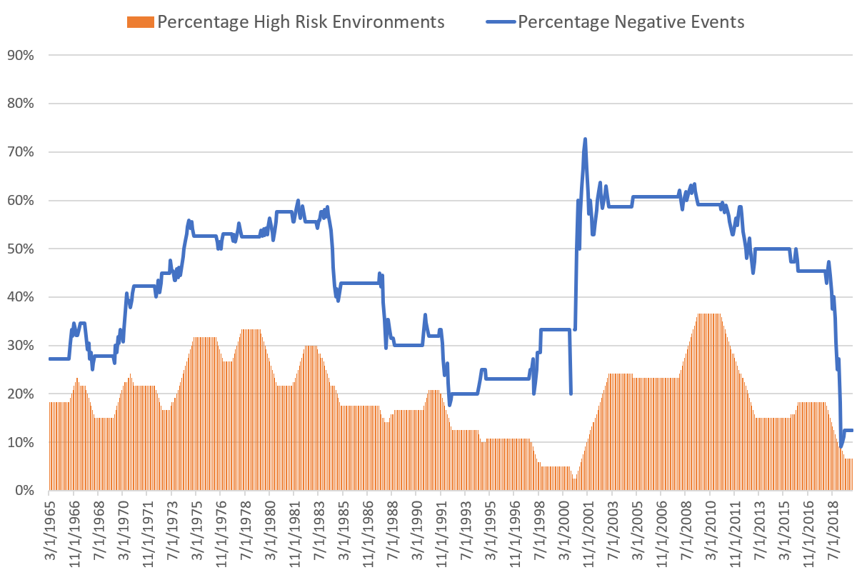
What jumps out is that in the most recent decade, more risky events have resolved to the upside than ever in history. On average, somewhere between 30-50% of these events materialize negatively; recently it's been under 15%. It's also been quite peaceful overall; the only other periods to show so few "risky" environments (the orange bar) were the ten years ending 1998 to 2000.
This makes a strong case that this is an outlier of relative global harmony, in which the few major risks (trade war, Brexit, et al) all resolved without doing too much damage. History suggests that this will be an incredibly difficult feat to repeat.
Still, it's worth analyzing how much this has impacted the returns of the Hedgewise portfolio. You'd think that missing months of upside would have a pretty dramatic negative effect, but here's the performance of the Risk Parity model compared to the S&P 500 over the last ten years.
Performance of the S&P 500 vs. Risk Parity Max, December 2009 to Present
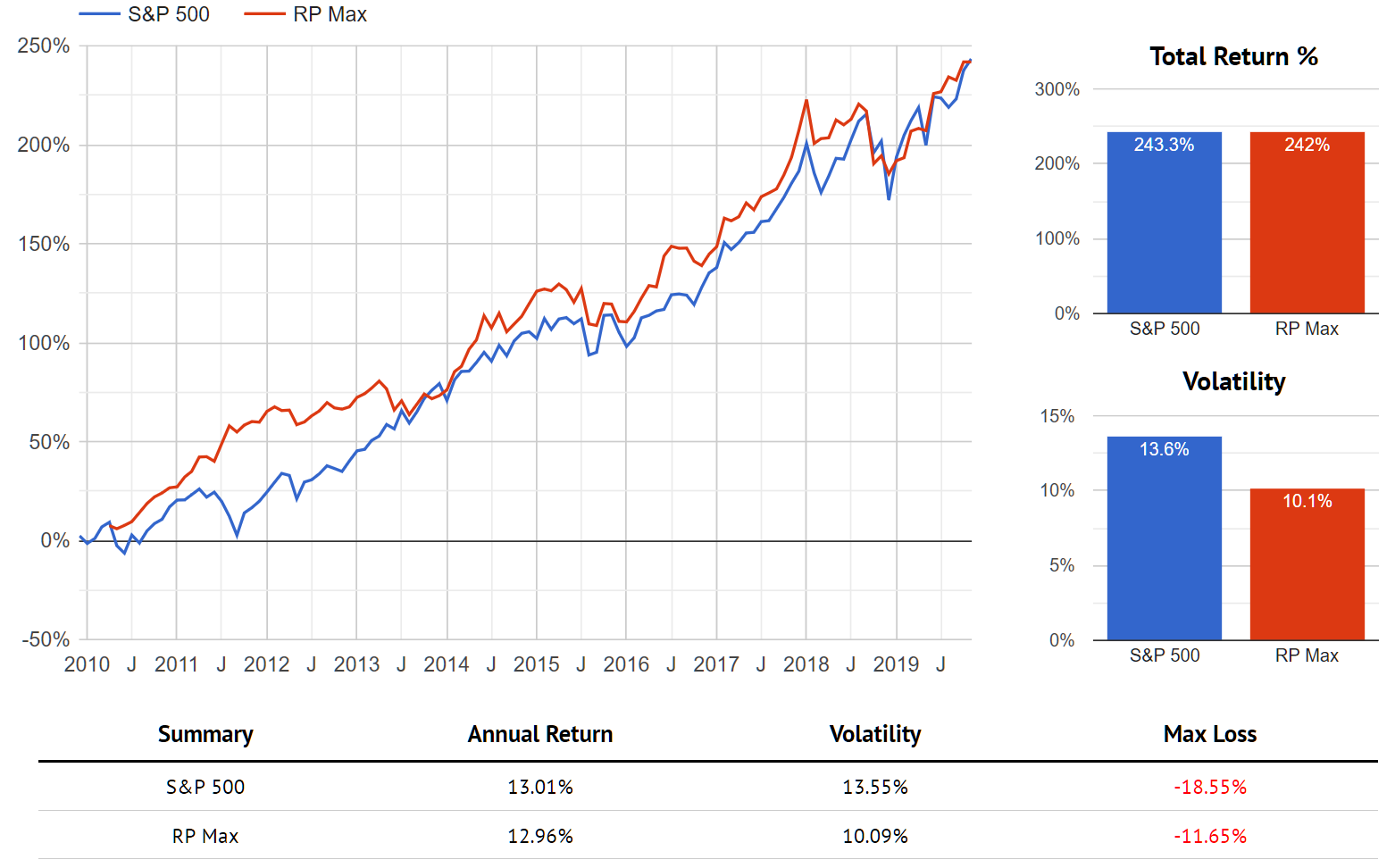
The story here is similar to the one of diversification: even when you do 'badly', you still mostly keep up. This is because so many other elements of the strategy have continued to function as they should (like the normal behavior of risk in other asset classes). Yet when some major risk does unfold, you do so much better. For example, simply include the 2008 recession.
Performance of the S&P 500 vs. Risk Parity Max, December 2007 to Present
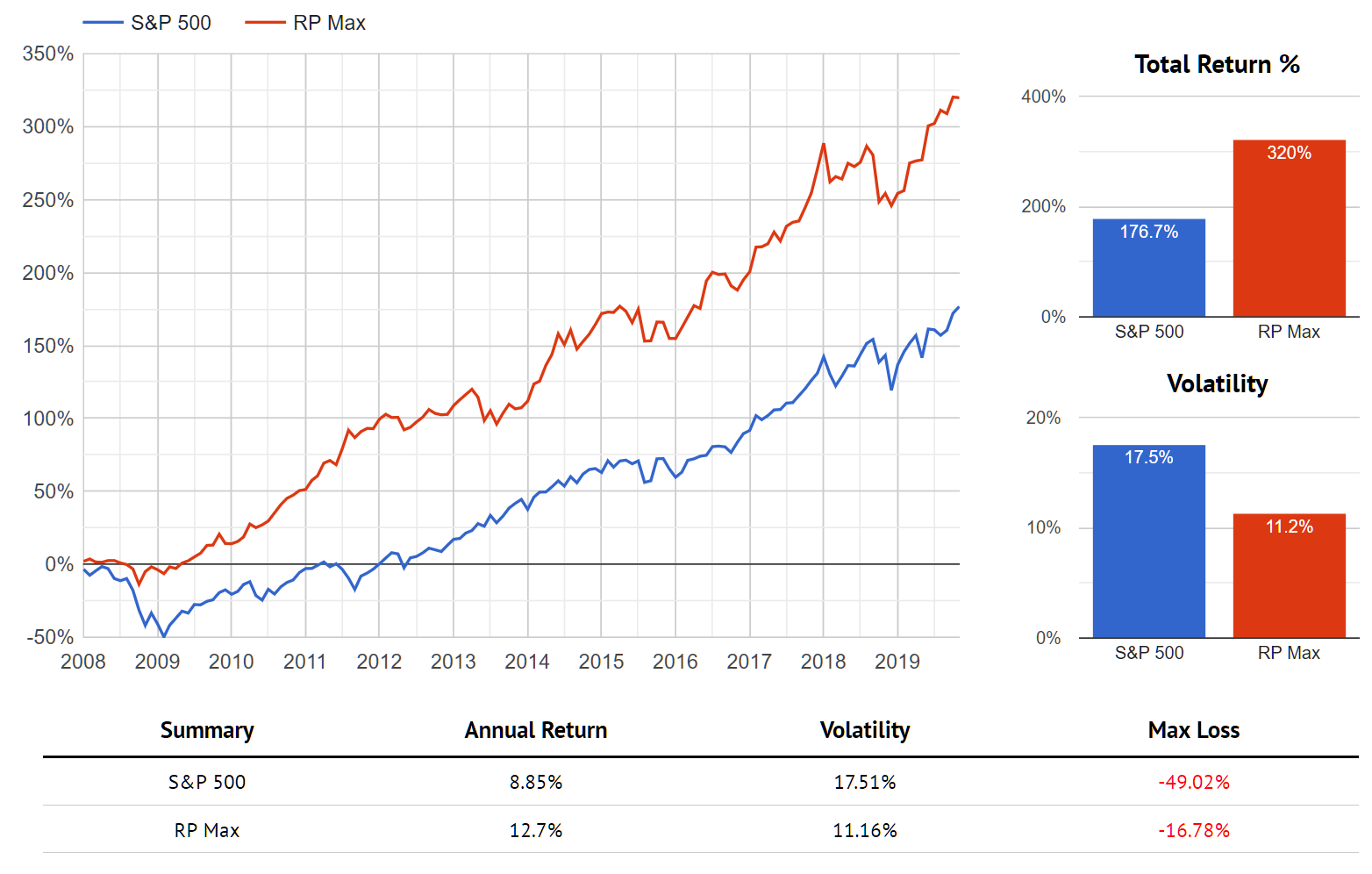
Notice that these long-term results include lots of individual months that 'felt' like the algorithm was working poorly. You have to deal with multi-year stretches where you underperform the S&P, like 2012 to 2013 or 2018 to today. In the broader scheme, these costs are minimal compared to the benefit you accrue over time.
Historically speaking, there's little chance that the 2020s continue as peacefully as the 2010s. Given that this past decade has been as low risk as it has, it's also pretty remarkable that it cost so little in terms of your net realized return. Hedgewise strategies will likely perform even better relative to the S&P 500 moving forward, but this has been pretty great so far as "bad" outcomes go.
Looking Forward: Grappling with an Uncertain World
In 2019, there's no denying that we've missed rallies, that commodities have lagged, and that no major risks have manifested. Yet all of that can occur without damaging long-term returns, and the same mechanisms driving these outcomes make your portfolio far more resilient for the future.
Moving into 2020, a significant overlooked risk is quite mathematic. Much of the gains in stocks and bonds this year are due to falling interest rates, which literally moves profit from the future into the present. Just as we saw in the modeling of this article, that introduces substantial downside even if rates simply return to where they were back in December 2018. Hedgewise strategies not only consider this possibility, they are probabilistically built around it.
Commodities have also been the key victim of a decade of low inflation, and will be an attractive source of returns if rates do rise again. Most traditional portfolios have no way to benefit from this, yet it will be difficult to generate positive returns without this exposure in a world of resurgent inflation.
Stocks have wondrously avoided most major risks for a very long time, but imagine if Trump or Xi decides to re-escalate, or if the EU shows more serious signs of falling apart. Climate change, presidential elections, and global inequality will all weigh significantly on the future. The world is a fragile place, and Hedgewise strategies behave with that in mind while minimizing the cost if we do manage to avert those risks.
The push and pull of all of these scenarios and probabilities is very difficult to grasp on a day-to-day basis, and it will always be easier to see the immediate decision that might have driven a bigger gain right now. By understanding and accepting these trade-offs, you dramatically improve your long-term return expectations. In 2019, that meant taking a 20% return instead of something higher; in context, that is pretty fantastic for the sake of 2020 and beyond.
Disclosure
This information does not constitute investment advice or an offer to invest or to provide management services and is subject to correction, completion and amendment without notice. Hedgewise makes no warranties and is not responsible for your use of this information or for any errors or inaccuracies resulting from your use. Hedgewise may recommend some of the investments mentioned in this article for use in its clients' portfolios. Past performance is no indicator or guarantee of future results. Investing involves risk, including the risk of loss. All performance data shown prior to the inception of each Hedgewise framework (Risk Parity in October 2014, Momentum in November 2016) is based on a hypothetical model and there is no guarantee that such performance could have been achieved in a live portfolio, which would have been affected by material factors including market liquidity, bid-ask spreads, intraday price fluctuations, instrument availability, and interest rates. Model performance data is based on publicly available index or asset price information and all dividend or coupon payments are included and assumed to be reinvested monthly. Hedgewise products have substantially different levels of volatility and exposure to separate risk factors, such as commodity prices and the use of leverage via derivatives, compared to traditional benchmarks like the S&P 500. Any comparisons to benchmarks are provided as a generic baseline for a long-term investment portfolio and do not suggest that Hedgewise products will exhibit similar characteristics. When live client data is shown, it includes all fees, commissions, and other expenses incurred during management. Only performance figures from the earliest live client accounts available or from a composite average of all client accounts are used. Other accounts managed by Hedgewise will have performed slightly differently than the numbers shown for a variety of reasons, though all accounts are managed according to the same underlying strategy model. Hedgewise relies on sophisticated algorithms which present technological risk, including data availability, system uptime and speed, coding errors, and reliance on third party vendors.