Contact Us
Hedgewise advisors are available to every potential client because you deserve to know and trust who is managing your money.
E-mail
Questions / Comments
SUBMIT
X CLOSE
Investments That Outperform
Thanks! Only $1,000,000 remaining.
You can help accelerate launch by referring a few friends.
X CLOSE
PERFORMANCE ABOUT NEWSLETTER LIVE
CLIENT LOGIN
PERFORMANCE
ABOUT
NEWSLETTER
DEMO
CONTACT US
TOPICS
About Us
|
Account
|
FAQ
|
Investment Strategy
|
Market Commentary
|
The Anatomy of Momentum: Why the Strategy Works, and How to Play the Odds
Posted in Investment Strategy on 2019-03-28

Summary

  • Since the summer of last year, the Hedgewise Momentum framework has experienced a period of significant drawdown and underperformance compared to the S&P 500
  • Though this raises many reasonable questions about its efficacy, such periods are quite consistent with the strategy underpinnings and almost guaranteed to occur an average of twice per decade
  • To understand this, it is useful to deconstruct "Momentum", which is really just an advanced stop-loss strategy. Such a framework is subject to periods of underperformance despite significant evidence that it provides superior long-term risk-adjusted returns
  • Looking forward, the outlook remains excellent, but not because of any "timing" ability or keen insight about the market, but rather because the framework persistently shifts the odds in your favor

Introduction: The Trouble with Intuition

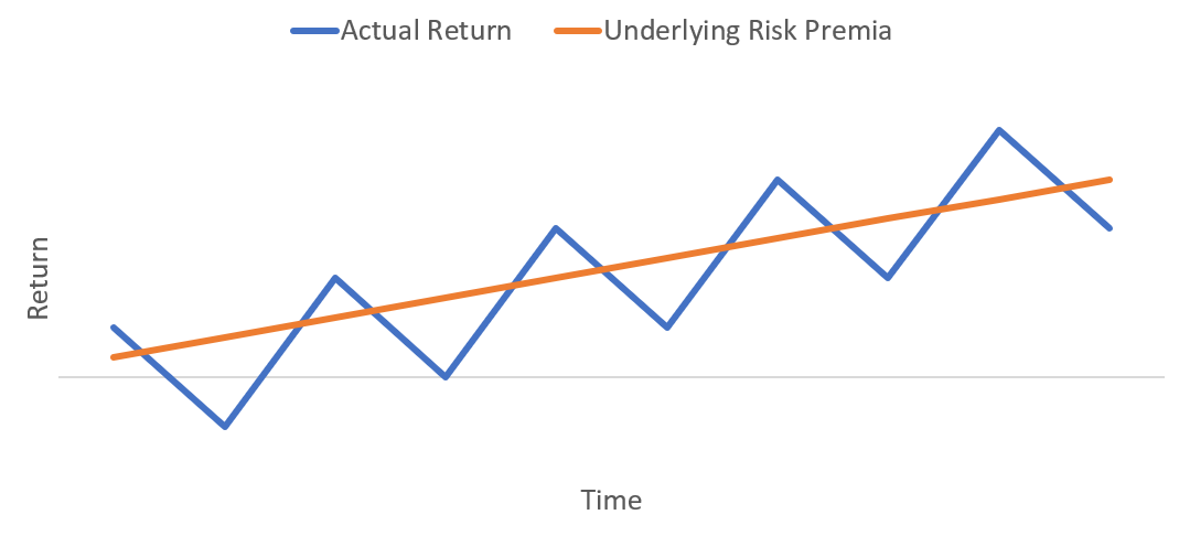
One of the persistent challenges of running a quantitative investment framework is dealing with periods of underperformance. Since the premise of any strategy is to drive superior long-term gains with less overall risk, it may feel like underperformance indicates a failure and suggests that perhaps the strategy has become less effective.

The problem with this intuition is that quantitative frameworks largely function by shifting your odds to a different set of risks than traditional passive benchmarks like the S&P 500. For example, Risk Parity is more vulnerable to issues with cross-asset performance and correlation, and "factor" investing is more vulnerable to various macroeconomic conditions and market microstructure. Even if, over long periods of time, such risks are less persistent and damaging compared to the risks facing the S&P 500, they are still bound to manifest occasionally, and this will naturally drive periods of underperformance.

As a simple example, imagine that the S&P 500 is a bit like a coin with a 60% chance of landing on heads, and a framework is like a completely separate coin with a 65% chance of landing on heads. Given 100 flips, the advantages of the framework will seem objectively obvious. But on any given flip, there's a pretty high chance that the S&P 500 lands heads and the framework lands tails. Despite the odds that the framework will consistently perform better, there will be frequent short-term exceptions.

As with any probability, the only way to converge towards the 'true' odds is to ignore each individual datapoint and keep playing for a relatively long time. Yet, as investors in the midst of losing money, it is natural to fear that the odds have changed, and to consider whether simpler passive strategies would be a better choice. By clearly deconstructing the elements of the Momentum strategy, this article will highlight exactly what has driven its historically superior returns and why this should continue to drive confidence moving forward.

Back to Basics: What is Momentum?

Broadly, the term "Momentum" is used to refer to investment strategies that assume certain trends tend to continue over time. For example, some trend-following frameworks assume that the best-performing stocks over the past year will continue to outperform, or if stocks have done badly recently, they will go on to do even worse. There is a great ongoing debate about how and why a factor like momentum would have such predictive power.

I believe the idea that trend-following strategies have significant predictive ability is simply not credible. That said, I also believe that using momentum as a framework can significantly improve your risk-adjusted returns. How can this be?

This is far easier to explain if you consider that a simple stop-loss mechanism - a rule to sell something after incurring a certain amount of loss - is functionally the same as momentum. If things keep going up, you hold on. If they go down a certain amount, you sell. It would be absurd to argue that such a trigger had any predictive power. Rather, this is more clearly a simple form of risk management, and the relative success of such a framework will be easy to predict. If an asset keeps going down, you avoid losses. If it doesn't, you incur some cost of selling and re-entering (called a "whipsaw" effect). The main benefit of this framework would be to minimize the size of your worst losses, presuming that the worst-case impact of whipsaws should be less severe than the worst-case impact of market crashes.

In terms of efficient market theory, this makes sense. Investors are always considering risk and reward, with the expectation of paying a discount for an underlying asset in the present in order to achieve a positive return in the future. Efficient markets should usually go up, and they shouldn't remain at the same level for very long. Thus, whipsaws shouldn't happen very often. Given that, it's believable that the drawdowns incurred during market crashes may be steeper than those incurred during whipsaws.

The entire validity of 'momentum' becomes a simple trade-off of probabilities. You aren't expecting to predict anything with accuracy, and you aren't trying to figure out whether a whipsaw or a crash is going to occur. You are simply shifting around the risks of your portfolio.

Simple enough: let's make this our hypothesis, and set-up some experiments to test it.

Testing the Hypothesis: First Experiments and Mechanics

To test our hypothesis, we'll first set-up three dead simple strategies that follow one rule: if the S&P 500 hits a certain level of drawdown, sell. Otherwise, invest. Upfront, realize that this first iteration cannot possibly beat the return of the S&P 500 unless you stopped the simulation right in the middle of a big crash. But it's still a useful first experiment to understand some of the mechanics.

We'll set-up three loss triggers to explore: -10%, -15%, and -20%. The goal is to test whether the hypothesis holds up with all of these levels, since they are all consistent with the broad idea.

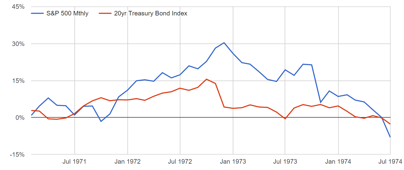
Performance of Stop-Loss Strategies vs. S&P 500, 1950 to Today

Annual ReturnMax Loss
S&P 50011.15%-54.98%
-10% Stop Loss8.81%-30.77%
-15% Stop Loss9.03%-36.55%
-20% Stop Loss9.41%-40.33%
Model uses index prices and includes all dividends, assumed reinvested. Assumes that portfolios realize end-of-day prices on the day that any drawdown level is exceeded or reversed. Sources: Bloomberg, Federal Reserve Economic Data, Hedgewise

Note that each of the stop-loss strategies has a substantially lower annual return, but also a lower maximum loss. This confirms the hypothesis that the worst-case 'whipsaw damage' tends to be lower than worst-case 'stock crash damage', but you may be still be surprised that a 10% stop-loss can experience a 30% drawdown. This is mechanically important to understand as it demonstrates how whipsaws function. Here's a look at one rough stretch for the 10% strategy.

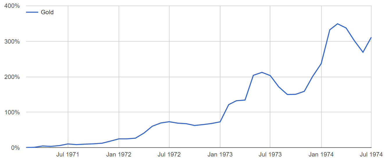
Understanding the Whipsaw Effect: December 1973

Source: Hedgewise Analysis

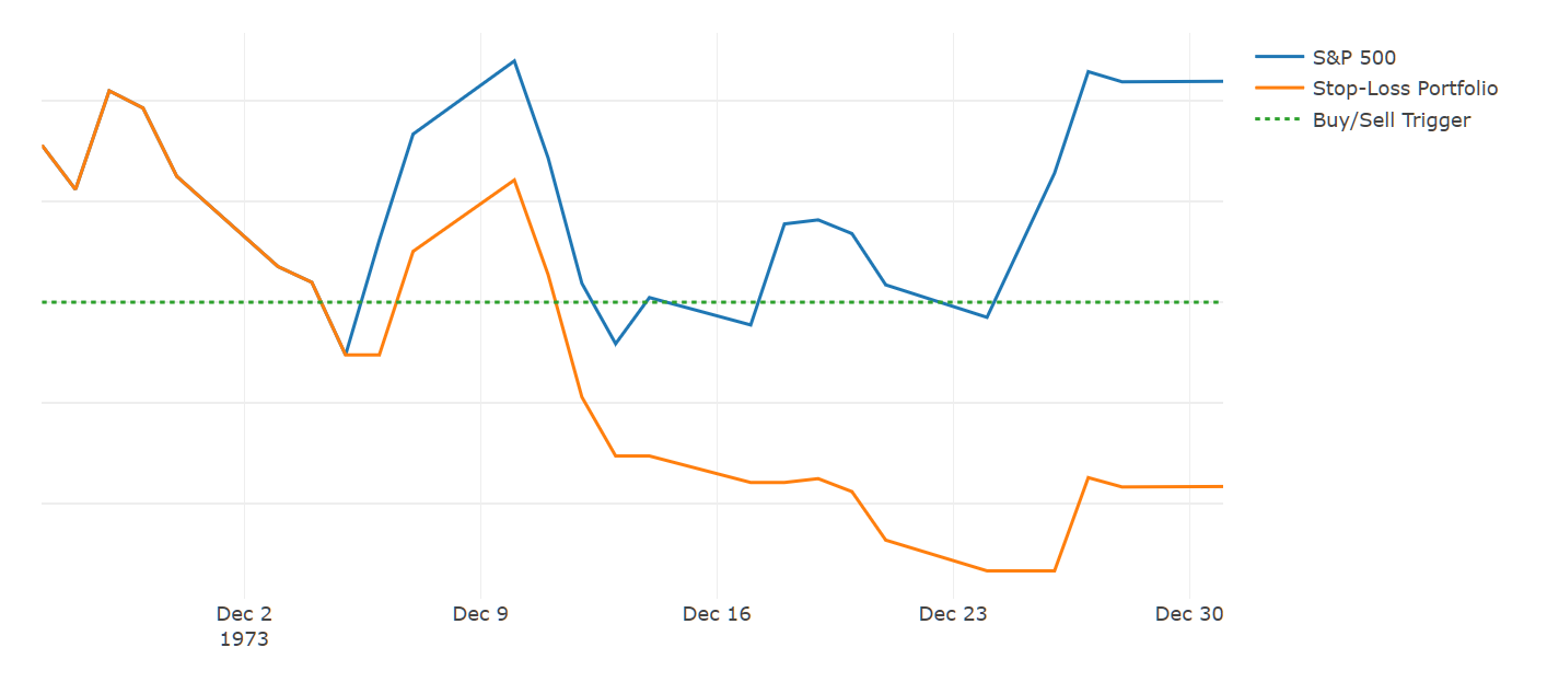
Here, the stop-loss trigger is frequently hit, and every time the portfolio liquidates. Then, the day after, stocks often recover and the portfolio buys again, but misses that days' gain. This is the whipsaw effect, which can thus accrue significant losses independent of the performance of the S&P 500. An important takeaway to highlight is that any stop-loss strategy will by definition do worse than stocks during periods where the market whipsaws, so you are likely to experience drawdowns when stocks do not, but you avoid losses when stocks crash.

While this seems scary and random, it is! But remember that's on purpose - you are actively choosing 'whipsaw crashes' over 'stock market crashes' and hypothesizing that it's still preferable.

Given the initial numbers, this doesn't seem like a clear conclusion. To enable a more equal comparison, we need to better take advantage of the stop-loss structure.

Engineering Fairer Odds

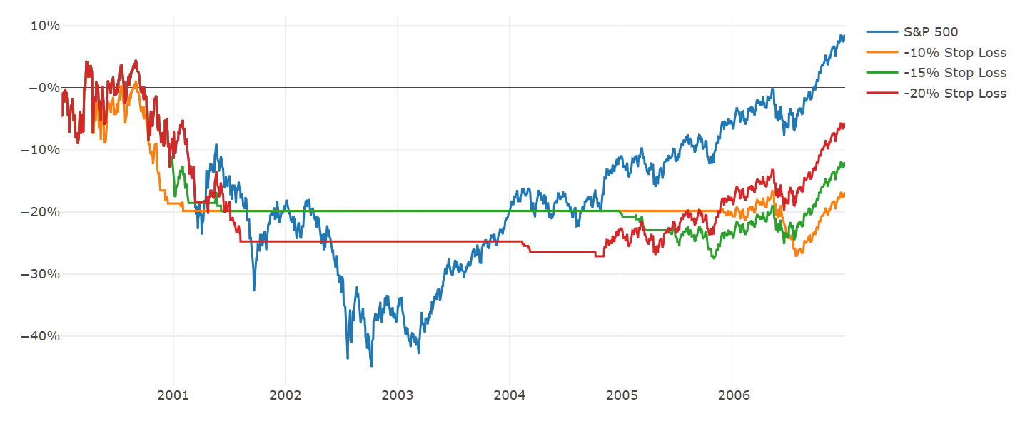
One of the substantial hidden handicaps of simple stop-loss strategies is that they will spend very long periods of time invested in nothing at all. For example, if stocks lose 40%, and take a few years to get back above a 10% net drawdown level, the strategy is 100% cash for those years. The period from 2000 to 2007 exhibits what this looks like.

Daily Stop-Loss Performance, 2000 to 2007

Source: Hedgewise Analysis

Spending this amount of time in cash is a bit of an unfair disadvantage. To correct it, we can simply choose a relatively low risk asset that is expected to accrue positive interest over these stretches. Bonds are the obvious choice, but remember that this is in no way timing bonds as the 'smart investment' when the trigger is hit. It's simply a way to deploy a positive yielding alternative when the portfolio is largely in cash. While sometimes bonds might do particularly well if markets go on to crash, they may also do poorly if markets stabilize. The stop-loss framework only cares that the net return is expected to be positive on average, especially when it is out of stocks for a significant duration of time.

If we use 10yr Treasury Bonds as a proxy, here is how it changes the performance of the 10% stop-loss strategy in the same timeframe.

Daily 10% Stop-Loss Performance Comparison, 2000 to 2007

Source: Hedgewise Analysis, Federal Reserve Economic Analysis. Includes all dividends and coupons assumed re-invested.

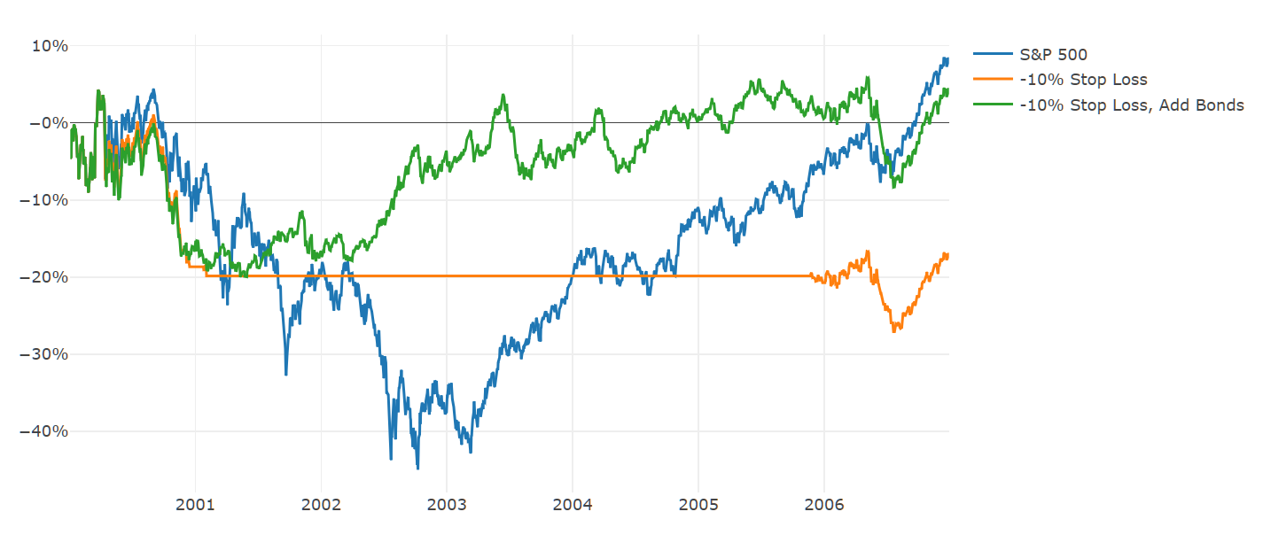
Observe that bonds significantly underperformed stocks for years beginning in 2003, but it isn't our goal to always outperform the S&P: we simply wanted to do better than cash for a stretch to avoid the stop-loss 'handicap'. It's also worth highlighting how this adjustment reduces the chances of hitting a particularly unlucky sequential drawdown, such as the cumulative impact of the whipsaws in 2001 and then subsequently in 2006.

Here's how the numbers change if we add this bond rule to each of the experimental portfolios and run it again since 1950.

Performance of Stop-Loss Strategies, Add Bonds, vs. S&P 500, 1950 to Today

Annual ReturnMax Loss
S&P 50011.15%-54.98%
-10% Stop Loss, Add Bonds11.27%-23.85%
-15% Stop Loss, Add Bonds10.72%-26.1%
-20% Stop Loss, Add Bonds10.26%-34.58%
Source: Hedgewise Analysis

This is a pretty dramatic effect! This alone makes the 10% Stop-Loss portfolio look more compelling than the S&P 500. However, we'd prefer our hypothesis to hold up consistently across all the portfolios to demonstrate greater statistical significance, and it's very unlikely that the 10% level has some unique special power. It's also still difficult to properly evaluate the 15% and 20% levels, which exhibit both lower annual returns and lower max losses.

The Introduction of Leverage

As you can see in the tables, a buy and hold approach would have experienced a 55% drawdown. It is interesting to consider what the return would be in the stop-loss portfolios if one were willing to tolerate that level of risk. Introducing leverage provides an easy way to do just that. Since you have a built-in mechanism (the stop-loss) to help avoid large crashes, it seems sensible to also amplify your exposure. The following adds a constant 50% 'loan' to the portfolio with an assumed cost equal to the rate on 1yr Treasury Bills.

Performance of Stop-Loss Strategies, Add Bonds and 50% Leverage, vs. S&P 500, 1950 to Today

Annual ReturnMax Loss
S&P 50011.15%-54.98%
-10% Stop Loss, Add Bonds, 150%14.36%-35.57%
-15% Stop Loss, Add Bonds, 150%13.43%-41.45%
-20% Stop Loss, Add Bonds, 150%12.6%-52.42%
Source: Federal Reserve Economic Data, Hedgewise Analysis. At all times, portfolios are either in 150% S&P 500 or 150% 10yr Treasuries, and a daily leverage cost based on either 1yr Treasury Bills (from July 1959 onward) or 3mth Treasury Bills (prior to July 1959) is subtracted from the return.

Now our hypothesis is beginning to look more convincing: every portfolio outperforms the S&P 500 without increasing your maximum loss, yet all of these portfolios still underperform the S&P 500 for lengthy periods of time. Mechanically, this must happen every time a whipsaw occurs. The existence of these periods does not change the idea that your odds were consistently improved over the long-run.

Demystifying "Momentum": Slightly Smarter Engineering

Hopefully, it is clear that all of our work thus far has little to do with secret signals or mysterious predictions. It's just plain financial engineering and probabilities. Introducing a few more intelligent tweaks will illustrate how these same principles apply to nearly all forms of "Momentum" you may hear about in the marketplace.

Some of the most common momentum "metrics" involve the use of moving averages and trailing returns (for example, sell stocks when they fall below their 200day moving average, buy otherwise). These are little more than advanced forms of 'stop-loss' strategies. For example, here's a comparison of a simple -10% stop-loss sell trigger, a 100day trailing return sell trigger, and a 1yr moving average sell trigger.

Stop-Loss Trigger vs. Trailing Return Trigger vs. Moving Average Trigger

Source: Hedgewise Analysis

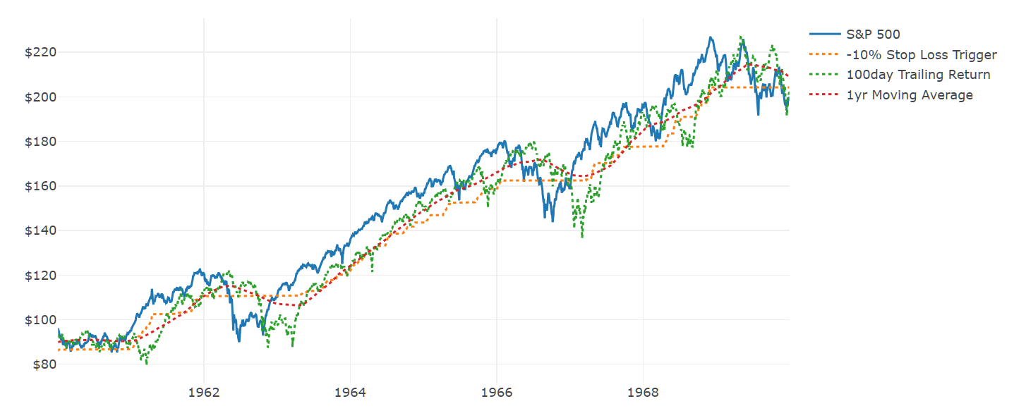
Notice how closely the dotted-lines often cluster; for a great majority of the time, there's no functional difference between them. The main advantage of the 'advanced' metrics are they build in one important and convenient heuristic: they allow for a re-entry point to equities after a big crash.

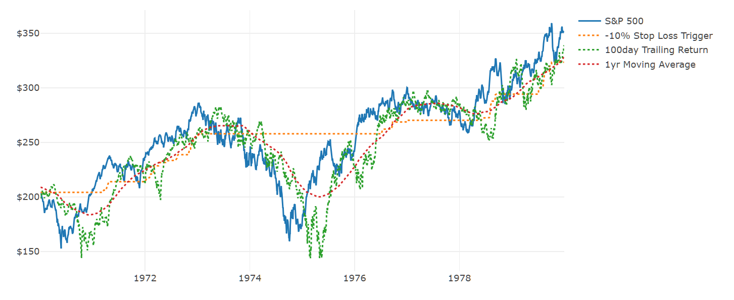
Recall in one of our earlier examples how the stop-loss strategies remain can remain in bonds for years at a time, and thus never take advantage of potentially 'cheaper' equity prices. Metrics like trailing returns and moving averages provide a convenient mechanism to re-enter stocks if prices have fallen significantly. To illustrate, here's how the various triggers moved around during the recession in the mid-1970s.

Stop-Loss Trigger vs. Trailing Return Trigger vs. Moving Average Trigger, 1970s

Source: Hedgewise Analysis

Allowing for a lower re-entry point to equities drives some significant potential extra upside, which can be seen by translating these triggers into the correlating actual performance.

Stop-Loss vs. Trailing Return vs. Moving Average Performance, 1970s

Each strategy is either invested in 100% S&P 500 or cash. The 100day Trailing Return sells on any day when the 100day trailing total return of the S&P 500, including dividends, falls below 0. The 200day MA Return sells on any day when the total price of the S&P 500, adjusted for dividends, falls below its 200day average. Source: Hedgewise Analysis.

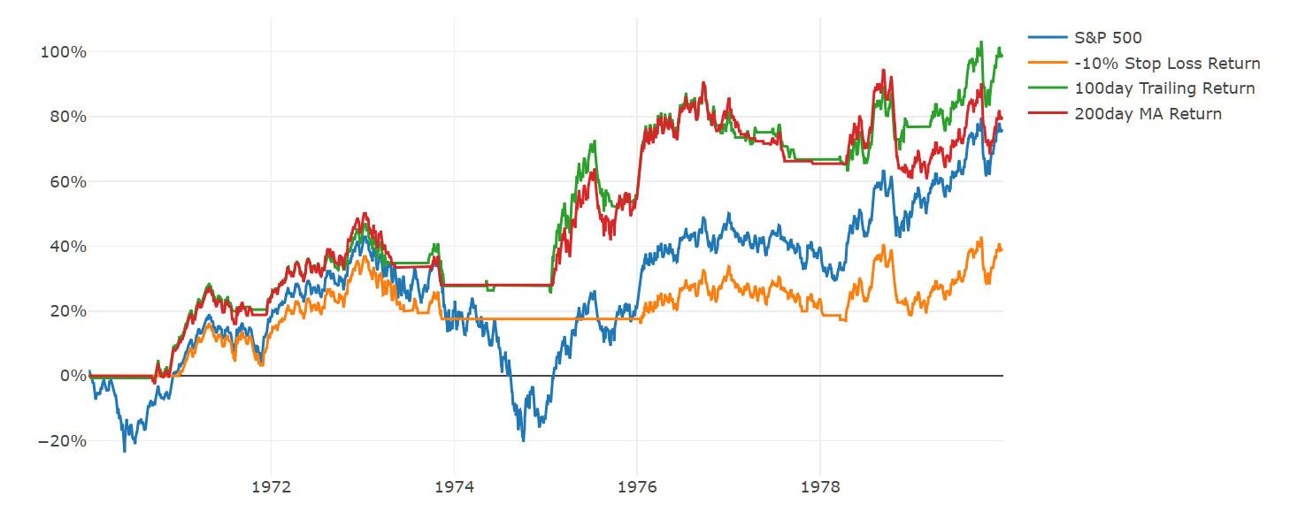
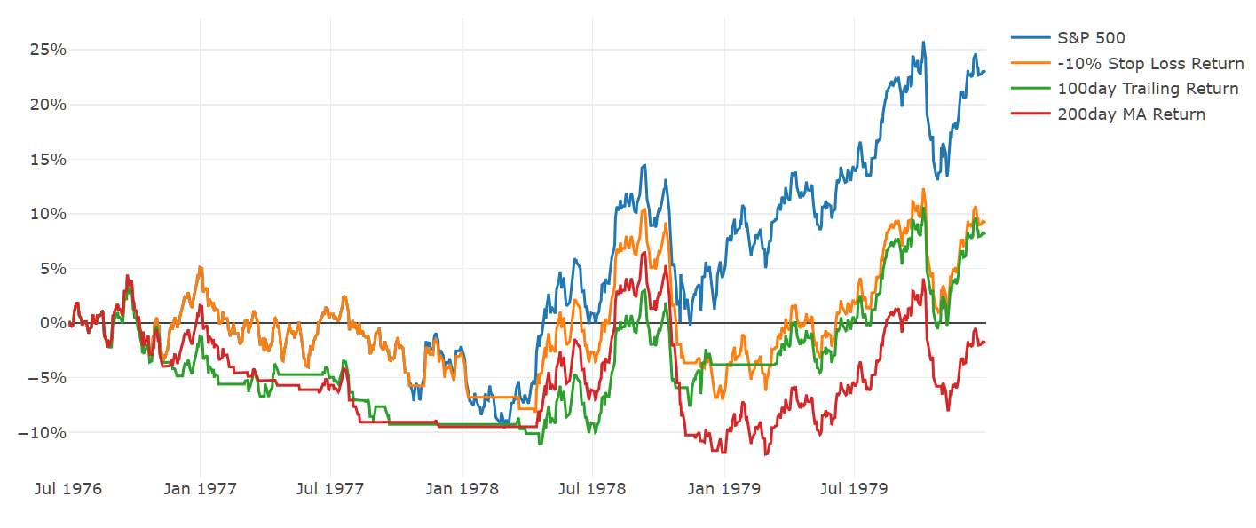
Note that the strategies only really separate as the recovery ensues between 1975 and 1976. Conversely, it's not as if the momentum metrics are immune to whipsawing, and they'll have other periods of churn where they look worse, as they did at the end of the 70s.

Stop-Loss vs. Trailing Return vs. Moving Average Performance , 1976 to 1980

See disclosures on prior graph.

This illustrates again that whipsaws will occur somewhat randomly around whichever level you happen to choose. That said, it seems perfectly logical that you might achieve some extra upside by allowing for re-entry points after significant equity losses, and these sorts of metrics are a convenient means of doing so. We can return to our identical framework from above to see whether this proves true, starting with the simple case of no leverage, but using bonds rather than cash whenever the triggers hit.

Stop-Loss vs. Trailing Return vs. Moving Average Performance, Add Bonds, 1950 to Today

Annual ReturnMax Loss
S&P 50011.15%-54.98%
-10% Stop Loss Return, Add Bonds11.27%-23.85%
100day Trailing Return, Add Bonds11.76%-25.47%
200day MA Return, Add Bonds12.53%-20.86%
Strategies using an identical set of rules as described above, but only invested in 100% 10yr Treasury bonds rather than cash. Source: Hedgewise Analysis.

This seems about right. If we then inject 50% leverage, all the better.

Stop-Loss vs. Trailing Return vs. Moving Average Performance, Add Bonds and 50% Leverage Performance, 1950 to Today

Annual ReturnMax Loss
S&P 50011.15%-54.98%
-10% Stop Loss Return, Add Bonds, 150%14.36%-35.57%
100day Trailing Return, Add Bonds, 150%15.15%-37.32%
200day MA Return, Add Bonds, 150%16.32%-29.97%
Strategies using an identical set of rules, but invested only in 150% S&P 500 or 150% 10yr Treasuries. A daily leverage cost based on either 1yr Treasury Bills (from July 1959 onward) or 3mth Treasury Bills (prior to July 1959) is subtracted from the return. Source: Hedgewise Analysis

These numbers are already starting to look pretty fantastic, and in some ways, it's easy to see why moving averages might appear to be 'powerful indicators'. But this analysis clearly dispels the notion of any predictive power, and each individual case of hitting a 'trigger' means nothing at all. This outperformance is driven solely through a mix of financial engineering and long-term probability. Thus, ironically, indicators like moving averages can be plenty useful despite meaning nothing at all!

Pressure Testing: Picking a Level, Dealing with Noise

One of the very tricky elements of this framework is that you have to choose a particular trigger, and that will seem like a big deal. Should it be a moving average? A trailing return? How do you choose the best one? What if you choose wrong?

The problem with this is that we've already established that this is not a market timing strategy and that whipsaws around any particular level are random and will occur. On the one hand, that means it shouldn't really matter which trigger you choose. On the other hand, it also means that there's a really, really high chance that some other trigger will be doing better than yours, but even so, there's no reason to think you should use that one instead.

To understand this better, let's expand the scope of our triggers to include many moving averages and trailing returns. If our theory is correct, all of them should exhibit similar performance profiles, though there will also be substantial noise given the randomness of whipsaws.

Various Daily Momentum Metrics Performance, Add Bonds and 50% Leverage, 1950 to Today

Annual ReturnMax Loss
S&P 50011.15%-54.98%
100day Return, Add Bonds, 150%15.15%-37.32%
200day Return, Add Bonds, 150%14.03%-52.7%
3mth Return, Add Bonds, 150%15.18%-41.49%
6mth Return, Add Bonds, 150%16.46%-46.7%
1yr Return, Add Bonds, 150%14.44%-51.45%
50day MA, Add Bonds, 150%15.63%-35.44%
100day MA, Add Bonds, 150%15.96%-53.52%
200day MA, Add Bonds, 150%16.32%-29.97%
6mth MA, Add Bonds, 150%15.73%-53.95%
1yr MA, Add Bonds, 150%16.28%-40.27%
Each of these strategies is using the exact same rules discussed earlier, with the only modification being what triggers a sale of the S&P 500. Source: Hedgewise Analysis.

In another fun twist, this also holds up in the same way if you make all of these monthly triggers - meaning you only trade on them once a month, rather than daily.

Various Monthly Momentum Metrics Performance, Add Bonds and 50% Leverage Performance, 1950 to Today

Annual ReturnMax Loss
S&P 50011.16%-52.82%
3mth Return, Add Bonds, 150%14.71%-37.29%
6mth Return, Add Bonds, 150%15.42%-34.89%
1yr Return, Add Bonds, 150%13.9%-43.39%
3mth MA, Add Bonds, 150%13.0%-38.37%
6mth MA, Add Bonds, 150%15.43%-38.1%
10mth MA, Add Bonds, 150%15.9%-33.81%
12mth MA, Add Bonds, 150%15.61%-36.97%
These strategies evaluate the given metric at the beginning of each month, rather than daily. All other aspects remain the same. Source: Hedgewise Analysis.

It is natural to gravitate towards the better performing raw numbers, but a different view of the rolling trailing ten year cumulative performance of a few of these strategies helps to show the powerful effect of randomness.

10 Year Trailing Performance

This measures the trailing ten year cumulative total performance of select strategies from the prior tables. Source: Hedgewise Analysis.

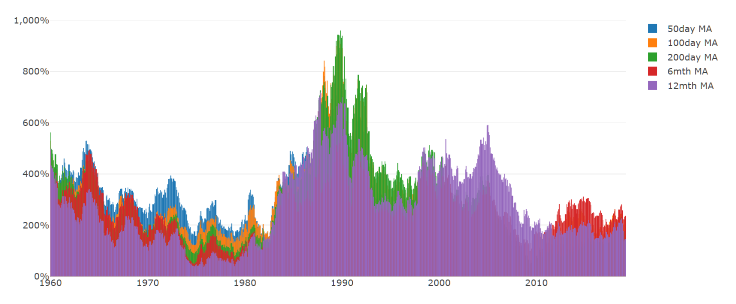
Every one of these strategies has some good decades and some bad ones, with no discernable pattern. When you look at the summary numbers, the 200day MA stands out as having one of the top returns, but that's only because of one random spike in the early 90s. Outside of that, there's nothing to suggest that it is somehow superior.

The most productive way to approach this choice is to pick a metric at random with confidence that you have an incredibly high chance of beating the S&P 500 over the long-term. It will be pure luck whether you wind up with 2% or 4% outperformance, and that's perfectly okay.

Sorting Through the Short-Term

This story sounds convincing when you are looking at ten-year time horizons, but the implications for the short-term can be quite challenging. When the strategy sells stocks, it will feel like you are trying to time a downturn (though you aren't). When you get hit by a whipsaw, it will feel like your strategy has failed (though it hasn't). Looking forward, you face an unavoidable element of randomness that will determine how well you perform in the future.

The key to sorting through this is to constantly orient your perspective to this very moment: right now, this year, does the framework give me better odds than the S&P 500?

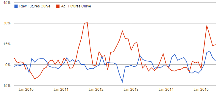
One nice visualization to answer this is the 1yr trailing returns of one of the stop-loss strategies compared to the S&P 500. The 100day MA metric is selected randomly for comparison, but note that every metric from the prior tables returns similar looking results.

1yr Trailing Performance, 100day MA Strategy vs. S&P 500

The 100day MA strategy depicts the 1 year trailing cumulative performance of a portfolio using the 100day daily moving average as a buy/sell trigger, investing at all times in either 150% S&P 500 or 150% 10yr Treasuries. Leverage costs are estimated as discussed in prior disclosures.

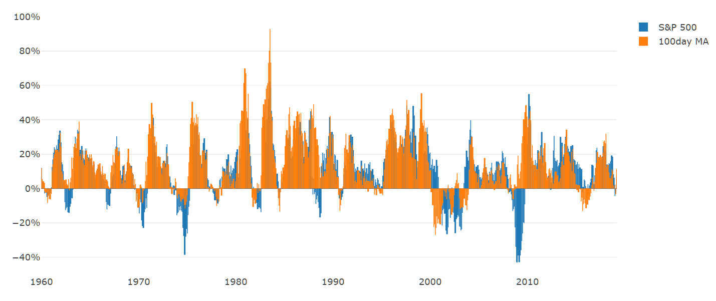
What jumps out immediately is that, on net, your returns are higher, more stable, and less prone to severe drawdowns. But you'll still have bad stretches and they'll often happen independently of equities.

The question is, given we can't know what the next 12 months will bring, which set of possible outcomes would you choose?

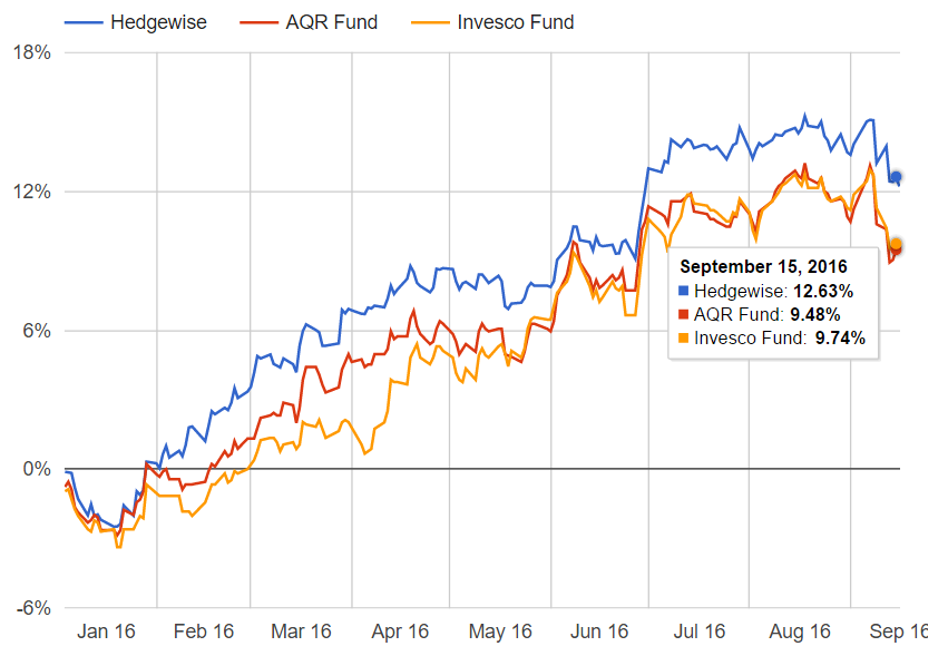
The Hedgewise Framework

At various point throughout this article, if you've thought "I wonder if you could tweak these rules in certain ways to make them even better", I have great news for you: the answer is yes, and this is what Hedgewise does! There are a couple of additions that are especially useful, such as layering on diversification across assets, and employing differing levels of exposure based on the environment.

While Hedgewise has abundant theory and research to suggest these are effective modifications, it's crucial to understand that the goal is still never to time the market. Instead, it's useful to return to the probabilities: imagine the simple momentum metrics above have about a 30% chance of hitting a whipsaw in any given year, and Hedgewise manages to reduce that probability to 20%. Even given this dramatic improvement, you still fully expect two whipsaws per decade!

By accepting whipsaws as inevitable in any form of this broad framework, it becomes easier to shift focus towards probabilities and long-term returns (rather than on each individual whipsaw and whether it could have been avoided). Using this lens, let's take a look at the relative effectiveness of Hedgewise methods.

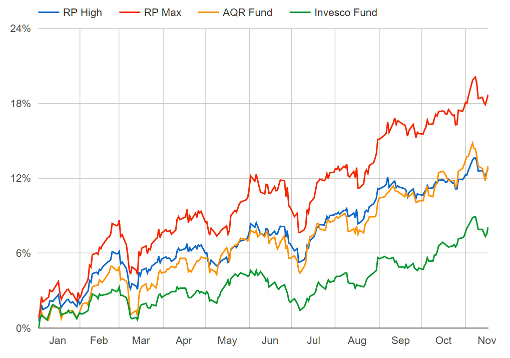
First, let's examine the same prior graph of 10yr trailing performance across various Momentum metrics, but add in the specific Hedgewise "Momentum Max" framework as well. The other metrics are still assuming that you have added bonds and 50% leverage.

10yr Trailing Performance, Hedgewise vs. Prior Momentum Metrics

Hedgewise Momentum Max performance prior to November 2016 is based on a hypothetical model that relies on the same algorithm used in live client portfolios. Beginning in November 2016, a composite of live client performance is used instead. The simulation includes an estimate for all fees and commissions and assumes a Hedgewise fee of 0.7%. All dividends included and assumed re-invested. Earliest data available to run the model begins in 1972; as a result, this 10yr view begins in 1982. See additional full performance disclosures at the end of this article.

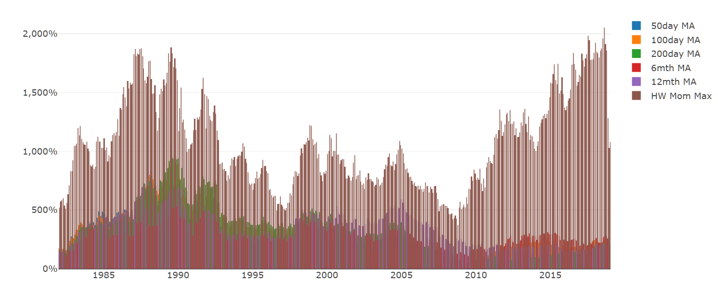
The Hedgewise Momentum Max portfolio is the brown bar, and there is not a single datapoint in which it has trailed the simpler momentum metrics. However, there is still a significant ebb and flow to the absolute performance, which naturally exists for the reasons already discussed.

Let's zoom in to look at the shorter 1yr trailing performance. This is the identical prior graph examining the performance of the 100day MA strategy, including bonds and 50% leverage, against the S&P 500. The trailing 1yr performance of the Hedgewise Momentum Max model has been added for comparison.

1yr Trailing Performance, Hedgewise Momentum Max vs. 100day MA vs. S&P 500

See disclosures on prior graph.

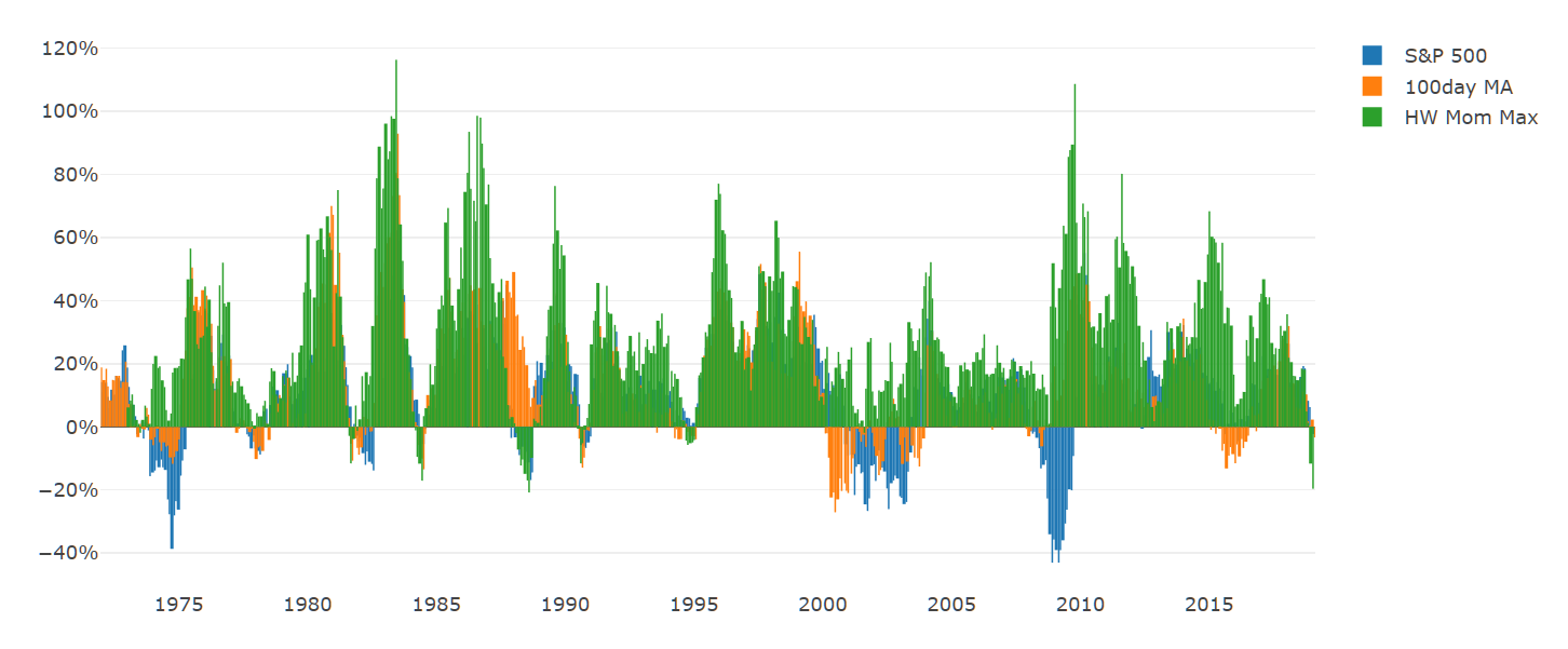
While the Hedgewise model drives consistently superior returns and a lower probability of loss, the natural variation still results in periods where it looks bad compared to simpler momentum metrics as well as the S&P 500. This is not a sign that anything is wrong, but rather an inevitability of our odds-based framework.

Conclusion: Reflections on Current Performance

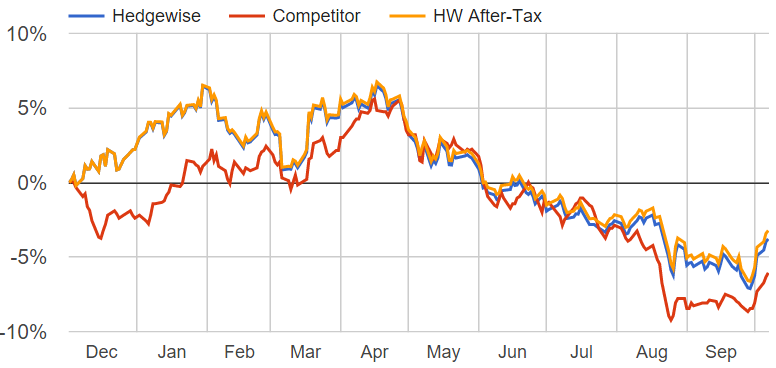
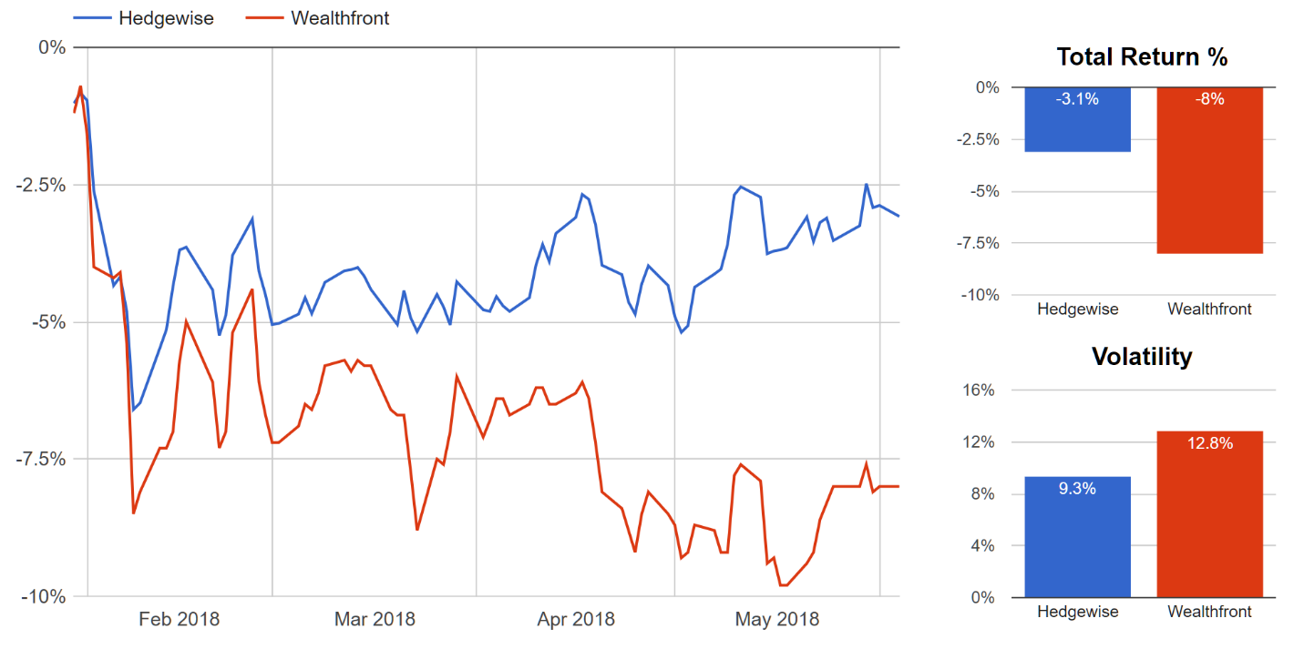
Bringing all of this theory back together with our current reality, it's difficult to defend a drawdown of a Momentum framework in isolation when there's such a purposeful element of randomness involved. That said, I'd say it's pretty easy to see why the market conditions of the past few months are fairly exceptional: the jaw-dropping drops in December remain difficult for anyone to fully explain, especially given the enormous reversal in January. Part of this can be attributed to the Fed making one of the most dramatic and speedy policy U-turns in history - which on its own is extremely unique! The point being that it takes a rare combination of factors to drive a whipsaw, and that's precisely why momentum frameworks have worked so well and will likely continue to work.

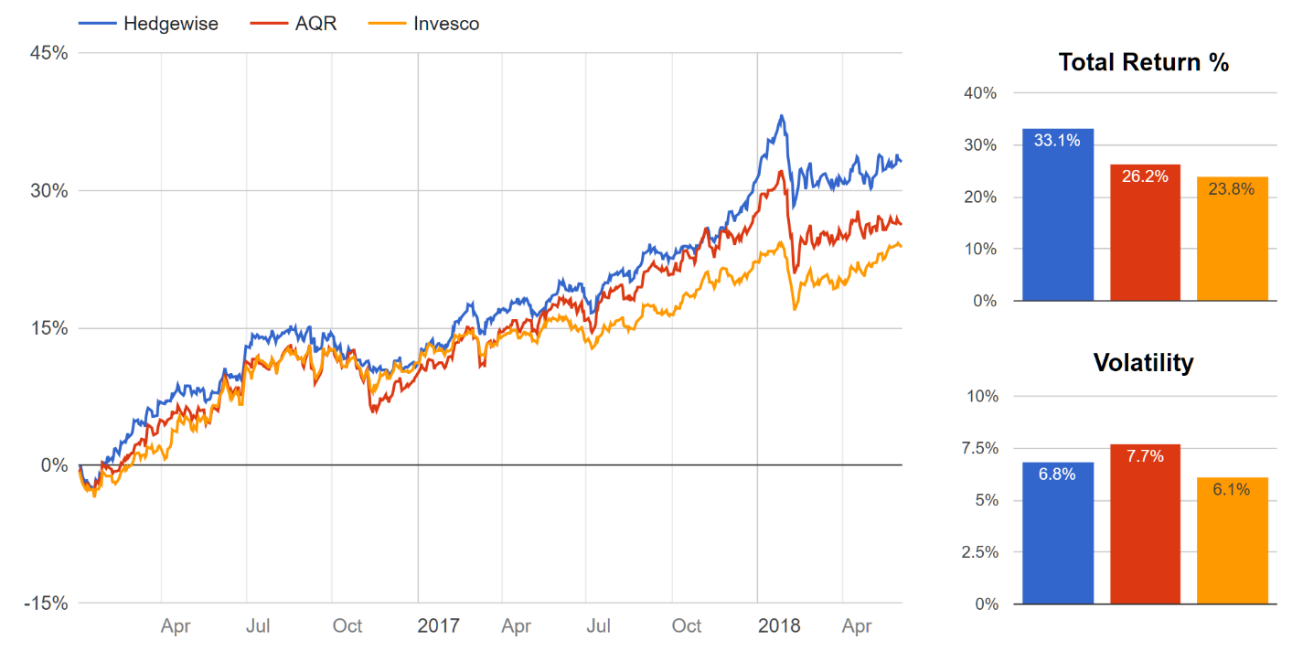
It's also really important to focus on the performance of the Hedgewise strategy outside of the period of whipsaw, since the whole idea is that it's a great bet so long as it's not whipsawing. In March alone, Momentum Max is currently +6.5%, compared to a 0.9% gain in stocks. From the launch of the strategy in November 2016 through September 2018, Momentum Max also beat equities by 10%. These are relatively common outcomes because markets are generally efficient.

That said, it's also not like the returns are driven by anything dramatic: you primarily make money in the momentum framework because stocks go up (and bonds, to a lesser extent). This is still the bet you are making, same as if you were in a purely passive index. Will another whipsaw occur? Probably! But the whole beauty of the framework is that you don't have to predict that, or try to avoid it, because it hasn't mattered over the long-run. You just have to sit tight and keep playing the game long enough to see.

Disclosure

This information does not constitute investment advice or an offer to invest or to provide management services and is subject to correction, completion and amendment without notice. Hedgewise makes no warranties and is not responsible for your use of this information or for any errors or inaccuracies resulting from your use. Hedgewise may recommend some of the investments mentioned in this article for use in its clients' portfolios. Past performance is no indicator or guarantee of future results. Investing involves risk, including the risk of loss. All performance data shown prior to the inception of each Hedgewise framework (Risk Parity in October 2014, Momentum in November 2016) is based on a hypothetical model and there is no guarantee that such performance could have been achieved in a live portfolio, which would have been affected by material factors including market liquidity, bid-ask spreads, intraday price fluctuations, instrument availability, and interest rates. Model performance data is based on publicly available index or asset price information and all dividend or coupon payments are included and assumed to be reinvested monthly. Hedgewise products have substantially different levels of volatility and exposure to separate risk factors, such as commodity prices and the use of leverage via derivatives, compared to traditional benchmarks like the S&P 500. Any comparisons to benchmarks are provided as a generic baseline for a long-term investment portfolio and do not suggest that Hedgewise products will exhibit similar characteristics. When live client data is shown, it includes all fees, commissions, and other expenses incurred during management. Only performance figures from the earliest live client accounts available or from a composite average of all client accounts are used. Other accounts managed by Hedgewise will have performed slightly differently than the numbers shown for a variety of reasons, though all accounts are managed according to the same underlying strategy model. Hedgewise relies on sophisticated algorithms which present technological risk, including data availability, system uptime and speed, coding errors, and reliance on third party vendors.

Best-In-Class Risk Parity Performance
Posted in Investment Strategy on 2018-06-08

Summary

  • The Hedgewise Risk Parity product has outperformed competitive funds by an average of 4.2% in 2018 and 3.3% annually since 2016
  • While 'smart beta' products like Risk Parity share a common philosophy, performance can significantly differ due to the strategic and operational approach
  • By stripping down the core financial theory to its most essential benefits at the lowest possible cost, Hedgewise has emerged as an industry pioneer and generated consistent outperformance for its clients

A Framework for Evaluating Hedgewise

Two core ideas drive the investment product philosophy at Hedgewise:

  • Financial theory can be used to engineer higher returns with lower risk, and
  • Great care must be taken during implementation to ensure the concepts are properly represented at a reasonably low cost

To evaluate the first idea, the focus must be on how a broad theory is supposed to work, and whether those assumptions can be validated in the real world. This is the substance of a majority of the research published here, but can only really convince you of whether 'smart beta' concepts like Risk Parity make sense in general. In that regard, it's not as much of a judgment on Hedgewise itself as on the theoretical frameworks being used.

However, the implementation of these frameworks is far more nuanced than constructing indexes like the S&P 500. Managers face questions like how to define risk, how many assets to include in the portfolio, and how often to trade. If the answers are too complex, they can often drive up costs. If the answers are too simple, they can fail to properly implement the theory. These issues will dramatically impact performance across managers.

Given that, the simplest and most direct way to evaluate Hedgewise is to compare its long-term performance to other competitive funds. This is now easy to do for Risk Parity, as there are three large competitive mutual funds (AQR, Invesco, and Wealthfront). Note that Hedgewise data is based on a compilation of live client portfolios at the High risk level, which had the closest level of overall volatility to the other funds, and includes all costs and fees.

Performance Summary Since 2016

YTD20172016Ann.
Hedgewise1.7%18.2%10.8%12.9%
Avg. Competitor -2.5% 13.1% 10.5% 9.6%
Diff. +4.2% +5.1% +0.3% +3.3%

Breakdown by Fund

YTD20172016Ann.
Hedgewise1.7%18.2%10.8%12.9%
AQR -0.9% 16.2% 11.2% 10.0%
Invesco 1.3% 10.0% 9.7% 9.1%
Wealthfront -8.0% N/A N/A N/A
Data as of end-of-day on June 5, 2018. Mutual fund data from Morningstar. Wealthfront fund launched in January 2018. Includes all dividends re-invested, costs, and fees. Current strategy model use began in 2016; an older model was used in 2015 and performance was close to even with competitive funds.

Hedgewise has beaten the competition by over 3% annually since 2016. Over a ten year horizon, this would lead to additional total gains of over 70%.

However, the key to establishing whether Hedgewise deserves credit for this outperformance is to examine the shape of the competitive performance curves. It isn't enough to simply generate a higher return; this must be accomplished strictly within the Risk Parity framework. If the performance of one manager deviated too significantly from the rest, it would suggest that some driver besides the core theory - like manager discretion, for example - was playing an outsized role. This would naturally diminish the benefits of the underlying strategy framework, and introduce new risks to the portfolio that have no relation to Risk Parity itself.

Performance Curves Since 2016

Data as of end-of-day on June 5, 2018. Mutual fund data from Morningstar. Wealthfront fund launched in January 2018. Includes all dividends re-invested, costs, and fees.

Hedgewise performance is fairly clustered against the competition over the short-term but with a clear edge that widens over the long-term. This kind of pattern is very close to ideal, as it suggests that the Hedgewise approach is successfully capturing the essence of Risk Parity in a superior way.

This is unsurprising since Hedgewise broadly charges lower fees and incurs fewer expenses on behalf of its clients. However, this approach can go quite badly if a manager oversimplifies too much or fails to invest the resources needed to properly define theoretical concepts. Finding this balance is the key to the success of any smart beta product: it must be simple enough operationally, but still conceptually robust.

The relative performance of Hedgewise over the past few years suggests that it has struck just the right balance and provides a tremendous sense of validation. Let's take a deeper look at the core elements of the approach, and how those differ from the competition.

The Difference in Approach

To minimize operational costs, Hedgewise sought to reduce any kind of complexity that would create little or no net benefit. This raised some very significant theoretical questions, like how much value might be gained from investing globally vs. domestically, or from adding more exotic asset classes to the portfolio mix. Research suggested that so long as you had a very accurate understanding of how to define risk itself, you could successfully run the strategy in one single country and with a relatively basic mix of assets. Yet before Hedgewise was founded, this had never been tested and was vastly different from the approach taken by competitive managers.

With the performance now validated, it seems obvious that these concepts are similar to what gave rise to passive investing in the first place. For example, the idea that you don't need to independently value every stock to still include it in a portfolio, or that holding 1,000 stocks instead of 100 doesn't make much difference. Hedgewise is simply refining similar kinds of concepts as they apply to Risk Parity.

However, unlike strictly passive investments such as the S&P 500, smart beta products tend to have more complex dimensions and more theoretical unknowns. For example, the definition of risk plays an enormous role in the Risk Parity framework, and there is no broad consensus on exactly what 'risk' means nor how to calculate it for different asset classes. Defining risk intelligently requires significant research and expertise, and there are many potential performance pitfalls if this is done poorly.

The new Wealthfront Risk Parity fund provides a useful case study. In its white paper, Wealthfront outlines an approach to defining risk that largely equates it with volatility, or how much an asset tends to move up or down every day. However, a key pitfall to this approach is that risky asset classes like equities often have long periods of low volatility. A volatility-driven framework might misinterpret this to mean that stocks have become 'low risk', and then become more vulnerable whenever risk returns.

This pattern would tend to result in losses especially during periods of elevated, choppy volatility - just like the year-to-date pattern in equities thus far in 2018. Though it can't be determined if this is precisely what has happened with Wealthfront since launching this year, its performance is quite consistent with the theoretical outcome. Note that the performance of AQR and Invesco was clustered closely to Hedgewise and omitted for readability.

Wealthfront vs. Hedgewise Risk Parity Daily Performance, 2018 YTD

Data as of end-of-day on June 5, 2018. Mutual fund data from Morningstar. Wealthfront fund launched on January 29 2018. Includes all dividends re-invested, costs, and fees.

Whether this differential was driven solely by the definition of risk, or some other combination of factors, the most important takeaway is that certain assumptions can have a huge impact on what Risk Parity means and how it performs. Even if the theory itself is entirely valid, different managers will still achieve different results. This is a natural hurdle in the smart beta space, since this makes it harder to separate the strategy from the manager.

Yet these challenges have also provided Hedgewise with the opportunity to demonstrate how powerful the approach can be when it is done well. Risk Parity has tremendous theoretical possibility, but that is diminished if the portfolio is burdened with complexity, expense, or misunderstanding.

Looking Ahead: The Evolution of Smart Beta

The idea of smart beta is still in its relative infancy, but one of the clearest themes to emerge thus far is that the broad ideas can be implemented in dramatically different ways. Some of the lessons from the rise of passive management, like prioritizing simplicity and low-cost, continue to resonate and have formed the basis for much of Hedgewise's outperformance over the past few years. However, it's also obvious that the underlying strategies involve some degree of subjectivity. Over the long-run, any smart beta product will only outperform if there is a real theoretical basis for how it works and a fairly accurate understanding of how to capture the benefit.

It's incredibly exciting to be at a point where there is enough data to identify Hedgewise as a clear leader in Risk Parity, and to see its balanced approach yield exactly the kind of benefits that were predicted.

Disclosure

This information does not constitute investment advice or an offer to invest or to provide management services and is subject to correction, completion and amendment without notice. Hedgewise makes no warranties and is not responsible for your use of this information or for any errors or inaccuracies resulting from your use. Hedgewise may recommend some of the investments mentioned in this article for use in its clients' portfolios. Past performance is no indicator or guarantee of future results. Investing involves risk, including the risk of loss. All performance data shown prior to the inception of each Hedgewise framework (Risk Parity in October 2014, Momentum in November 2016) is based on a hypothetical model and there is no guarantee that such performance could have been achieved in a live portfolio, which would have been affected by material factors including market liquidity, bid-ask spreads, intraday price fluctuations, instrument availability, and interest rates. Model performance data is based on publicly available index or asset price information and all dividend or coupon payments are included and assumed to be reinvested monthly. Hedgewise products have substantially different levels of volatility and exposure to separate risk factors, such as commodity prices and the use of leverage via derivatives, compared to traditional benchmarks like the S&P 500. Any comparisons to benchmarks are provided as a generic baseline for a long-term investment portfolio and do not suggest that Hedgewise products will exhibit similar characteristics. When live client data is shown, it includes all fees, commissions, and other expenses incurred during management. Only performance figures from the earliest live client accounts available or from a composite average of all client accounts are used. Other accounts managed by Hedgewise will have performed slightly differently than the numbers shown for a variety of reasons, though all accounts are managed according to the same underlying strategy model. Hedgewise relies on sophisticated algorithms which present technological risk, including data availability, system uptime and speed, coding errors, and reliance on third party vendors.

Can You Time Risk-Managed Strategies?
Posted in Investment Strategy on 2018-04-17

Summary

  • Many clients wonder whether they should adjust their approach depending on market conditions
  • However, risk-managed strategies are constantly responding to the current environment, such that attempts at timing are usually counterproductive
  • After a quick review of why this is consistent with the underlying theory, I'll analyze a few of the most common "timing" questions to see if they have any merit:
    • Should I wait to put cash to work until after a period of large losses?
    • Should I take cash off the table after a period of large gains?
    • Should I invest elsewhere if I think an equity or bond bear market is approaching?

Risk Management versus Timing

If inflation, trade wars, data leaks, slowing global growth, or government instability has given you pause on the investment outlook, you are certainly not alone. It's hard not to wish that you had just sold everything in January, or not to wonder whether you should still sell everything now. The good news is that Hedgewise frameworks have already shifted to account for these market conditions, and the future outlook remains excellent. The bad news is that you will still likely wonder whether you can time it better yourself, but fortunately we can look to the theory and data for guidance.

While Hedgewise runs two different risk-managed frameworks - Risk Parity and Momentum - they are rooted in the same core financial principles:

  • Investors generally expect a positive return on their investments, so in normal environments, markets appreciate over time
  • Diversification across different kinds of assets, like stocks and bonds, reduces risk by offsetting short-term gains and losses
  • As market risk goes up, so does the probability of large gains or losses

Hedgewise then uses financial engineering, like leverage and risk balancing, to most effectively apply these concepts to its products.

Note that none of these principles require you to figure out whether assets are over- or under-valued, which tends to be incredibly difficult. This kind of "timing" usually backfires because it requires that you know the exact right time to enter or exit. One of the main reasons that risk management is effective is because it avoids the need for such precision.

When relying on the relatively simple principles above, the focus shifts away from short-term returns and towards long-term stability and loss reduction. When this is done intelligently, it means your portfolio is constantly maximizing the odds in your favor. Positive returns are always more likely than not, even in the worst of market conditions.

Clients often find this counterintuitive because 1) it seems impossible that return expectations would be positive if markets are about to collapse, and 2) risk-managed strategies still undergo periods of loss, which in theory might be timed. However, because these periods of loss are driven by the relationships between different assets and their volatilities, they often have little to do with bear markets. For example, both Risk Parity and Momentum wound up with calendar year gains during four of the last five major stock crashes.

Put another way, to time a risk-managed strategy, you'd need to be able to predict when fundamental asset relationships and risk indicators are about to breakdown in conjunction with a major market crash - a tall order indeed! These kinds of events tend to be quite sudden, random, and short-lived by definition.

Now, it is true that the probabilities of gain or loss do shift in certain market conditions - for example, you have a better than normal chance that risk-managed strategies will do well after a period of loss. But in waiting around for a loss to happen, you'll probably miss substantial gains in the meantime. No matter which way you cut the scenario, the same theme arises: it's tremendously difficult to beat the simple approach of buy-and-hold.

Scenario 1: Waiting for a Loss

It's far easier to invest with confidence when assets look cheap, and many prefer to wait on the sidelines until after some kind of crash. This is always a tricky topic because, in hindsight, it's true that you make more money if you buy low, and cash also carries great comfort for the risk averse. The problem is that risk-managed strategies are hedged across many different kinds of assets, so a crash in a single market often doesn't result in net losses to the portfolio.

As an illustration, here are the rolling 1yr returns since 1972 for Risk Parity High, Momentum High, and a 50/50 split between the two.

1yr Rolling Returns By Strategy Since 1972

Data based on hypothetical models using end-of-day index data since 1972. All dividends are included and assumed re-invested. Includes an estimate for Hedgewise fees of 0.7%. See full disclosures at end of article.

Depending on your strategy mix, you've historically had about a 6-10% chance of incurring a loss over the following 12 months, or conversely a 90-94% chance of incurring a gain. Most of these losses were also fairly minimal; there was a less than 2% chance of incurring a loss of 10% or more.

That said, you may still figure that waiting for one of these periods still bumps your odds up further, and you'd be right: if you happen to start after a twelve-month loss, your historical odds of a subsequent gain go up to over 98%. But the question is not whether the odds improve, but rather if it makes sense to wait around for that to happen.

A simple way to answer this question is to calculate a "breakeven point" in time. That is, the date where the gains you would have accrued before the subsequent drawdown were greater than the drawdown itself. This assumes that you also had the magical ability to invest right at the exact bottom of each pullback. Performance is drawn from the 50/50 split portfolio (though RP/MM alone show similar numbers).

If you got in at the exact bottom in.. You'd still be worse off than if you started..
Jun 19787 months earlier
Sept 198117 months earlier
Jun 19848 months earlier
Aug 198823 months earlier
Sept 19905 months earlier
Nov 199417 months earlier
Aug 20012 months earlier
Jan 20164 months earlier
Data based on hypothetical models using end-of-day index data since 1972. All dividends are included and assumed re-invested. See full disclosures at end of article.

On average, you lost about 10 months' worth of gains. In other words, to successfully take advantage of an upcoming period of losses, you need to a) correctly identify the 10% chance that losses are going to occur at all, b) be pretty sure it's not more than 10 months away, and c) know exactly when the drawdown hits bottom. If you fail on any single one of these conditions, you'd be better off investing now rather than waiting.

That said, there are understandable exceptions: you may keep a discretionary pool meant for more opportunistic investing, you may have new savings become available at a distinct point in a year, or you may be quite confident in your ability to foresee an upcoming loss. In these cases, you'd like to know when the probabilities for a near-term gain are the most favorable.

One way to study this is to compare the size of any current drawdown in the strategy framework to the subsequent returns. Performance is drawn from the 50/50 split portfolio, but RP/MM alone again show similar numbers.

Forward Return of the 50/50 Split Portfolio for Various Timeframes, by Size of Drawdown

Data based on hypothetical models using end-of-day index data since 1972. All dividends are included and assumed re-invested. See full disclosures at end of article.

Interestingly, even drawdowns as small as 3% substantially increased the size of future returns. While it might seem tempting to wait and capitalize on the bigger losses, they are extremely infrequent: the last 15% drawdown happened in 1988. A more reasonable target would be anywhere in the 5-10% range, which you'll usually see every other year or so. But remember, if you sit in cash for more than a couple of months, you'll probably miss more gains than even a successful timing attempt will recoup.

Applying this analysis to today, we experienced a drawdown in the 50/50 strategy of around 10% from January 26th through February 8th. Historically speaking, there's around a 95% chance we are already past the bottom. While there's been some recovery since then - the current drawdown is now more like 7% - it is still quite an attractive time to invest if you happen to be sitting on cash.

Scenario 2: Selling After Gains

Looking back, it seems obvious that the initial fast gains in January were signs of overheating, and to wonder whether there was a way to identify that beforehand. However, nothing in the underlying theory suggests that gains of a particular size or speed should be worrisome. After all, we expect gains to happen 90% of the time, and the techniques of hedging and risk management are always limiting the impact of an individual asset bubble or crash. To test this, we can compare short-term gains in the 50/50 strategy to subsequent historical returns. To further isolate "overheating" scenarios, this data is also limited to months in which there was no recent drawdown.

Forward Return of the 50/50 Split Portfolio for Various Timeframes, by Size of Prior 1 Month Gain

Data based on hypothetical models using end-of-day index data since 1972. All dividends are included and assumed re-invested. See full disclosures at end of article.

This data shows no indication that large gains typically precede losses. In fact, quite the opposite: forward-looking returns often increase instead! Digging into the numbers, it is unsurprising to learn that you see clusters of great returns in the middle of broad, calm bull markets - years like 1997, 2006, or 2017. In these periods, when you had a fantastic one-month gain, you typically went on to have many more of the same. This same pattern shows up using prior three-month, six-month, and one-year gains as well; there's simply nothing to suggest that big positive returns frequently reverse.

If a risk-managed strategy is implemented well, this is what you'd expect. While individual asset classes like equities may become "irrationally exuberant", such risks are explicitly built into the frameworks and minimized. Though occasional drawdowns are inevitable, they tend to be quite random, and certainly have nothing to do with recent performance trends.

Scenario 3: Timing Bear and Bull Markets

The final timing question that many clients wonder is: what if it is just a bad time to be invested in general? For example, if you knew that bonds and/or stocks were going to do poorly for the next year, wouldn't you be better off exiting?

Even if you had the ability to correctly forecast an upcoming downturn, that wouldn't necessarily mean that risk-managed strategies make a bad investment. Returning to the theory, different asset classes will perform differently depending on the underlying economic environment. For example, in a recession, gold and bonds will tend to rally while stocks will tend to fall. So long as these relationships hold up as expected, risk-managed strategies should be quite resilient against individual asset crashes.

To test this, we can examine the performance of the 50/50 split portfolio in the worst-performing stretches for both stocks and bonds. Starting with equities, the following table displays tranches of every rolling one-year period of losses in the S&P 500 since 1972 and summarizes how the 50/50 split portfolio performed over the same periods. Note that the "% Gain" and "% Loss" columns display the number of data points when the 50/50 portfolio had either a gain or loss out of the total number of data points within tranche.

Rolling 1yr Performance of the 50/50 Split Portfolio During Equity Drawdowns

50/50 Split Performance
S&P 500 1yr Loss Avg.% Gain% Loss
0-5% Loss +5.4% 67.7% 32.3%
5-10% Loss +4.3% 69.6% 30.4%
10-15% Loss +7.6% 87.5% 12.5%
15-20% Loss +9.8% 90.9% 9.1%
20-30% Loss +8.7% 94.1% 5.9%
Over 30% +14% 88.9% 11.1%
Data based on hypothetical models using end-of-day index data since 1972. All dividends are included and assumed re-invested. See full disclosures at end of article.

In every single tranche, you averaged gains in the 50/50 split despite losses in the S&P 500. Your odds of a gain also significantly increased along with the size of the equity pullback. This is because risk-managed strategies tend to minimize equity exposure as losses increase, while safe-haven assets like bonds and gold rally. In fact, the strategies tend to be most vulnerable to "small" losses (under 10% or so) that occur when the market is still trying to "figure things out". For example, in our most recent pullback, bonds and gold have not rallied much despite the pullback in equities because it is not yet certain that a recession is imminent. Of course, these short periods are all the more difficult to time!

Now let's repeat these same numbers for bonds to make sure the story is consistent. Note that the loss ranges had to be reduced compared to equities as bonds are far more stable.

Rolling 1yr Performance of the 50/50 Split Portfolio During Bond Drawdowns

50/50 Split Performance
10yr Treasury 1yr Loss Avg.% Gain% Loss
0-1% Loss +10.2% 87.5% 12.5%
1-2% Loss +13.5% 88.2% 11.8%
2-3% Loss +16% 93.3% 6.7%
3-4% Loss +14.1% 91.7% 8.3%
4-5% Loss +12.9% 83.3% 16.7%
Over 5% +9.2% 74.3% 25.7%
Data based on hypothetical models using end-of-day index data since 1972. All dividends are included and assumed re-invested. See full disclosures at end of article.

Bonds exhibit a similar story, though you do see slightly lower (albeit positive) returns for losses of over 4%. Many of the data points in this upper range come from periods of high inflation, during which both stocks and bonds tend to do poorly while commodities provide a hedge. This presents less opportunity for net upside as commodities are naturally a smaller portion of the portfolios. At worst, though, you averaged a 9.2% annual return and a 75% chance of gains.

Summing up the numbers, it really didn't make sense to avoid risk-managed strategies even if you had perfect insight about upcoming equity and bond pullbacks. Your worst-case returns were around 4-5% during smaller equity pullbacks, while in all other cases you achieved returns of 8% or more. Those are pretty stellar numbers in years of very rocky markets.

Conclusion: Staying the Course, Expecting a Few Bumps

Put simply, risk-managed strategies are really effective at dealing with worst-case scenarios. They assume that bubbles and crashes are part of the norm, but since this logic is already built-in, you can't apply traditional thinking like how to "get out at the top" or "get in at the bottom". Neither a stock crash nor a bond crash will necessarily result in losses; more often, the portfolio is vulnerable to quick pullbacks or markets that have a great deal of uncertainty. Even if you could time these situations, the losses are usually pretty small and not worth the headache of figuring out when to re-enter. If you try to time unsuccessfully, the gains you miss quickly outweigh any potential benefits.

None of this is to suggest that these frameworks are invulnerable, but rather that the probabilities are enormously in your favor if you invest early and stay patient. You will certainly have a few situations where this patience is tried: you may underperform the S&P 500 for stretches of time, hedges will fail to work in certain situations, and markets will sometimes be blindsided by the unpredictable. Despite all of that, there is an extraordinarily high chance that you will go on to perform wonderfully if you simply shrug your shoulders.

For discretionary pools, you've generally found good entry points during drawdowns of 5-10% or during periods of consistently large gains, regardless of surrounding market conditions. That said, if you don't currently have better uses for your discretionary funds, or if in reality you are just trying to optimize the entry point for your broader portfolio, the best path is almost certainly the simplest: invest now at your long-term risk level, and don't worry about the timing.

Disclosure

This information does not constitute investment advice or an offer to invest or to provide management services and is subject to correction, completion and amendment without notice. Hedgewise makes no warranties and is not responsible for your use of this information or for any errors or inaccuracies resulting from your use. Hedgewise may recommend some of the investments mentioned in this article for use in its clients' portfolios. Past performance is no indicator or guarantee of future results. Investing involves risk, including the risk of loss. All performance data shown prior to the inception of each Hedgewise framework (Risk Parity in October 2014, Momentum in November 2016) is based on a hypothetical model and there is no guarantee that such performance could have been achieved in a live portfolio, which would have been affected by material factors including market liquidity, bid-ask spreads, intraday price fluctuations, instrument availability, and interest rates. Model performance data is based on publicly available index or asset price information and all dividend or coupon payments are included and assumed to be reinvested monthly. Hedgewise products have substantially different levels of volatility and exposure to separate risk factors, such as commodity prices and the use of leverage via derivatives, compared to traditional benchmarks like the S&P 500. Any comparisons to benchmarks are provided as a generic baseline for a long-term investment portfolio and do not suggest that Hedgewise products will exhibit similar characteristics. When live client data is shown, it includes all fees, commissions, and other expenses incurred during management. Only performance figures from the earliest live client accounts available or from a composite average of all client accounts are used. Other accounts managed by Hedgewise will have performed slightly differently than the numbers shown for a variety of reasons, though all accounts are managed according to the same underlying strategy model. Hedgewise relies on sophisticated algorithms which present technological risk, including data availability, system uptime and speed, coding errors, and reliance on third party vendors.

Analyzing Hedgewise 2017 Performance: Benchmarks, Timeframes, Theory and Proof
Posted in Investment Strategy on 2017-11-21

Summary

  • Hedgewise continues to outperform all asset classes and comparable benchmarks in 2017, achieving a return of 18% to 20% in products at higher risk levels.
  • However, many clients ask about how to evaluate this performance compared to the equity bull market, and wonder whether high returns this year foreshadow inevitable losses.
  • The most useful metrics actually have little to do with raw returns over the past day, month, or even year. The S&P 500 is often a poor benchmark to use, and recent positive returns have almost no predictive value.
  • While these facts can feel counterintuitive, a deeper analysis reveals that they are entirely consistent with the underlying financial theory, and help to paint a very optimistic picture moving into 2018.

2017: A Great But Unsurprising Year

Traditionally, portfolio managers are judged by the two most intuitive benchmarks: absolute performance and performance compared to the S&P 500. It is also quite natural to focus on recent history, so year-to-date figures tend to dominate. By these simple measures, 2017 has been a tremendous year for Hedgewise, which has achieved returns near 20% and consistently outperformed the S&P 500 (in Hedgewise products at a comparable level of risk).

Yet these benchmarks play almost no role in my internal analysis. Returns have been in line with my expectations, but I place little weight on where they fall relative to the S&P or the somewhat arbitrary YTD figure. While 2017 has provided a few more data points that suggest markets continue to function as the theory might predict, I'd be equally pleased with a year of flat or even negative performance so long as it validated the same.

As an example, I was quite excited to see how Hedgewise products mitigated losses during the bond pullback late in 2016, though clients were also experiencing losses along the way. I would describe that period of loss as necessary, expected, and a very positive indicator that 2017 might continue to unfold the way it has. Hedgewise pared similar losses in the energy markets earlier this year, which was a more important development to me than the fact that YTD total returns were positive at the time.

While on first glance such a perspective may seem strange, it is actually quite intuitive once you examine the underlying principles at work. It can also be fairly transformative for your investing mindset, reducing the burden of worry about bubbles, relative performance, and manager acumen. Below, I've examined the key ideas that shed light on why traditional benchmarks and timeframes don't apply, how this relates to the core financial theory, and where this year's performance fits into the picture.

But first, let's take a quick look at what happened so far in 2017.

Performance Recap: Hedgewise Outperforming Where It Should

So far in 2017, Hedgewise products have outperformed all traditional benchmarks at comparable levels of risk.

Hedgewise YTD Performance vs. Traditional Portfolio Benchmarks

ProductYTDBenchmark (Ticker)
RP+ Med.10.04%6.80% (AOK)
RP+ High12.81%8.44% (AOM)
RP+ Max18.70%15.17% (AOA)
Mom. Max20.57%17.36% (SPY)
Data as of November 17th, 2017. Hedgewise performance based on a composite of all live client portfolios in each product and include all costs and fees. Benchmarks based on publicly available end-of-day prices and include all dividends.

As I discussed in the intro, while this outperformance is broadly in line with expectations, it is not all that meaningful over such a short timeframe. I'd be equally pleased if Hedgewise had simply matched the benchmarks or even underperformed because neither stocks nor bonds have experienced any persistent downswing this year. Regardless, the big picture is that Hedgewise continues to prove that you can successfully manage major risks and still keep up with robust bull markets.

Hedgewise has also consistently matched or beaten the other major Risk Parity mutual funds this year.

Hedgewise YTD Risk Parity Performance vs. Major Mutual Funds

Hedgewise data based on composite client performance at each risk level and includes all costs and fees. Mutual fund data based on publicly available end-of-day prices and includes all dividends. As of November 17th, 2017.

I love this chart because it continues to validate the passive, systematic approach of Hedgewise. The AQR fund has about 300 holdings, invests globally, and employs five full time investment professionals. The Invesco fund takes a heavily active approach, often trading daily and heavily tilting towards certain asset classes. Both funds have an expense ratio over 1% and a significant tax burden. Hedgewise has a maximum of seven holdings, invests solely in the US, and runs entirely via tax-efficient algorithms at half the cost. As you can see, all of that extra complexity and expense doesn't add up to much!

Risk Parity strategies as a whole have done well in 2017 for a simple reason: stocks, bonds, and commodities have all gone up. Momentum has done even better since it overweights stocks, which have performed the best. In some ways, that makes this year relatively uneventful, since there's not much opportunity to demonstrate the use of hedging and risk management. However, it does help to dispel the common misconceptions that bonds will be a drag on portfolios during bull markets or that hedging in general must depress returns (ideas which I've covered in greater depth in this article).

Still, most clients find it strange that I'd call a year of 20% returns uneventful, and stranger still that I'm not worried about an equity pullback, that I don't closely follow this month's returns, or that I'd call a 10% drawdown no big deal. But allow me to explain, and you'll see that these ideas are both simple and cause for persistent optimism.

Benchmarks: Moving Past Absolute and Relative Returns

Traditionally, bull markets are celebrated and managers are rewarded for beating common benchmarks like the S&P 500. At Hedgewise, I view positive returns as commonplace and I expect to underperform the S&P 500 quite frequently.

The key to understanding this is all about stability. The goal of any good risk-managed framework is to produce more consistent returns, which means I'd rather have two years of 5% returns than one year where I make 20% and the next where I lose 15%. This is because such volatility inevitably injects timing risk to a portfolio - what if you happen to start at the wrong time, or what if you can avoid the next downswing? In real life, you also run into unfortunate stretches like 2000 to 2010 where a couple of bad years can wipe out a decade's worth of gains.

Hedgewise seeks to create stability through a variety of hedging mechanisms, like intelligent diversification, risk-weighting, and loss management. The goal of these techniques is to transform client return distributions to be more stable and consistently positive, like this:

Normal vs. Risk-Managed Return Distribution, In Theory

Note that the risk-managed curve experiences fewer extreme gains as well as fewer extreme losses, which is entirely the point! If the S&P 500 represents "Normal Returns", then that means you'd expect a risk-managed framework to underperform the S&P 500 when it is doing well and to outperform it when it is doing poorly. You would view both outcomes as equally good, since they both lend proof to the idea that returns are being stabilized.

By extension, you would only tend to see net outperformance for the risk-managed framework after the S&P experiences a period of underperformance.

With this in mind, let's see what this curve looks like for the actual Hedgewise framework. I've chosen the RP High strategy for comparison, for which my expectation is a return near or slightly above the S&P 500 over the long-run but with far greater stability.

S&P 500 vs. RP High Annual Return Distribution, 1972 to Present

Simulated data based on end-of-day index prices and includes all dividends. See full disclosures at end of article.

While the real-world data is a little messier, it still about lines up with the expectation. The RP High framework actually has a lower median return but a higher average return than the S&P 500. In other words, you will tend to underperform the S&P 500 in any given year, but you will still outperform it over time. This is primarily driven because you avoid the major 'left tail' negative shocks, like 2008, that only come around once in a while but make an enormous difference to your net returns.

This year, clients in RP High have a return of 12.8%, which is maybe a little better than average but still pretty typical. Same goes for the S&P 500, which returned 17.25%. When you put this in context of the theory, this is exactly what you'd expect! It would be silly to judge this underperformance against the S&P as a bad thing. It would also be silly to call this a 'bull market' for Risk Parity when really it is just a normal market.

On a related note, the messiness of the above chart highlights why an annual timeframe isn't all that useful; it generally takes a longer time to see the true benefit of stability.

Timeframes: Understanding Days, Months, Years, and Decades

Especially during extended equity bull markets, I naturally run into lots of skepticism about whether risk-management is really that useful when you could do so well in any old index fund. The key question this raises is, how long does it usually take to see definitive proof?

You can probably guess that it takes about as long as the typical equity bull market, since most of the benefit accrues when stocks are doing poorly. With the average bull market lasting about ten years, let's extend the timeframe to that length and take a look at the same return distributions as earlier. According to the theory, the risk-managed framework should almost always outperform stocks given this amount of time.

S&P 500 vs. RP High 10yr Return Distribution, 1972 to Present

Simulated data based on end-of-day index prices and includes all dividends. See full disclosures at end of article.

These results are pretty amazing: Risk Parity avoids any negative returns and consistently outperforms equities, even during the strongest bull markets in history. That said, waiting a full decade can be a bit of tall order for most clients; luckily, you can see these same benefits in as little as three years if you have the right perspective.

S&P 500 vs. RP High 3yr Return Distribution, 1972 to Present

Simulated data based on end-of-day index prices and includes all dividends. See full disclosures at end of article.

This shows that Risk Parity usually generates equity-like returns over any three year period, but with far less risk of incurring a net loss. However, this just isn't a long enough time to expect that you'll definitely outperform stocks, nor should that be particularly important. If it happens to be a stretch where stocks do poorly, the benefits will be obvious. If not, you'll probably have returns between 15% and 100%, and you didn't have to worry whether a crash was just ahead.

Now we'll look at one final comparison that is purposefully messy: one month returns. As you might expect, such a short timeframe doesn't really tell you much of anything.

S&P 500 vs. RP High One Month Return Distribution, 1972 to Present

One month returns are almost pure noise. You may frequently lose a few percent, you may often underperform equities, and you may have many consecutive months that are flat or down. Despite this, if you simply wait three years, you'll probably have some nice gains.

This is why I'm never very focused on recent history, nor am I surprised about all of the ups and downs along the way. Rather, I care most about market shocks, like the bond pullback of 2016, which let you see the hedges really working. In calm waters, I only expect moderate upward trending returns over the course of a few years, and 2017 has fit that to a tee.

Returns: Where They Come From, What They Mean

So far, this analysis has focused on how to evaluate the benefits of a more stable return over time, but it still begs the question of where that return comes from and why it should be consistently positive at all. It is also fair to ask whether very high returns are often followed by very low ones, and vice versa, since this tends to be the case with individual assets like stocks or commodities.

The beautiful thing about public markets is that at any given point in time, every individual participant is expecting to make money no matter how much they have made already. To enable this, investors apply a discount to every asset they buy that bakes in an expected return. Generally, that discount gets applied to expected cash flows, e.g., actual profits at a company or coupon payments from a bond.

It's useful to illustrate this with a simple hypothetical. Say Company X is valued at $100 per share and expects to make $10m per year now and forever into the future. An investor would simply discount that $10m to come up with the value today and divide that by the number of shares to get $100.

Now say a year passes and nothing at all has changed with the company. They made $10m, and they expect to continue to make that now and forever into the future. The same investor runs the same analysis and values the company at $100 per share. But something very important has changed. A year has passed, and anyone that owns a share of the company just got a piece of the $10m in profits.

This is a very important distinction because there is often confusion that the only way to make money in the markets is if prices continuously go up. But this is not true. You can make perfectly reasonable returns over time even if prices stay exactly the same.

This powerful concept explains how you might achieve positive returns every year without any kind of irrationality or price bubble. In financial parlance, these returns are called "risk premia", and Hedgewise simply builds products to collect these risk premia as efficiently as possible.

The rub is that sometimes investors get overexcited about prospects that won't ever actually make any profit, like during the dot-com bubble or, if I were guessing, the current cryptocurrency craze. In these cases, asset prices can skyrocket without any real money being made, and fall just as easily.

A hypothetical illustration of expected asset returns would look something like this:

Theoretical Asset Return Patterns

The blue line represents a theoretical live market, in which asset prices often swing up and down with investor speculation. The orange line is the underlying risk premia (i.e., actual profits being made or paid back to investors) that accumulates along the way, and basically represents fair value. While live market prices constantly fluctuate above or below this fair value, you still expect appreciation over time.

In other words, consistent positive returns over time are perfectly normal, and negative returns are unlikely to persist for very long. If you had perfect insight, you could also time every individual top and bottom, but it is hard to justify all of that effort when you can gain so much by just waiting.

If this theory is accurate, you'd expect big losses to reverse far more consistently than big gains, especially in a framework like Risk Parity. Let's see whether this has been true. The following is a scatterplot where the horizontal axis is the trailing one year return, and the vertical axis is the following year's return. The bottom left quadrant (emphasized) represents the instances when you had two consecutive years of loss.

Last Year's Return (X Axis) vs. This Year's Return (Y Axis), Risk Parity High

Simulated data based on end-of-day index prices and includes all dividends. See full disclosures at end of article.

Notice that there have been only two periods of consecutive annual losses, out of over five hundred data points. The large majority of the time you have had two consecutive years of gain (upper right quadrant). There's also no evidence that really large gains are consistently followed by losses.

Basically, it is really hard to lose money over any reasonably long stretch of time because you get a constant positive lift from risk premia. Losses tend to disappear pretty quickly, and gains tend to persist. We've recently seen a great example of this when losses in 2015 very quickly reversed in 2016. This year, RP High is up about 13%, which is quite normal and doesn't suggest that next year will be a bad one.

Wrapping Up: An Approach with Better Answers

Once this theory starts to click, it really provides a much more satisfying set of answers than traditional portfolios or managers can. Are equities overvalued? It has really never mattered much. Are we underperforming the S&P? Quite frequently, but that's how I know it is hedging well. Are my managers smart enough? No managers required, we're just systematically gathering returns in a smart way. Did we lose money this year? Maybe, but if we did, there is an exceedingly high chance that we're about to make it back.

In a world of stock-pickers, real estate bubbles, and irrational exuberance, it is completely natural to approach investing reactively and to constantly worry about what's next. Fortunately, the financial theory behind Hedgewise allows you to shift to a much calmer mindset, where short-term swings and big asset crashes are much less of a concern. 2017 has been one more data point that the theory is working just like it should. The fact that such a good year has been no surprise provides all the more reason for optimism heading into next year.

Happy Holidays, and hopefully Hedgewise has made it a little easier to enjoy without worrying about the markets!

Disclosure

This information does not constitute investment advice or an offer to invest or to provide management services and is subject to correction, completion and amendment without notice. Hedgewise makes no warranties and is not responsible for your use of this information or for any errors or inaccuracies resulting from your use. Hedgewise may recommend some of the investments mentioned in this article for use in its clients' portfolios. Past performance is no indicator or guarantee of future results. Investing involves risk, including the risk of loss. All performance data shown prior to the inception of each Hedgewise framework (Risk Parity in October 2014, Momentum in November 2016) is based on a hypothetical model and there is no guarantee that such performance could have been achieved in a live portfolio, which would have been affected by material factors including market liquidity, bid-ask spreads, intraday price fluctuations, instrument availability, and interest rates. Model performance data is based on publicly available index or asset price information and all dividend or coupon payments are included and assumed to be reinvested monthly. Hedgewise products have substantially different levels of volatility and exposure to separate risk factors, such as commodity prices and the use of leverage via derivatives, compared to traditional benchmarks like the S&P 500. Any comparisons to benchmarks are provided as a generic baseline for a long-term investment portfolio and do not suggest that Hedgewise products will exhibit similar characteristics. When live client data is shown, it includes all fees, commissions, and other expenses incurred during management. Only performance figures from the earliest live client accounts available or from a composite average of all client accounts are used. Other accounts managed by Hedgewise will have performed slightly differently than the numbers shown for a variety of reasons, though all accounts are managed according to the same underlying strategy model. Hedgewise relies on sophisticated algorithms which present technological risk, including data availability, system uptime and speed, coding errors, and reliance on third party vendors.

Understanding the Theory Behind Better Returns
Posted in Investment Strategy on 2017-06-21

Clients in the Momentum Max product have an average of a 15% YTD return compared to a 9% YTD return in the S&P 500, including all dividends re-invested and all costs and fees. Clients in the Risk Parity Max product have a 25% lower volatility of daily returns compared to the S&P 500 since 2016. Past performance is no guarantee of future returns. Different Hedgewise products are more suitable for different client goals, and will have different risk and return profiles. See full disclosures at end of article.

The Foundation of Outperformance

Hedgewise was founded on the idea that core financial theory can be used to improve returns and reduce risk. By focusing on 'first principles' of markets - why they function the way they do, what drives prices, and how they relate to broader economic trends - Hedgewise develops theories that are similar in nature to those found in the physical world, like the laws of gravity. Any truly superior and lasting investment strategy must have such a basis to be relied upon over many decades.

While it may initially sound outlandish to compare financial theory to the laws of nature, there are a number of well-known ideas that already rise to this level. Diversification is probably the most familiar, which asserts that holding a basket of assets will always result in better returns with less risk than holding just a few. This largely explains why more than 90% of stock-picking managers have failed to beat index benchmarks over the last 15 years.

On the other hand, there is also a misperception that passive index funds are the best and final application of financial theory. For example, if you are relatively young, should you invest entirely in equities? Should you account for radical events like the real estate crash? Should you use leverage in your portfolio? These questions can dramatically alter the composition of your portfolio, but passive funds provide few compelling answers.

The reality is that passive index funds are better building blocks of a portfolio than individual stocks, yet they only represent the tip of the iceberg in terms of understanding and applying financial theory. As time goes on, I believe 'active' management will remain alive and well, but will be represented only by funds which have developed a deeper and more accurate understanding of how markets operate, rather than a handful of individual stocks. These new kinds of portfolios will naturally outperform simple passive strategies in the same way that those simple strategies have outperformed stock-picking: because the theory represents something true and unavoidable in the marketplace.

Every Hedgewise product is built on this same philosophical foundation, and there have been a number of recent market developments that lend further proof that the theories in use are quite powerful, and already producing superior outcomes for Hedgewise clients.

Theory One: A Foundation of Risk Premia

A 'risk premium' is the amount that an investor discounts the expected returns from any investment to compensate for the possibility of loss, and to account for other competitive potential investments. For example, if you might realistically lose half your money, you'd expect a higher potential return than if you might only lose 5% of your money.

We can call the amount an investor is willing to pay for an investment today it's 'Present Value', and represent that calculation with the following formula:

Where 'rf' is the risk-free rate, and 'rp' is the risk premium attached to that investment. The higher the risk, the less you are willing to pay for an investment today. The more skilled investors are at understanding and predicting the future, the closer you'd expect their realized return to match the risk-free rate plus the assigned risk premium.

If this theory holds, you'd also expect to see higher realized returns for stocks than government bonds, since you are basically guaranteed a return on bonds if you are willing to wait until maturity. You'd also expect a higher return on bonds than on commodities, since commodities have many various uses outside of being a pure investment (e.g., you can use sugar to make food products for a profit).

If this theory is true conceptually, you'd expect return curves to look something like the following:

Theoretical Realized Return Bell Curve, by Asset Class

This conceptual basis is important because it provides a framework for answering some interesting questions, mainly:

  • How skilled are investors in different asset classes at predicting the future? The more skilled they are, the more that returns should converge with the assigned risk premium.
  • Does the theory hold up over certain time horizons but not others? For example, if the theory generally holds up for annual returns but not for monthly returns, then it might be reasonable to attribute monthly returns to random noise and not worry too much about explaining them.

With that in mind, let's take a look at the actual bell curves of asset class returns over a number of different time frames. I'm using the returns of the S&P 500, 10yr Treasury Bonds, and gold as a proxy for commodities. These returns represent the trailing gain or loss for the given time frame, in other words, for the 1yr horizon, you are seeing the trailing 1yr returns for that asset class for every month in history.

One Month Trailing Return Distribution by Asset Class

One Year Trailing Return Distribution by Asset Class

Three Year Trailing Return Distribution by Asset Class

In the final graph using three year trailing returns, the curves are certainly starting to resemble what we expected in theory. This suggests that risk premia are a real force, and that investors are always expecting a positive return from the markets. Because the curves tighten as you look over longer timeframes, it's likely that investors are modeling risk well enough to smooth out most short-term volatility, especially over one month or one year. However, every asset class (especially stocks and commodities) still has a nagging 'left tail' of significant losses even over three years.

Since we just established that investors are formulaically expecting a return, and attempting to account for future risks, the only reasonable explanation for long-term losses are substantial, low probability, or entirely unforeseen negative events.

This leads to a few key parts of how Hedgewise manages its funds:

  • I primarily care about gathering as many risk premia as possible, which means I never fight against the markets via things like covered calls or naked puts (although I may short negative risk premia, like in the oil markets).
  • I care very little about the normal deviation of prices or upcoming events that are well-known, the impact of which are pretty efficiently smoothed out over time. Instead, almost all of my research is based on managing potential hidden or poorly forecasted shocks that will radically shift markets.

Tying this back to the theory, this is how I think about the earlier bell curve of one month trailing returns:

This also helps explain why I do not consider short-term losses, especially week-to-week or month-to-month, to be much of a concern. In other words, I am never trying to predict near-term price movements. Rather, I am managing the risk that a major, negative event might occur. Unless such an event happens, your best move is generally just to do nothing and trust that the odds are heavily in your favor.

Interestingly, this sheds light on why so many active investors get into trouble. There is an enormous amount of noise in short-term returns, and trying to predict it is both really hard and mostly unnecessary. It also dispels the notion that economic indicators like price-to-earnings ratios or the length of the current bull market matter. Investors are pretty reliable in applying risk premia to all currently known information, and they are still building in a positive return expectation. Given that, it's usually a bad idea to avoid the market because it feels 'overvalued'.

Since launching last November, the Hedgewise Momentum framework has provided a nice example of this theory in action. The theory suggests that most of the time, especially over periods of five years or more, equities will yield a positive return. Then it follows that most of the time, it is safe to be 100% in equities - in fact, it might even sometimes make sense to use leverage and go more than 100% into equities, especially if you ignore normal monthly noise and don't overreact to market events that aren't meaningful, like the types described earlier. The Momentum product is structured to primarily revolve around these ideas and is usually overweight equity markets to varying degrees.

Here's how the Momentum product has performed in live Hedgewise client portfolios since launch. This data is a composite of all live client portfolios using the "Max" risk level, and includes all costs, fees, and dividends as of end of day on June 14th, 2017.

MonthMomentumS&P 500
November 20167.02%4.81%
December 20162.87%2.00%
January 20172.35%1.97%
February 20176.56%3.90%
March 2017-0.46%0.14%
April 20172.18%1.08%
May 20172.68%1.33%
June 20171.98%1.25%
Total27.87%17.64%

The outperformance of the product so far ties directly back to the concepts being discussed: equity markets are behaving in a normal range, and the types of market events that have been unfolding over this period, like the US elections, are relatively normal and foreseeable. While the return looks great, it's simple market theory at work.

A natural question is whether this performance would quickly reverse if stocks start to do badly. However, unlike a purely passive index, Hedgewise layers on additional kinds of risk management to maximize the chance that clients will hold on to their gains.

Theory Two: Behave Conservatively in High Risk Environments

The other major piece of the puzzle is the ability to catch major negative market shocks. However, theory suggests that you don't actually need to do be able to predict such events with great accuracy; even if you are only right 20-30% of the time, you'd still expect such a bet to be profitable.

There are two main reasons for this. First, there is the simple law of percentages: If you lose 50%, you then need to then gain 100% to get back to breakeven. Every time you successfully avoid one negative return, you can afford to miss out on a positive return of a greater relative size.

Second, there is the assumption that markets will be working normally far more often than not. Essentially, you are not usually expecting to have an equal chance of making or losing a large amount. Rather, you are expecting a very small chance of losing a large amount and a very large chance of making a small amount. If this is true, you can afford to be wrong about negative shocks far more often then you are right (since you usually don't miss out on very much when you are wrong, but you save a ton when you are right).

To understand this, it is useful to look at another view of the data. The following is a distribution of all realized one month returns for the S&P 500.

All One Month Trailing Returns of the S&P 500

The goal is to develop an ability to manage risk such that you can avoid a few of the extremely negative returns above. As laid out in the theory, you don't have to have a high probability of success for this to be worthwhile: avoiding one large negative return will compensate for missing many smaller positive returns. There is also no expectation that we can avoid every loss - we only expect that our overall returns will be higher than if we had done nothing to manage risk at all.

The following compares the original chart to a new distribution that removes all historical points deemed 'high risk' using the Hedgewise risk filter.

Comparison of All S&P 500 Monthly Returns to Risk Filtered Monthly Returns

Notice that the overall distribution of the risk filtered returns has shifted slightly upward, resulting in an average monthly return that is 0.56% higher than the unfiltered data. Even though not all negative months were caught, the impact of removing a few was more than enough to significantly improve the result.

Of course, the results above depend entirely on the quality of the Hedgewise risk filter, which was modeled with the benefit of hindsight. Luckily, we now have a few live data points to examine how it has been performing in real portfolios.

The current iteration of the Hedgewise risk filter was rolled out to live client portfolios in August 2016, and there have been two asset classes which have had months identified as 'high risk' since then: bonds and energy. Let's take a look at how the risk filter performed over this time period.

Comparison of 10yr Bond Monthly Returns to Risk Filtered Monthly Returns Since August 2016

Note that the "X" represents the mean of the data series.

In the bond markets, the average monthly return shifted up by 0.55% using the live risk filter.

Comparison of WTI Oil Monthly Returns to Risk Filtered Monthly Returns Since August 2016

Note that the "X" represents the mean of the data series.

In the energy markets, the average monthly return shifted up by 2.5% using the live risk filter.

These results are incredibly encouraging but consistent with what was expected. To review, we are behaving conservatively in high risk environments even though we will be wrong most of the time. Because of the nature of markets, the few times that we are right will still lead to improved returns in the portfolio.

Creating risk filters for individual asset classes is only one pillar of risk management at Hedgewise, though. You can layer on additional techniques, like hedging, to improve even further.

Theory Three: Commodities as Free Insurance

I've already written a number of previous articles on how hedging works, so I want to focus here specifically on the role of commodities, specifically gold. As you may have noticed earlier, gold has a realized return close to zero, so it makes sense to wonder why it belongs in any portfolio. You may be even more surprised to learn that I usually expect gold to be a drag on the portfolio, but it is still absolutely worth holding.

To understand this, you need to reframe the different functions that an asset can have. The most intuitive function is to drive positive returns, and I discussed how risk premia drive such returns in assets like stocks and bonds in the first section. However, an asset can also serve a role as insurance, and if it does so effectively, it no longer requires any expectation of a return.

Consider a case where you could actually buy insurance on a portfolio invested 100% in equities. You'd expect to pay a premium to an insurer, who would then agree to reimburse you if stocks fell below a certain value. Most of the time, you'd be losing money by having the insurance, but it gives you protection against extreme events.

In theory, gold provides almost exactly the same kind of protection as this hypothetical insurance, but is basically available for free. As a physical metal, gold will generally retain value over time and keep up with inflation, as it is often used as a substitute for currency. This also makes it useful as a safe haven for investors who fear radical events like a run on banks or a government default, since their bank accounts or bond holdings would no longer be secure. As such, gold prices do particularly well in times of runaway inflation or when investors feel very afraid, like during a major global crisis.

Still, gold is not useful in a portfolio if you have to remove something with a higher expected return to make room for it. For example, a portfolio of 100% stocks would have a higher return over time than a portfolio of 85% stocks and 15% gold, since the gold portion would probably yield very little. However, you can transform gold into a form of insurance with no drag on returns if you introduce leverage to the portfolio.

For example, consider a portfolio of just 100% stocks versus a portfolio of 105% stocks and 15% gold. The latter portfolio is leveraged by 20%, meaning you took out a form of loan. This loan will have a small cost, typically near the risk-free rate, but in exchange you now have protection from global crises and runaway inflation. In theory, the cost of adding gold to the portfolio will be less than the amount you gain by leveraging extra exposure in other asset classes.

This theory is easy to test by modeling the exact portfolios mentioned. These numbers use end-of-day index prices, include the cost of leveraged measured as the rate on the 1yr Treasury Bond, and include all dividends and coupons re-invested. Gold first became tradable in 1970.

Comparison of 100% Stocks to 105% Stocks / 15% Gold, 1970 to Current

This result is both unsurprising but incredible at once: you increased your annual return by almost 1% with very little increase in risk or maximum losses! Yet this makes perfect sense: you increased your expected return by owning more stocks, but you mitigated the risk of that extra exposure by adding the insurance of gold. Leverage allows you to manipulate the portfolio to effectively gain insurance and boost returns at the same time.

However, just like insurance, gold will rarely have a positive return except in circumstances of elevated fear or inflation. Outside of these events, the expectation is that gold will be flat or negative. This in no way changes the fact that it is having a positive overall effect on your portfolio.

As a result, it is unfair to judge gold on its raw performance over a few months or even a few years. A better way to evaluate it is whether it is properly hedging the kinds of events you expect. While we haven't had any kind of major global crisis or hyperinflation since Hedgewise opened its doors, gold has still demonstrated its safety whenever the possibility has arisen. Here's how gold performed during the three worst months for the S&P 500 since 2015:

DateStocksGold
August 2015-8.61%4.62%
December 2015-4.11%0.60%
January 2016-3.47%5.02%

Gold nicely hedged the losses of August 2015 and January 2016, which were driven by worries of systemic economic problems in China. It didn't do much in December 2015, as that pullback was centered around actions at the Fed, but it clearly remains a safe haven whenever a global crisis gets more likely. There was another nice example of this on the day of the Brexit in June 2016, as gold rallied 5% overnight.

While none of these events materialized into an economic downturn, gold provides a persistent hedge that allows us to improve portfolio construction in other ways. When the next downturn finally does arrive, gold will even more dramatically redeem its value.

Wrapping Up: Financial Theory in Practice

The past two years have provided an excellent, real life demonstration of the financial concepts underlying every Hedgewise product. Unlike active managers of the past, Hedgewise rests on a foundation of theory that, if true, can fundamentally improve returns and reduce risk in the same way that simple diversification does. While it is still relatively early days, the evidence so far has been amazingly close to what you'd expect to see, and this has already been driving outperformance for clients.

By understanding and gathering risk premia, Hedgewise products have a basis of positive returns built-in. Then, multiple risk management techniques are layered on top of this to make the portfolio less likely to be impacted by sudden negative shocks. Portfolios gain a kind of 'free insurance' by more effectively managing and hedging high risk environments, and leverage is used to make this possible without weighing down returns.

In the short-term, this can sometimes be confusing to watch. Assets like gold frequently have a negative return, and sometimes there are large losses which cannot be avoided. Risk algorithms are imperfect, and frequently appear to move in or out of an asset at just the wrong time. Yet when you step back and examine the underlying theory, this is all within the range of expectations. Even better, when you look at the evidence available since Hedgewise opened, it's obvious that the net result has been quite positive. I'm very confident that the more time goes on, the clearer the benefits will become.

Disclosure

This information does not constitute investment advice or an offer to invest or to provide management services and is subject to correction, completion and amendment without notice. Hedgewise makes no warranties and is not responsible for your use of this information or for any errors or inaccuracies resulting from your use. Hedgewise may recommend some of the investments mentioned in this article for use in its clients' portfolios. Past performance is no indicator or guarantee of future results. Investing involves risk, including the risk of loss. All performance data shown prior to the inception of each Hedgewise framework (Risk Parity in October 2014, Momentum in November 2016) is based on a hypothetical model and there is no guarantee that such performance could have been achieved in a live portfolio, which would have been affected by material factors including market liquidity, bid-ask spreads, intraday price fluctuations, instrument availability, and interest rates. Model performance data is based on publicly available index or asset price information and all dividend or coupon payments are included and assumed to be reinvested monthly. Hedgewise products have substantially different levels of volatility and exposure to separate risk factors, such as commodity prices and the use of leverage via derivatives, compared to traditional benchmarks like the S&P 500. Any comparisons to benchmarks are provided as a generic baseline for a long-term investment portfolio and do not suggest that Hedgewise products will exhibit similar characteristics. When live client data is shown, it includes all fees, commissions, and other expenses incurred during management. Only performance figures from the earliest live client accounts available or from a composite average of all client accounts are used. Other accounts managed by Hedgewise will have performed slightly differently than the numbers shown for a variety of reasons, though all accounts are managed according to the same underlying strategy model. Hedgewise relies on sophisticated algorithms which present technological risk, including data availability, system uptime and speed, coding errors, and reliance on third party vendors.

How to Create Leverage Using Options Contracts
Posted in Investment Strategy on 2016-09-24

By using derivative contracts, such as options and futures, you can generate leverage in your portfolio at an interest rate only slightly higher than US Treasury Bills. As of 2016, this means you can essentially give yourself a loan with an underlying interest of about 0.5%! Since most retail investors do not have portfolios large enough to justify the use of futures, this article will focus on how to use options contracts to generate leverage.

Derivative contracts are always based on some underlying security, like a stock. Because of this, it is easy to take the opposite side of a contract and create "arbitrage", which is a form of guaranteed return. For example, with an options contract, selling a call and buying put at the same strike price and termination date is equivalent to shorting 100 shares of the underlying stock. If you buy 100 shares of that stock at the same time, you no longer have any risk of loss as the positions completely offset.

To illustrate this, here is the payoff diagram at expiration of a long put and short call at the same strike price. If you also were also long 100 shares of the underlying stock, the positions would entirely offset.

Option Contract Payoff Diagram

For example, let's say you bought 100 shares of SPY at $200 per share, for an initial outlay of $20,000, and went long a put and short a call at a strike price of $200 at the same time. Assume the options expire in 3 months.

If at the end of 3 months, the price of SPY goes up to $210, you make $10 on your stock shares, but you lose $10 on your call contract. Conversely, if the price goes down to $190, you lose $10 on your stock shares, but you make $10 on your long put. Thus, there is no risk of loss when you hold this combination of positions.

The arbitrage opportunity is determined when you initially purchase the contracts, as you will be paying a premium when you buy the put and receiving a premium when you sell the call. If you receive more for the call than you do for the put, that would be a guaranteed profit since there is no risk of future loss.

If put prices got too high, or call prices got too low, anyone in the marketplace could put together this combination and pocket the difference. They just need to have enough capital to purchase the underlying shares, and then wait until the options expire. Generally, the difference will settle out to be pretty close to the risk-free interest rate plus 0.3% to 0.5%. For example, if you had to put up $20,000 to buy this combination of positions for 3 months, and the risk-free rate was 0%, you'd expect payment of 0.3% to 0.5%, or $60 to 100. These forces are what help determine the relative pricing of put and call contracts in real-time, and there are enough players in the market to ensure that this interest rate never gets too high.

This arbitrage ensures that any combination of a long/short call and a short/long put, at the same strike price and expiration date, generally carries a similar interest rate. To take advantage of this situation to generate leverage in your portfolio, you can simply purchase that combination of options contracts. For example, instead of buying 100 shares of SPY, you'd go long a call and short a put on SPY at the same strike price and expiration date. This is known as a "synthetic long".

Option Contract Payoff Diagram - "Synthetic Long"

Note that the final payoff is equivalent to as if you owned 100 shares of the underlying. However, the amount of capital you needed to create this position is about 20% to 25% as much as if you had bought the shares outright. In other words, instead of buying 100 shares for $20,000, you were able to get the exposure for $4,000 to $5,000. You'd expect this position to perform exactly the same as if you had bought 100 shares, minus the cost of the interest rate discussed above.

It's easy to show real-life examples that this works quite well, since Hedgewise builds these kinds of contracts for its clients all the time. Here are a couple of examples using completely real market data.

Example 1: SPY options, $205 strike, expiring January 15, 2016

This is the SPY synthetic long option with a termination date of January 15, 2016 and a strike price of $205. The options contracts were purchased at end-of-day prices on June 1, 2015, and liquidated at the end of September. The total performance difference over this four-month period was 0.26%, including all dividends. This translates to an annualized "interest rate" of about 0.8%.

The total capital required to create the options position was about $5,000, compared to about $20,000 that would have been needed to buy 100 shares. That means you generated leverage of approximately $15,000 in your portfolio.

Example 1: SPY options, $215 strike, expiring January 15, 2016

This next example illustrates that the strike price of the option contracts does not matter. The premiums of the call and put contract automatically adjust to account for any difference between the strike price and the current spot price. The option gamma and vega offsets since you own both sides of the contract.

The total performance difference for this contract was 0.183%, or an annualized interest rate of 0.55%. Note that the exact interest rate can be calculated based on the option premiums at the time of purchase and thus will vary slightly depending on your execution prices.

Caveats

You should only consider implementing this kind of strategy if you are deeply familiar with how options contracts work and the associated risks. It is recommended that you calculate the implied interest rate on every combination of contracts before executing any trade. These positions require that margin be set aside in your account, and there is the possibility of having a margin call if you experience a significant loss. Written options contracts may also be exercised early, which would require you to immediately re-adjust your portfolio and could create additional risk.

Footnotes

1 Performance figures use end-of-day price data and do not account for spreads or commissions. Hedgewise provides no guarantee as to the accuracy of the data. The performance is not based on any real portfolio and does not constitute a recommendation to any client.

2 The use of derivatives exposes your portfolio to potentially increased cost due to interest, spreads, and lost dividends. These derivatives also require that some cash be set aside in your account as margin for each contract, known as a 'margin requirement'. Large and sudden losses may cause the brokerage where your assets are held to forcibly liquidate your positions to meet the margin requirement. American-style written naked put options also have the risk of early exercise, in which you would be required to purchase the underlying asset at the strike price of the option. Both of these circumstances would require an immediate account rebalancing and would result in additional risk and cost.

Disclosure

This information does not constitute investment advice or an offer to invest or to provide management services and is subject to correction, completion and amendment without notice. Hedgewise makes no warranties and is not responsible for your use of this information or for any errors or inaccuracies resulting from your use. Hedgewise may recommend some of the investments mentioned in this article for use in its clients' portfolios. Past performance is no indicator or guarantee of future results. Investing involves risk, including the risk of loss. All performance data shown prior to the inception of each Hedgewise framework (Risk Parity in October 2014, Momentum in November 2016) is based on a hypothetical model and there is no guarantee that such performance could have been achieved in a live portfolio, which would have been affected by material factors including market liquidity, bid-ask spreads, intraday price fluctuations, instrument availability, and interest rates. Model performance data is based on publicly available index or asset price information and all dividend or coupon payments are included and assumed to be reinvested monthly. Hedgewise products have substantially different levels of volatility and exposure to separate risk factors, such as commodity prices and the use of leverage via derivatives, compared to traditional benchmarks like the S&P 500. Any comparisons to benchmarks are provided as a generic baseline for a long-term investment portfolio and do not suggest that Hedgewise products will exhibit similar characteristics. When live client data is shown, it includes all fees, commissions, and other expenses incurred during management. Only performance figures from the earliest live client accounts available or from a composite average of all client accounts are used. Other accounts managed by Hedgewise will have performed slightly differently than the numbers shown for a variety of reasons, though all accounts are managed according to the same underlying strategy model. Hedgewise relies on sophisticated algorithms which present technological risk, including data availability, system uptime and speed, coding errors, and reliance on third party vendors.

Hedgewise Outperforming Every Major Risk Parity Mutual Fund in 2016
Posted in Investment Strategy on 2016-09-17

Since launching two years ago, the Hedgewise Risk Parity strategy has consistently outperformed every other major competitor in the marketplace. I'm extremely proud to now have evidence that Hedgewise is offering a truly best-in-class product.

There are two major mutual funds offering some form of Risk Parity product: AQR (AQRNX) and Invesco (ABRYX). Thus far in 2016, Hedgewise has consistently outperformed both those funds by over 3% while maintaining a relatively high correlation. In other words, we are doing what they are doing, just consistently better, more tax efficiently, and with 40% lower fees.

Performance of Hedgewise vs. Major Risk Parity Mutual Funds, 2016 YTD

Hedgewise performance based on the composite average performance of clients in the "RP High" portfolio. Includes all dividends and fees.
Two of the most common questions that potential new clients have when considering Hedgewise are:
  • How do I know you are running a true Risk Parity framework?
  • What makes it better than using a mutual fund or trying to build it myself?

I'm incredibly excited to now be able to answer these questions with undeniable facts!

Disclosure

This information does not constitute investment advice or an offer to invest or to provide management services and is subject to correction, completion and amendment without notice. Hedgewise makes no warranties and is not responsible for your use of this information or for any errors or inaccuracies resulting from your use. Hedgewise may recommend some of the investments mentioned in this article for use in its clients' portfolios. Past performance is no indicator or guarantee of future results. Investing involves risk, including the risk of loss. All performance data shown prior to the inception of each Hedgewise framework (Risk Parity in October 2014, Momentum in November 2016) is based on a hypothetical model and there is no guarantee that such performance could have been achieved in a live portfolio, which would have been affected by material factors including market liquidity, bid-ask spreads, intraday price fluctuations, instrument availability, and interest rates. Model performance data is based on publicly available index or asset price information and all dividend or coupon payments are included and assumed to be reinvested monthly. Hedgewise products have substantially different levels of volatility and exposure to separate risk factors, such as commodity prices and the use of leverage via derivatives, compared to traditional benchmarks like the S&P 500. Any comparisons to benchmarks are provided as a generic baseline for a long-term investment portfolio and do not suggest that Hedgewise products will exhibit similar characteristics. When live client data is shown, it includes all fees, commissions, and other expenses incurred during management. Only performance figures from the earliest live client accounts available or from a composite average of all client accounts are used. Other accounts managed by Hedgewise will have performed slightly differently than the numbers shown for a variety of reasons, though all accounts are managed according to the same underlying strategy model. Hedgewise relies on sophisticated algorithms which present technological risk, including data availability, system uptime and speed, coding errors, and reliance on third party vendors.

The Right Way To Invest In Oil
Posted in Investment Strategy on 2016-05-12

Hedgewise can intelligently manage your oil investments for you at a low fee and with zero commissions.

Summary

  • Investors seeking oil exposure should not trust the most popular energy ETFs on the market
  • These ETFs suffer from significant problems like the "roll cost" in the futures market and idiosyncrasies within the oil industry
  • New research suggests a model for oil investing which avoids these problems and drives structural outperformance over the long run
  • This model has already been implemented in live portfolios and has significantly outperformed the alternatives since inception

Introduction: A New Model For Oil Investing

We assume that your goal is a simple one: if oil prices go up over any given timeframe, long or short, you'd like to realize that profit. Yet, if you have done a bit of research, you have likely discovered that there is no ETF on the market that consistently accomplishes this goal.

Oil futures contracts, utilized by ETFs such as the United States Oil Fund LP (USO), the United States 12 Month Oil Fund LP (USL), the PowerShares DB Oil Fund (DBO), and the iPath S&P GSCI Crude Oil Fund (OIL), commit you to buying oil at a set price in the future. Unfortunately, that price is usually much higher than the price today, creating a significant cost drag on your portfolio.

Broad energy-related ETFs, such as the Energy Select Sector SPDR Fund (XLE), the Vanguard Energy Fund (VDE), the iShares Oil & Gas Explore & Production Fund (IEO), and the SPDR S&P Oil & Gas Explore & Production Fund (XOP), have failed to keep up with many of the most substantial oil rallies of the last decade, including the most recent one in February 2016. This is because the underlying stocks that compose these funds are frequently uncorrelated to changes in the price of oil.

However, our research has shown that it is quite possible to avoid these problems, and to create a dynamic portfolio that is far more effective than the most popular alternatives. In fact, by taking advantage of certain relationships within the marketplace, this model has systematically outperformed oil price changes over time while maintaining a tight directional relationship.

The model is based on three key assumptions:

  • Financially stable companies which are very directly exposed to the price of oil will perform more predictably than a broad index
  • Oil futures contracts are the best investment choice when the market is in "backwardation"
  • Oil derivatives, such as gasoline, are occasionally underpriced relative to oil, enabling systematic outperformance during specific periods

A back-tested simulation that applies this logic can be seen in the graph below, under the label "Dynamic Oil Portfolio". It significantly outperforms an investment in USO, the most popular oil ETF. Over the course of this article, we have also simulated the impact of each individual assumption so you can see exactly how this was built. Note that data is only available since August 2009 and assumes all dividends are re-invested.

If you are suspicious of simulations, you can also check out a 100% live portfolio with real-time performance that has been available since February 22, 2016.

Performance of Dynamic Oil Portfolio and USO vs. WTI Oil Spot Price, August 2009 - May 2016

Source: Yahoo Finance, EIA, Hedgewise Analysis

Read on to find out why this model works and how to easily apply these techniques to your own portfolio.

Assumption 1: Invest Directly in Oil Companies, Not ETFs

In this article, we explored the many limitations of the most popular energy ETFs in the marketplace. However, we do not believe these limitations are unavoidable; you just need a more sophisticated approach than implementing some simple, broad index. Our theory is that an intelligently-selected portfolio of ten equally-weighted stocks can overcome many of these problems.

The oil market is commonly separated into six sectors, but only two of them - the Independent sector and the Drilling & Exploration sector - have a very high natural exposure to the spot price of oil. However, many of the smaller, independent players often experience radical performance swings due to idiosyncratic factors like the prospects for a particular oil field. Conversely, many of the biggest players in the Drilling & Exploration sector are also the biggest energy companies on the planet (Conoco Philips, etc.). Companies of this size are usually vertically integrated across nearly every oil sector, thus dampening their exposure to spot prices.

Still, these sectors are obviously the best places to start, so we'll only be selecting stocks within them. The next step is to apply a few filters to specifically deal with each problem.

Since we only want stocks with a high correlation to the spot price of oil, that seems like an obvious first step. We ran a regression on the monthly performance of every stock in these two sectors compared to oil prices, and simply chose the ten stocks with the highest correlation each month. However, the performance of this new portfolio was not significantly different from the Independent sector as a whole, which is far too volatile.

Performance of Independent Sector and the Top 10 Stocks in the Independent & Drilling Sectors vs. WTI Oil Spot Price, August 2009 - May 2016

Source: EIA, Hedgewise Analysis

This likely traces back to some of the limits of regression analysis - you can find a high correlation between two things even if the amplitude of the movement is on an entirely different scale. Our portfolio wound up consisting of stocks that were highly responsive to oil prices, but which experienced huge swings up and down along the way.

Upon deeper analysis, the stocks that were causing the biggest problem tended to be small, highly levered companies. These firms were of the 'all-or-nothing' type, with one big oil field discovery doubling their stock price or one disappointment spiraling them into bankruptcy. We needed a way to eliminate these outliers, and decided to filter based on a couple of financial metrics to do so.

We focused on metrics which indicated a very low risk of bankruptcy. The companies needed to have enough cash on hand to cover their near-term liabilities (i.e., a high current ratio), and a relatively low amount of total debt on their books (i.e., low debt-to-equity). We also filtered out any companies in the 'micro-cap' space (valued under $300M). The idea was that larger companies with a solid balance sheet would have a much lower chance of experiencing massive performance swings.

After applying these filters, we again chose the top ten stocks each month according to the regression analysis. This time, the results were far more promising.

Performance of Independent Sector and the Top 10 "Filtered" Stocks vs. WTI Oil Spot Price, August 2009 - May 2016

Source: EIA, Hedgewise Analysis

These results are an enormous step in the right direction. While the new portfolio still has small deviations from the spot price in either direction, it has a far tighter relationship than any ETF you can find on the market. These are the current top ten stocks for May 2016:

  • Atwood Oceanics (ATW)
  • Sanchez Energy (SN)
  • Ensco (ESV)
  • Gran Tierra Energy (GTE)
  • Eclipse Resources (ECR)
  • Kosmos Energy (KOS)
  • Rowan Companies (RDC)
  • Hess (HES)
  • Transocean (RIG)
  • Transocean Partners (RIGP)

On seeing this list, you may have individual reservations about certain stocks. Keep in mind that the list changes each month, so if one of these stocks starts to move independently of oil, or becomes less solvent, we would just switch it out. This method led to the performance graph shown above, and you can also see that this portfolio has performed quite effectively since inception in a live portfolio on February 22nd.

Performance of Top 10 "Filtered" Stocks vs. WTI Oil Spot Price, February 22, 2016 to May 13, 2016

Source: EIA, Hedgewise Analysis

This day-to-day view is also illustrative of the natural deviation that will still occur, but remember that the purpose of this portfolio is to track oil over a medium to long timeframe. USO will show a tighter daily correlation, but will experience a terrible cost drag over a few weeks or longer.

While this is already a far improved solution to oil investing compared to the current alternatives, our research indicated that we could take this a couple of steps further, and not only track oil, but systematically outperform it. The key is a deeper understanding of the futures market.

Assumption 2: Take Advantage of Oil Futures "Backwardation"

Most of the time, oil futures contracts suffer from something called "contango", where the price in the future is higher than the price today. Occasionally, you will see the opposite occur, which is known as "backwardation". In these times, you can buy an oil futures contract for a cheaper price than it is selling today. Basically, you get a guaranteed discount.

While our ten stock portfolio is a great general alternative, it still can't beat a cheap contract that is directly tied to the price of oil. So instead of holding ten stocks all the time, we allowed our model to switch into futures in any months in which backwardation existed. This doesn't happen all that frequently, but when it does, it creates a meaningful difference in performance.

Performance of Top 10 "Filtered" Stocks and Top 10+Futures Contracts vs. WTI Oil Spot Price, August 2009 - May 2016

Source: EIA, Hedgewise Analysis

The red and yellow lines are literally the same portfolio, except in a few key months when the futures curve was in backwardation, such as mid-2011. Every time you take advantage of this, you systematically pick up a few percentage points, for a difference of about +14% over the entire time period. While you do have to monitor the futures curve carefully to implement this yourself, it appears to be a systematically winning bet.

Call us crazy, yet we still weren't satisfied. We couldn't help but wonder whether there were other opportunities to 'boost' performance in the oil universe, and our research led us to gasoline.

Assumption 3: Buy Gasoline When It Is Relatively Cheap

Along with the recent crash in oil prices, we've all noticed better prices at the pump. This is because crude oil makes up about 70% of the pump price of regular gasoline. It also turns out that you can invest in gasoline futures just like you can invest in oil futures, and that the two often move in lockstep. So why not consider this as another alternative?

After running lots of numbers, what we found is quite interesting. Most of the time, gasoline futures have all the same drawbacks as oil futures - if one market is in contango, it affects the other just the same. Occasionally, though, and for very short periods, the price of crude oil will spike and gasoline prices will be a little slow to catch up. If you happen to buy gasoline futures on one of these occasions, they don't just tend to keep up with oil - they often outperform it.

To test this, we added gasoline futures to our potential mix, but only utilized them in the short windows when the price was 'lagging' that of oil. The portfolio also needed to be shifted weekly, rather than monthly, since these windows tended to be so small.

Performance of Top 10+Futures and Top 10+Futures+Gasoline vs. WTI Oil Spot Price, August 2009 - May 2016

Source: EIA, Hedgewise Analysis

This small change had another big positive effect: it boosted performance by about 35% over this timeframe. Note that this all comes from a few key weeks when you are implementing this 'arbitrage', and there is no guarantee that it will happen again or achieve the same effect when it does. You also need a consolidated model for relating gasoline prices to oil prices, though we provide our version here. If history is any guide, though, this will be a sound strategy to continue implementing in the future.

Caveats

First, if you are considering implementing the part of this model involving futures contracts, it is vital that you understand the risks of that marketplace and that the tactics in this article provide no guarantee of performance. Especially in the short-term, futures pricing can be extremely volatile, such that even if these patterns do repeat, it may take a while for the story play out.

Second, the "Top 10 Filtered" portfolio will also have inevitable periods of significant variation from stock prices. For example, right after the Deepwater Horizon Spill in 2010, nearly every oil driller on the planet experienced a significant decline in stock price. However, this event did not have nearly the same impact on the actual spot price of oil. Such geopolitical and company-specific anomalies always have the potential to distort performance.

Despite these caveats, we still believe this approach is superior to most other available alternatives. There is simply no such thing as a 'perfect' oil investment.

Conclusion: No Rocket Science, Just Smarter Investing

The ideas presented in this article are meant to be logical and relatively easy to follow. We invest in individual oil companies instead of broad ETFs, but weed out small ones with a high risk of bankruptcy. We use oil futures contracts when you can buy them at a discount, but not otherwise. We do the same with gasoline futures contracts. This isn't based on individual company valuations, or advanced charting, or personal opinions, because those techniques depend too much on being 'right' or 'wrong'. This approach is simply about achieving the simple goal of investing in oil without having to worry about so many pitfalls.

To be clear, this article is not taking a stance on whether current oil prices are high or low. However, many investors believe that a price of $50 or $60 per barrel is relatively likely within a two-year timeframe, but have not had a very sensible way to capitalize on this bet. Others may be waiting for oil to drop in price again, but will still need an effective approach to invest if it does. Wherever you fall on the spectrum, we hope the techniques discussed in this article may prove useful.

Disclosure

This information does not constitute investment advice or an offer to invest or to provide management services and is subject to correction, completion and amendment without notice. Hedgewise makes no warranties and is not responsible for your use of this information or for any errors or inaccuracies resulting from your use. Hedgewise may recommend some of the investments mentioned in this article for use in its clients' portfolios. Past performance is no indicator or guarantee of future results. Investing involves risk, including the risk of loss. All performance data shown prior to the inception of each Hedgewise framework (Risk Parity in October 2014, Momentum in November 2016) is based on a hypothetical model and there is no guarantee that such performance could have been achieved in a live portfolio, which would have been affected by material factors including market liquidity, bid-ask spreads, intraday price fluctuations, instrument availability, and interest rates. Model performance data is based on publicly available index or asset price information and all dividend or coupon payments are included and assumed to be reinvested monthly. Hedgewise products have substantially different levels of volatility and exposure to separate risk factors, such as commodity prices and the use of leverage via derivatives, compared to traditional benchmarks like the S&P 500. Any comparisons to benchmarks are provided as a generic baseline for a long-term investment portfolio and do not suggest that Hedgewise products will exhibit similar characteristics. When live client data is shown, it includes all fees, commissions, and other expenses incurred during management. Only performance figures from the earliest live client accounts available or from a composite average of all client accounts are used. Other accounts managed by Hedgewise will have performed slightly differently than the numbers shown for a variety of reasons, though all accounts are managed according to the same underlying strategy model. Hedgewise relies on sophisticated algorithms which present technological risk, including data availability, system uptime and speed, coding errors, and reliance on third party vendors.

The Wrong Way To Invest In Oil
Posted in Investment Strategy on 2016-03-17

Hedgewise can intelligently manage your oil investments for you at a low fee and with zero commissions.

Introduction: The Trouble With Oil Investments

With interest rates near all-time lows, and stocks likely approaching the end of a decade-long bull market, many investors are wisely considering oil as an alternative. The logic is quite intuitive: oil prices have fallen to their lowest levels in over a decade, and while it may be impossible to tell exactly when they will recover, there is a pretty good chance that they will eventually.

Yet it is incredibly difficult to execute on this simple idea because most instruments that provide exposure to oil are riddled with holding costs or tracking error. One of the most popular oil ETFs, the United States Oil Fund (USO), often suffers from paying high premiums on futures contracts (called "contango"), which has cost investors in the range of 10% to 80% per year. Investing directly in broad energy ETFs, like the Energy Select Sector SPDR (XLE), may seem like a reasonable alternative, but these products often fail to track the spot price of oil very closely. For example, in 2008, when oil prices went up 110%, XLE was only up 41%, or a difference of 69%.

In this guide, we'll provide a deep exploration of the root of these problems, and how they affect each of the most popular energy ETFs in the marketplace. You'll discover:

  • How oil futures contracts work, and why this can result in systematic underperformance over time
  • Why broad energy ETFs, like XLE, so often fail to keep up with oil rallies
  • Why alternatives like the iShares Dow Jones US Oil & Gas Exp. (IEO) do no better

The Oil Futures Market

The most direct way to invest in oil, besides literally buying a barrel of it, is with something called an oil "futures contract", which commits you to buying oil at an agreed upon price at some point in the future. Unfortunate ly, much of the time there is a premium on the price of oil futures, called "contango", due to speculation and to account for the costs of storing oil over time. For example, say the current spot price of oil was $50, and you could buy a futures contract for next month at $55. If the price of oil were to stay exactly flat for the next month, you would probably lose about $5 on that contract. If this were to keep happening, you would lose about 10% per month for the entire year!

This is often referred to as the "roll cost", and it plays a very significant part in your expected performance over time.

How This Applies to Oil Futures ETFs

The effect of this problem can be seen by examining the performance of ETFs that specialize in trading oil futures contracts. For example, USO has a policy of rolling over the nearest oil futures contract every month. This results in significant cost whenever the market is in contango, explaining its underperformance over time.

The iPath S&P GSCI Crude Oil Total Return ETN (OIL) and the United States 12 Month Oil Fund ETF (USL) are affected in a similar way. Note that data for all three ETFs has only been available since December 2007.

Performance of USO, OIL, and USL vs. WTI Oil Spot Price, December 2007 to March 2016

Source: EIA, Yahoo Finance

You might notice that USL has performed the best. This is because USL invests in 12 different futures contracts at all times, while OIL and USO only invest in the futures contract of the nearest month. This has helped to avoid some of the dramatic costs of trading futures in periods of heavy speculation, when the near month contract is often the most expensive. Even so, USL will still suffer from periods of underperformance, as it did from 2010 through 2014.

That said, the relative performance of USL provides an important insight. Since different oil futures contracts trade at different prices, there is an opportunity to pick the cheapest one at any point in time. This is the mandate of the PowerShares DB Oil Fund ETF (DBO), and, in theory, should lead to improved performance. Unfortunately, in practice, it has not.

Performance of DBO and USL vs. WTI Oil Spot Price, December 2007 to March 2016

Source: EIA, Yahoo Finance

The main reason that DBO has failed to outperform USL is because of the consistency of the futures curve. It is often upward sloping over time, such that the adjusted cost is about the same no matter which contract you buy.

It is helpful to zoom in on different time periods to get a better sense of how this works. You might have already observed how well DBO and USL performed from January 2008 to January 2009. We can examine the futures curve over that time period to understand why this was possible. Note that a "2 Month Oil Futures" contract is one that expires 2 months from today, and a "4 Month Oil Futures" contract is one that expires 4 months from today. If the "4 Month" price is higher than the "2 Month" price, this indicates that the market is in contango.

WTI Oil Spot Price vs. 2 Month and 4 Month Futures Contract Prices, January 2008 to January 2009

Source: EIA, Yahoo Finance

The important observation is how close the prices of both futures contracts were to the spot price over this entire period. In fact, at some points, the prices of the futures contracts were actually below the spot price, which is a case of "backwardation". This allowed USL and DBO to outperform. However, this trend changed dramatically in 2010.

WTI Oil Spot Price vs. 2 Month and 4 Month Futures Contract Prices, January 2010 to January 2011

Source: EIA, Yahoo Finance

Here, the futures curve was upward sloping, with the price of the 4 Month contract consistently above that of the 2 Month contract. As a result, all of the ETFs involved in trading oil futures suffered.

This demonstrates the general point that if you are going to get oil exposure using futures (whether directly or via ETFs), you need to be constantly monitoring the futures curve and adjusting accordingly. When the curve is upward sloping, trading futures will cost a hefty sum over the long term. Unfortunately, this will be the case for a majority of the time due to various structural reasons. Thus, it is necessary to identify alternative ways to get oil exposure, such as ETFs that invest directly in oil-related companies.

Unfortunately, you'll find that this can be equally frustrating.

Investing Directly in Energy-Related ETFs

While the most obvious candidates for direct investing are the numerous energy-related ETFs in the marketplace, a quick look at their long-term performance raises some concerns. Here's a look at a few of the most popular: the Energy Select Sector SPDR Fund (XLE), the iShares US Oil & Gas Explore & Production ETF (IEO), and the SPDR S&P Oil & Gas Explore & Production ETF (XOP).

Performance of XLE, IEO, and XOP vs. WTI Oil Spot, June 2006 to March 2016

Source: EIA, Yahoo Finance

The immediate reaction to this chart is often positive because it appears that all of these stocks have outperformed oil over time. While this is true, it also highlights that the companies held by these ETFs are being influenced by many factors besides the spot price of oil; otherwise, why would there be such a great deal of deviation from the curve? While this deviation may be positive over certain periods, it can just as easily be negative over others. One of the most salient examples of this downside risk occurred during the significant oil turnaround from 2007 to 2008.

Performance of XLE, IEO, and XOP vs. WTI Oil Spot, June 2006 to February 2007

Source: EIA, Yahoo Finance

Oil prices went down by around 20% from the summer of 2006 through 2007, yet none of these energy ETFs experienced the same dip. Before you celebrate, consider the implication: if the ETFs avoided losing money as oil prices sank, why would they be expected to make money upon a recovery?

This danger manifested soon after, as all of these ETFs failed to keep up with oil's rally over the following year.

Performance of XLE, IEO, and XOP vs. WTI Oil Spot, June 2007 to June 2008

Source: EIA, Yahoo Finance

Fast forward to today, and these ETFs are again outperforming the recent oil crash. With that in mind, they hardly seem like a great bet for taking advantage of any recovery. As a matter of fact, since the most recent oil bottom in early February, all of these ETFs have been underperforming.

Performance of XLE, IEO, and XOP vs. WTI Oil Spot, February 11, 2016 to March 17, 2016

Source: EIA, Yahoo Finance

Why Is This Happening?

The nature of this tracking error can be traced back to the fundamentals of the oil industry, which can be split into six different sectors:

  • Independent
  • Major Integrated
  • Drilling & Exploration
  • Refining & Marketing
  • Pipelines
  • Service & Equipment

As you might immediately guess, some of these sectors have very little to do with the actual price of oil. For example, if you run a gas station, you receive a small mark-up on the price of oil after buying it wholesale, but your profits are actually far more dependent on sales of snacks and beverages. Because refineries use crude oil as an input to produce gasoline or heating oil, lower oil prices may actually lead to higher profits, rather than vice versa.

Very broad energy ETFs, like XLE, naturally span across all of these sectors without intelligently accounting for such dynamics. As a result, their monthly performance will usually have a very loose correlation to the spot price of oil. For example, since late 2009, the Refining & Marketing sector has rallied even as oil prices collapsed. This has also buoyed the price of ETFs like XLE.

Performance of XLE and Refining & Marketing Sector vs. WTI Oil Spot, August 2009 to March 2016

Source: EIA, Yahoo Finance

While this sector outperformed while oil was crashing, it is now underperforming as oil rallies back. This is one of the primary drivers of the recent underperformance of XLE.

More tailored ETFs, like IEO and XOP, should theoretically avoid this problem by focusing on Drilling & Exploration. XOP primarily invests in smaller sized owner-operators of oil fields ("Independents"), while IEO skews towards larger, "Major Integrated" companies. Unfortunately, both of these methods still fail for different reasons.

Performance of XOP and Independent Sector vs. WTI Oil Spot, January 2012 to March 2016

Source: EIA, Yahoo Finance

While XOP most closely aligns with the performance of the Independent sector, these small companies are hugely susceptible to swings due to idiosyncratic factors, like their recent discoveries and the prospects for their particular oil fields. They are also far more susceptible to bankruptcy when oil prices fall quickly. These factors inject an element of pure randomness to long-term performance and make such stocks difficult to rely on.

Performance of IEO and Major Integrated Sector vs. WTI Oil Spot, January 2012 to March 2016

Source: EIA, Yahoo Finance

Since IEO holds larger companies, it most closely aligns with the Major Integrated Sector, in which firms are vertically integrated across many types of business. Though IEO attempts to 'tilt' its holdings towards firms with a heavier reliance on Drilling & Exploration, this has clearly had very little impact on overall performance. It falls victim to the same distortions present in XLE, with both ETFs often holding many of the same companies.

Conclusion: Is There A Better Solution?

It is fairly incredible that most investors still use either oil futures or broad-energy ETFs despite these problems. In the futures market, you are often fighting against a monthly cost drag as high as 10%, which makes it nearly impossible to invest for more than a few weeks. With broader ETFs, there is a huge element of randomness due to issues within the different oil sectors. Shouldn't there be a more elegant solution for such a basic investment goal?

The reality is that the ETF market is still relatively young and that most funds rely on relatively simple, generic indices. As the industry is maturing, it is becoming more obvious where such simple methods are not nearly sufficient. However, a growing amount of research suggests that there are indeed better solutions. For example, this method of building your own portfolio of oil companies has drastically outperformed all of the funds discussed in this article. While there will never be a "perfect" oil investment vehicle, these types of innovations show that there is plenty of room for improvement, and it may be only a matter of time until new standards begin to emerge.

Disclosure

This information does not constitute investment advice or an offer to invest or to provide management services and is subject to correction, completion and amendment without notice. Hedgewise makes no warranties and is not responsible for your use of this information or for any errors or inaccuracies resulting from your use. Hedgewise may recommend some of the investments mentioned in this article for use in its clients' portfolios. Past performance is no indicator or guarantee of future results. Investing involves risk, including the risk of loss. All performance data shown prior to the inception of each Hedgewise framework (Risk Parity in October 2014, Momentum in November 2016) is based on a hypothetical model and there is no guarantee that such performance could have been achieved in a live portfolio, which would have been affected by material factors including market liquidity, bid-ask spreads, intraday price fluctuations, instrument availability, and interest rates. Model performance data is based on publicly available index or asset price information and all dividend or coupon payments are included and assumed to be reinvested monthly. Hedgewise products have substantially different levels of volatility and exposure to separate risk factors, such as commodity prices and the use of leverage via derivatives, compared to traditional benchmarks like the S&P 500. Any comparisons to benchmarks are provided as a generic baseline for a long-term investment portfolio and do not suggest that Hedgewise products will exhibit similar characteristics. When live client data is shown, it includes all fees, commissions, and other expenses incurred during management. Only performance figures from the earliest live client accounts available or from a composite average of all client accounts are used. Other accounts managed by Hedgewise will have performed slightly differently than the numbers shown for a variety of reasons, though all accounts are managed according to the same underlying strategy model. Hedgewise relies on sophisticated algorithms which present technological risk, including data availability, system uptime and speed, coding errors, and reliance on third party vendors.

Retirement Investing in a Rising Interest Rate Environment
Posted in Investment Strategy on 2015-12-10

Summary

  • As it becomes increasingly likely that we are entering a rising interest rate environment, both bonds and stocks face limited potential upside with significant potential downside.
  • This raises doubts about the current viability of the traditional retirement portfolio mix of 50% stocks / 50% bonds.
  • Similar environments in the past, such as the early 1970s and 2000s, have proven that this mix will often perform badly, with both asset classes vulnerable to downside shocks.
  • We examine why allocating 10-25% of your portfolio to commodities is one of the smartest ways to stay protected as rates begin to rise.

Introduction: The Rising Interest Rate Retirement Conundrum

If you are currently retired or close to it, the current investment environment presents quite a minefield. Stocks are in one of the longest bull markets in history, and are unlikely to rally much further as capital becomes more expensive. If interest rates rise, bonds will also perform badly by definition. How, then, can a retiree be comfortable with something like the Vanguard Target Retirement 2025 Fund, which is basically a split of 50% in the S&P 500 (SPDR S&P 500 (SPY)) and 50% in intermediate bonds (Vanguard Total Bond Market (BND))?

Unfortunately, this kind of mix is simply ill-equipped to handle rising interest rates. The entire premise of diversification fails to work since higher inflation (the true driver of higher rates) tends to affect both stocks and bonds negatively. Without any adjustment, this can result in a portfolio with zero or even negative real returns over an extended timeframe.

Fortunately, there is another oft overlooked asset class that tends to perform quite splendidly in just these circumstances: commodities. Real assets like gold, oil, and base metals all naturally outperform during inflationary periods by definition: if one dollar now buys less, one ounce of gold will then cost more.

While many investors may dismiss commodities as 'too risky', history has shown quite the opposite, especially during rising interest rate environments. With many commodity prices already near decade lows due to a recently surging US dollar and weaker global demand, this is also the only asset class that currently looks like a bargain.

Read on to see why adding 10 to 25% exposure to commodities is the smart move for retirement investors in a rising interest rate environment. We also offer advice on specific portfolio mixes and how to most effectively invest in commodities.

A Quick Review: Rising Interest Rates and Commodities

First, a quick recap of how and why the Fed controls interest rates. The Fed has a dual mission of sorts: first, to keep inflation between 2-3%. Second, to keep unemployment and general economic calamity to a minimum. It's important to understand that the Fed will never raise rates unless inflation is at risk of exceeding its target range. If unemployment keeps getting lower and the economy is booming, but inflation is still at a healthy 2%, rates simply will not rise.

This fact is important because it provides the link for why commodities will tend to do so well during periods of rising interest rates. If the Fed is worried, it's because prices of real assets are increasing too quickly - for example, the prices of energy, food, and raw materials. If commodity prices remain low, on the other hand, it's also pretty unlikely that rates will actually go up.

With that in mind, let's take a look at a couple of periods in history that show this linkage in action, as well as the limitations of the traditional stock/bond portfolio during those same times.

Early 1970s: The Beginning of Stagflation

The average inflation rate from 1970-1979 was a whopping 7.06%, spurred on by the oil crises of 1973 and 1979 as well as ineffective monetary policy. Traditional investors found little respite throughout the decade. Note that all performance graphs include dividends and coupons reinvested and are based on index price levels.

Performance of the S&P 500 and 20 Year Treasuries, February 1971 - July 1974

Sources: Federal Reserve, Yahoo Finance

After the first half of the decade, stocks were down 8% and bonds were down 3%. Even worse, inflation was already accelerating, pushing real returns down even further. The Effective Fed Funds Rate rose from 4% to over 12% during this timeframe.

You might notice that stocks did quite a bit better than bonds for the first couple of years, only to then fall off precipitously. This is typical of rising rate environments: while stocks are initially more resilient to inflationary pressure than bonds, there is the constant lurking risk of a recession due either to runaway inflation or the high cost of capital. Without a crystal ball, neither asset class can be considered 'safe'.

During this time, the United States exited the Bretton Woods system, which pegged the US dollar to the price of gold. As a result, gold became a freely traded commodity, and began exhibiting just the kind of performance you'd expect during periods of high inflation.

Performance of Gold, February 1971 - July 1974

Source: IMF

There was also the first 'oil shock' in 1973, which sent the price of oil soaring and was a big reason for the inflationary pressure at the time. This goes back to the point: if rates are rising, it's very likely connected to higher prices of raw materials. All commodity prices will tend to go up together, since a weaker dollar makes all real assets more expensive.

That said, many consider this decade an outlier because of the specific politics of the time. Gold may have been underpriced already due to the Bretton Woods system, and it took a major oil embargo to so radically shift the price of oil. However, we saw these same trends happen again in the years after the 'Dot Com' crash, without any notable political interference.

Post Dot Com Bubble: 2004 to 2006

The Effective Fed Funds Rate reached a low of 1% in 2003, and then began rapidly rising over the next two years, reaching over 5% by mid-2006. While many remember this period as a great economic expansion, fueled by booming real estate, the stretch of rising rates actually wasn't a great time for traditional retirement investors.

Performance of the S&P 500 and 20 Year Treasuries, March 2004 - May 2006

Source: Federal Reserve, Yahoo Finance

While at first glance, this doesn't look terrible, the real annualized returns of a 50/50 portfolio were relatively paltry, equaling about 1.6% after taking inflation into account. Meanwhile, here's how gold and oil performed over this same timeframe.

Performance of Gold and WTI Oil, March 2004 - May 2006

Source: IMF

Just as expected, as the Fed is raising rates, the prices of real assets are rapidly increasing. Adding a small, diversified set of commodities to your portfolio mix over this timeframe would have significantly improved your performance.

Commodities: Other Positive Signals

While these relationships will tend to hold true regardless of the environment, commodities also happen to be selling at a tremendous discount right now due to a unique set of circumstances. We'll be exploring this more in-depth in our next article, but the basic story is that the dollar has gotten extremely strong over the past year and taken the price of all commodities down with it.

Trade-Weighted US Dollar Index: Broad, Since 2010

Source: St. Louis Fed

Meanwhile, since May of 2014, almost every major commodity is off by 20% or more. While many pundits are blaming it on a massive global recession or huge supply gluts, it's probably quite a bit simpler than that. If the dollar is 20% stronger, commodities will be at least 20% less expensive.

While we can't get into too much detail in this article, there are many reasons to believe this kind of strength in the dollar is unsustainable, especially if the Fed is worried enough about inflation to raise rates. This adds another dimension to our view of commodities as an attractive, relatively cheap asset class.

How to Determine the Right Mix, and Evaluating Other Alternatives

As to specific portfolio allocation, we recommend a relatively simple change to the traditional retirement portfolio mix: move 5-10% of both your stock and bond exposure into a basket of commodities instead. For example, a reasonable range might be 40-45% bonds, 40-45% stocks, and 10-20% commodities. This essentially creates a very effective hedge against rising rates without radically altering your portfolio or exposing it to additional, unwanted risk. If you aren't sure where to begin, you might also consider strategies like risk parity, which automatically include some exposure to commodities and intelligently adjust the percentages to account for risk.

In terms of which commodities to use, we recommend carrying an even basket of gold (SPRD Gold Shares (GLD)), oil (Energy Select SPDR ETF (XLE)), and copper (iPath Bloomberg Copper SubTR ETN (JJC)), the three most readily tradable and widely benchmarked assets. Because each is subject to its own unique set of individual market forces, it makes sense to diversify. We generally avoid broad commodity futures ETFs like the PowerShares DB Commodity Tracking ETF (DBC) because of the hidden dangers of the futures market that can wind up eating into returns over an extended period.

Other alternatives to dealing with rising interest rates include moving some money to cash, selecting specific industry sectors, or reducing your exposure to fixed income instruments specifically. Each of these options is more dependent on being correct about interest rates immediately rising, with larger consequences if that winds up not being the case. By simply adding commodities to your mix instead, you keep your general portfolio construction intact while gaining an intelligent hedge at an attractive valuation.

Caveats

If rising interest rates fail to materialize - either because of economic weakness or a lack of inflationary pressure - commodities will be unlikely to rally. Commodities are inherently risky instruments that can be complicated to understand and trade, and we recommend seeking a professional for advice if you are unfamiliar with the asset class.

Conclusion

With unemployment down to 5% and a decade of zero interest rates behind us, it seems almost certain that the Fed will begin rising interest rates shortly. Unfortunately, that leaves the traditional retirement portfolio mix of 50% stocks and 50% bonds quite vulnerable to poor returns over the next few years. Using history as a guide, adding 10-25% of commodities to your portfolio mix may be a simple and effective way to hedge out the risks of an inflationary environment without the need for market timing or more advanced tactical adjustments.

Disclosure

This information does not constitute investment advice or an offer to invest or to provide management services and is subject to correction, completion and amendment without notice. Hedgewise makes no warranties and is not responsible for your use of this information or for any errors or inaccuracies resulting from your use. Hedgewise may recommend some of the investments mentioned in this article for use in its clients' portfolios. Past performance is no indicator or guarantee of future results. Investing involves risk, including the risk of loss. All performance data shown prior to the inception of each Hedgewise framework (Risk Parity in October 2014, Momentum in November 2016) is based on a hypothetical model and there is no guarantee that such performance could have been achieved in a live portfolio, which would have been affected by material factors including market liquidity, bid-ask spreads, intraday price fluctuations, instrument availability, and interest rates. Model performance data is based on publicly available index or asset price information and all dividend or coupon payments are included and assumed to be reinvested monthly. Hedgewise products have substantially different levels of volatility and exposure to separate risk factors, such as commodity prices and the use of leverage via derivatives, compared to traditional benchmarks like the S&P 500. Any comparisons to benchmarks are provided as a generic baseline for a long-term investment portfolio and do not suggest that Hedgewise products will exhibit similar characteristics. When live client data is shown, it includes all fees, commissions, and other expenses incurred during management. Only performance figures from the earliest live client accounts available or from a composite average of all client accounts are used. Other accounts managed by Hedgewise will have performed slightly differently than the numbers shown for a variety of reasons, though all accounts are managed according to the same underlying strategy model. Hedgewise relies on sophisticated algorithms which present technological risk, including data availability, system uptime and speed, coding errors, and reliance on third party vendors.

Comparing Hedgewise Risk Parity to the Competition
Posted in Investment Strategy on 2015-10-08

Summary

  • Hedgewise did not invent the "risk parity" strategy. However, we have innovated in a number of ways to make it smarter, cheaper, and more accessible for individual investors.
  • The competitive mutual funds in this space have an annual expense fee as high as 2% and tend to be relatively tax inefficient. Many are also closed to new investors.
  • While our competitors play a more "active" role in management, our theory is that a more efficient and systematic approach will still capture most of the benefits while significantly lowering costs with lower fees and tax-loss harvesting.
  • Moving forward, we will be benchmarking our performance to a leading fund in the space. While results will inevitably be different for a number of reasons that we outline below, we will be transparent in showing you how the approaches compare over time.

Introduction: Our Approach to Risk Parity

As we've discussed in some of our earlier articles, risk parity is a fancy name for a fairly simple concept: a properly diversified portfolio will tend to achieve a better return with a lower risk of loss. Risk parity seeks to continually pinpoint this point of 'optimal diversification' with a framework that balances risk across different types of assets.

Our approach to the strategy has been to begin with these principles and avoid adding unnecessary cost or complexity. Just as Vanguard has already proven with its own passive indexes, we believe that an inexpensive and systematic approach to investing will often outperform more active efforts. However, up until this point, such an approach did not exist for the risk parity framework.

There are two primary reasons for this. First, the idea of 'optimal diversification' can become a bit unwieldy. Ideally, you could invest in every asset class available across the globe, but this presents a number of challenges. Global investing presents problems like currency exposures, and many types of commodities can only be traded via futures contracts, which often come with additional cost and complexity.

Second, much like the early days of mutual funds, investment managers often apply their own judgment to the theory, much like 'stock picking', but in this case, it has become 'asset class picking'. This kind of 'active' approach commands higher management fees with the pretext that it is adding value.

As a result, the competitive mutual funds in the space tend to be quite complex and pricey. Since the core concepts are so simple, though, our approach at Hedgewise is to run a version of the strategy that is entirely systematic (not 'active') and uses only highly liquid, US instruments. This enables us to offer it at lower cost, with greater tax efficiency, and customized to each client's target level of risk and return.

We discuss the implications of some of these trade-offs in greater detail below, but thus far we believe our relative performance speaks for itself. We will also be keeping this graph updated daily on our strategy overview page for full transparency moving forward.

Hedgewise Target 10% Performance versus Leading Competitor, Dec 2014 - October 2015

Hedgewise performance is based on a live client portfolio at the 10% Target and includes all fees and expenses. Client displayed is the earliest non-employee account opened at this risk level. "Competitor" performance is that of a leading risk parity mutual fund and is based on publicly available price information, including all dividends reinvested. "After-tax" returns are hypothetical and based on a number of assumptions about the impact of tax management strategies on an investment portfolio over time. Based on a 20 year timeframe and an 8% average annual return, we estimate that the Hedgewise strategy will gain an additional 0.7% return per year compared to a risk parity strategy that is not managed for tax efficiency. There is no guarantee that this benefit can be achieved in your portfolio. All securities involve risk and may result in loss. There can be no assurance that any investment mix will perform in any predictable manner. Past performance is no guarantee of future returns.

Systematic Risk Management

Every provider of this strategy must have a system to measure and balance risk across asset classes. While it is quite unlikely that any two frameworks will be exactly the same, they will inevitably be centered on similar concepts. Each asset class has fundamental attributes that give rise to the possibility of loss. In bonds, the current level of interest rates drives risk factors like duration and convexity. In stocks, macroeconomic factors play a large role. These fundamentals form a natural basis for estimating risk. Beyond these, historical and implied volatility provide additional guidance on how risk may be changing at a given point in time.

We provided some additional commentary on our approach to risk in this article, but the general idea is that any quality system will yield fairly similar estimates. Tweaks to one framework versus another may change performance slightly over time, but not drastically.

However, we strictly avoid using human judgment to adjust our risk estimates, which is really no different from active management. This is a key differentiator from our competitors, who regularly adjust up or down certain exposures based on their current opinion of the market. Our belief is that such active decision making tends to be very difficult over the long run, especially given the higher fees that come along with it.

Highly Liquid, US Only

In a completely ideal world, you would be able to diversify across every asset class imaginable: equities, fixed income, credit, real estate, and commodities across both developed and emerging economies. In theory, every independent return stream would better balance your return over time.

In practice, though, many types of investments come with undesirable baggage. If you invest in a foreign economy, you are then exposed to that currency, which you must hedge out using FX instruments. Creating these hedges comes with additional cost, and it may even be impossible with smaller portfolios.

Some asset classes, like credit, do not have highly liquid instruments available. You must use more exotic contracts like 'credit default swaps', which may need to be created with a single counterparty rather than over an exchange. This introduces additional default risk if that counterparty cannot fulfill its obligation for some reason, which was a huge problem during the crisis of 2008. In addition, any exotic contract will have little liquidity, which tends to increase the cost of purchase.

Finally, many exposures may not prove to be 'independent' return streams, which is a key part of diversification. For example, adding large-cap stocks and small-cap stocks to a portfolio which already owns the S&P 500 will have little diversifying affect: every exposure has the same underlying risk factors. Adding elements with such marginal impact will tend to increase costs without much benefit.

In our approach, we assume that the cost of foreign and/or illiquid exposures will often negate any positive impact. We also believe that you can get nearly the entire benefit of this strategy using only broad-based US indexes due to the increasingly connected global economy. For example, during the crisis in 2008, the stock markets of nearly every developed economy crashed while bond markets rallied. Whether you had a balanced portfolio of stocks and bonds in the US alone, or in every other country, the net result was about the same.

Avoid Tail Risk

On a related note, many exotic exposures have a difficult to quantify but significant underlying tail risk. That is, there is a very small probability of an extremely large loss. In credit default swaps, for example, one party receives a small but constant payment in exchange for guaranteeing the other party that some underlying investment will not default. If that investment does default, the first party is suddenly on the hook for a huge sum.

We strictly avoid these kinds of risks because it is so difficult to model them and to effectively diversify a portfolio against them. Any benefit they provide may be suddenly and unexpectedly wiped out in an instant.

Lower Fees, Tax Efficient, and Customizable

By structuring our portfolio in this way, a number of additional benefits become available. First, our fees and net costs are far lower than the competition. Second, we are able to lower any tax burden through the use of tax-loss harvesting and tax-efficient portfolio allocation. Finally, we allow each client to control their own desired level of risk and return and to change it at any time.

Wrapping Up

Risk parity is a very intelligent approach to long-term investing that should be available to anyone that wants it. Our first year of performance is comparable to best-in-class mutual funds, and while there will inevitably be some deviation between providers, we offer you full transparency into what is driving the difference. Over the long run, we are confident that our combination of a systematic approach, lower fees and taxes, and customizability will prove to be a superior option for savvy investors. We look forward to continuing to prove it to you.

Disclosure

This information does not constitute investment advice or an offer to invest or to provide management services and is subject to correction, completion and amendment without notice. Hedgewise makes no warranties and is not responsible for your use of this information or for any errors or inaccuracies resulting from your use. Hedgewise may recommend some of the investments mentioned in this article for use in its clients' portfolios. Past performance is no indicator or guarantee of future results. Investing involves risk, including the risk of loss. All performance data shown prior to the inception of each Hedgewise framework (Risk Parity in October 2014, Momentum in November 2016) is based on a hypothetical model and there is no guarantee that such performance could have been achieved in a live portfolio, which would have been affected by material factors including market liquidity, bid-ask spreads, intraday price fluctuations, instrument availability, and interest rates. Model performance data is based on publicly available index or asset price information and all dividend or coupon payments are included and assumed to be reinvested monthly. Hedgewise products have substantially different levels of volatility and exposure to separate risk factors, such as commodity prices and the use of leverage via derivatives, compared to traditional benchmarks like the S&P 500. Any comparisons to benchmarks are provided as a generic baseline for a long-term investment portfolio and do not suggest that Hedgewise products will exhibit similar characteristics. When live client data is shown, it includes all fees, commissions, and other expenses incurred during management. Only performance figures from the earliest live client accounts available or from a composite average of all client accounts are used. Other accounts managed by Hedgewise will have performed slightly differently than the numbers shown for a variety of reasons, though all accounts are managed according to the same underlying strategy model. Hedgewise relies on sophisticated algorithms which present technological risk, including data availability, system uptime and speed, coding errors, and reliance on third party vendors.

Improvements to our Risk Model
Posted in Investment Strategy on 2015-10-08

Summary

  • We've just completed a significant amount of research to improve our ability to estimate and balance risk moving forward.
  • We examined every significant market event going back to the 1950s to ensure that our risk model still made sense and that the strategy functioned as planned. We also expanded our view to the market history of other countries, such as Germany and Japan.
  • This resulted in a number of adjustments to our model to account for very extreme environments, such as when interest rates approach zero.
  • We are confident these changes will ensure that we are offering a best-in-class risk parity product, and we are now benchmarking our performance against billion-dollar competitive products to prove it.

Introduction: A Recap on Risk

We've published a number of articles on the basics of how risk parity works and why it has been so resilient through the decades. However, a common critique of the strategy is whether risk can really be measured. After rolling out a few improvements to our system his month, it seemed like an opportune time to address these concerns and to share some additional detail on how we view risk.

At the highest level, risk is quite simple - it is the chance that you will lose money. Generally, with a higher risk of loss, there also comes a greater potential for gain, since investors wouldn't be willing to take the chance otherwise. If the goal of diversification is to achieve balance in your portfolio, then you need fewer 'higher risk' assets to offset 'lower risk' assets.

While this is quite intuitive, the rub comes when you need to continually measure risk on an ongoing basis. How risky are bonds when interest rates are near zero? How risky are stocks when there is little market volatility? Because these questions are challenging, critics of risk parity often claim that it cannot be trusted.

Our position is that any kind of risk measurement needs to be founded in common sense. It is too extreme to say that risk cannot be measured, since a 5 year Treasury bond is obviously less risky than the S&P 500. However, it would be equally extreme to say that the S&P 500 is no longer risky if it experienced very low volatility for an extended period of time.

We begin with a fundamental understanding of how every asset class is priced by investors. Fixed income products, like Treasury bonds, are priced according to expected interest rates and the risk of default. If the US government stays solvent, there is no risk of losing your capital if you are willing to wait until your bond matures. Compare this to a small-cap stock, where the risk of bankruptcy is quite real and happens to a number of companies every year. We consider these risks 'permanent', and they construct the general framework for how we weight each asset in our portfolio. This framework ensures that we aren't doing anything crazy like saying 'risk is the same as volatility'.

With that starting point in place, we layer in the assumption that risk is dynamic. For example, when interest rates are extraordinarily low, there is a much higher chance that you will lose money on long duration bonds. Similarly, during times of extreme economic uncertainty, like the period from 2008 to 2009, equities have an increased level of risk. Our platform constantly takes all of this information into account and transforms it into an estimate of where risk is shifting in a given time period.

We find this framework quite intuitive. In normal market environments, bonds tend to be less risky than stocks, which tend to be less risky than commodities. As a result, a mix like 60% bonds, 30% stocks, and 10% commodities would be sensible. Interestingly, that exact mix has also been close to the optimal point of diversification for the past 60 years. However, if the markets begin to signal a rising interest rate environment, it would make lots of sense to ease back the relative exposure to bonds.

While this logic is fairly easy to understand, it is extremely important that the system is robust to any kind of economic environment. Naive models of risk parity may fail to properly account for extremes, like the 1970s, when interest rates went up 10% in the course of a single year. This is why we continuously research different time periods and pressure test our risk estimates.

With this in mind, a couple of events prompted our newest research efforts. First, the 10 year German Treasury bond hit interest rates of near 0% for the first time earlier in the year. Second, market risk levels in the US have been very elevated in every asset class since August. Both of these scenarios raised questions for which we wanted to make sure we had good answers.

Better Accounting for Zero Interest Rates

Compared to the traditional portfolio mix, the risk parity strategy has a much heavier allocation to bonds as a result of the balancing logic we discussed earlier. However, bonds are unique in that they have a strict lower bound at 0% interest (otherwise, you'd be literally paying the government every year). If rates near this lower bound, bonds become a guaranteed bad bet. Best case, you make very little, and worst case, you lose quite a lot.

Put another way, if it becomes absolutely certain that interest rates are going to rise, it no longer makes sense to hold bonds in your portfolio. The question becomes, when does this become a certainty? Yields on the 10 year US Treasury bond are currently around 2%, but reached as low as 1.6% earlier in the year. Many pundits are constantly claiming that rates can't get any lower, but if you take a quick look at Europe, you'll find that their 10 year yields have gotten far, far worse.

Interest Rate on 10yr German Bund, 2011 - Present

Source: Bloomberg

In April, the 10 year German Bund (their equivalent to Treasuries) reached a yield of 0.155%. While this demonstrates that current US yields may not be that low after all, the key dilemma is how to handle bond exposure on the way down. At what point do bonds become a bad bet? 1%? 0.5%? What is the right way to adjust your portfolio mix as a result?

To answer these questions, we took a deeper look at the interest rate history in Germany as well as Japan. What we found may seem quite obvious: as interest rates approach the lower bound, bonds become an increasingly risky bet, to the point of "infinite" risk if rates actually hit 0%. This provided us with a natural framework to better estimate risk at each point along the yield curve.

While our original model included some sense of this, our new research has helped to make it more precise and adaptive. We combine fundamental attributes of the bond market, such as duration and convexity, with the current yield curve to address even the most extreme environments. As interest rates fall to dangerous levels, we now adjust our portfolio mix to favor less risky bonds (e.g., 5yr vs. 10yr), and we also reduce our overall bond exposure across the board.

Compare this to the traditional portfolio for a retiree, which might be a static mix of 60% bonds and 40% stocks. In Germany, that would have meant that you had 60% of your investments in assets that could not possibly achieve a positive return! In environments like that one, it is quite clear that measuring risk is a necessity.

Optimizing Exposure in a High Risk Environment

Our second piece of research centered around the extremely elevated levels of asset risk we've seen over the past two months. Since around the middle of August, nearly every market has been quite volatile.

Market Risk Snapshot in the Hedgewise Dashboard, 10/3/2015

Note: This snapshot was taken directly from a real Hedgewise client dashboard, and real-time data is available daily in your personal dashboard in real-time.

Because our strategy naturally reduces exposure in such environments, we began seeing some allocation to cash in our lower risk portfolios. We wanted to make sure this was being done intelligently, given that we tend to avoid any allocation to cash since it does not provide any expected return.

We found two things. First, every market is pricing in extreme risk - we are at levels typically only seen during significant market corrections or recessions. While such indicators are no guarantee, it certainly makes sense that our model is calling for extra caution.

Secondly, we have added in exposure to shorter term bonds, such as 5 year Treasuries, as a preferable alternative to cash. This ensures you are getting some yield on your cash regardless of the environment, as every little bit counts.

Removing our Retroactive Model Simulation

As a result of these changes, our model is now slightly different than the retroactive simulation we originally showed on a few pages of the Hedgewise website. In addition, the new model is more difficult to accurately replicate outside of a live market environment. Finally, there is a high likelihood that we will continue to make small adjustments to our framework as we continue to do research over time.

Rather than attempt to update our simulation, we will be exclusively posting our live performance data moving forward. This will ensure that any Hedgewise performance figures you see are based on live trades and account for all costs and fees.

However, to help validate that our approach to risk parity is consistent with that of much larger competitors, we have begun benchmarking our performance to other risk parity mutual funds. After all, we did not invent this framework - we are simply making it cheaper, more tax efficient, and more accessible. In fact, we encourage you to explore the competitive options, since they provide lots of additional information on why risk parity makes sense, while failing to give you all of the same benefits as Hedgewise.

For more information, we've also posted a separate article outlining how our strategy compares to other providers. We are confident that risk parity will continue to outperform the traditional portfolio mix over the long run, and that Hedgewise will be the one of best places to access it.

Disclosure

This information does not constitute investment advice or an offer to invest or to provide management services and is subject to correction, completion and amendment without notice. Hedgewise makes no warranties and is not responsible for your use of this information or for any errors or inaccuracies resulting from your use. Hedgewise may recommend some of the investments mentioned in this article for use in its clients' portfolios. Past performance is no indicator or guarantee of future results. Investing involves risk, including the risk of loss. All performance data shown prior to the inception of each Hedgewise framework (Risk Parity in October 2014, Momentum in November 2016) is based on a hypothetical model and there is no guarantee that such performance could have been achieved in a live portfolio, which would have been affected by material factors including market liquidity, bid-ask spreads, intraday price fluctuations, instrument availability, and interest rates. Model performance data is based on publicly available index or asset price information and all dividend or coupon payments are included and assumed to be reinvested monthly. Hedgewise products have substantially different levels of volatility and exposure to separate risk factors, such as commodity prices and the use of leverage via derivatives, compared to traditional benchmarks like the S&P 500. Any comparisons to benchmarks are provided as a generic baseline for a long-term investment portfolio and do not suggest that Hedgewise products will exhibit similar characteristics. When live client data is shown, it includes all fees, commissions, and other expenses incurred during management. Only performance figures from the earliest live client accounts available or from a composite average of all client accounts are used. Other accounts managed by Hedgewise will have performed slightly differently than the numbers shown for a variety of reasons, though all accounts are managed according to the same underlying strategy model. Hedgewise relies on sophisticated algorithms which present technological risk, including data availability, system uptime and speed, coding errors, and reliance on third party vendors.

Is Gasoline the Smart Oil Play? (UGA vs. USO)
Posted in Investment Strategy on 2015-07-23

Summary

  • Oil looks like a strong long-term play now that it has returned near decade-lows.
  • However, funds like USO are a bad bet due to contango in the futures markets.
  • We analyze whether gasoline futures are a smarter play using UGA, and present a cost model for monitoring this moving forward.
  • Building gasoline futures into your broader oil exposure has been quite effective historically, but only if you understand when and why to use it.

Introduction

After its sharp rally in March, oil prices have fallen all the way back down to $50 per barrel. We continue to be quite bullish on the long-term prospects of the commodity, however, as these prices are extraordinarily cheap from a historical perspective. However, there is no direct way to invest in oil, and it can be quite treacherous to use popular options like the United States Oil Fund (USO), which utilizes oil futures contracts.

For example, since March, the spot price of oil is about breakeven, as it rallied about 20% but then gave it all back. USO, however, is off about 10% in this same timeframe. This is because futures contracts often have a natural underlying cost called "contango", which is when futures prices are more expensive than the spot price of oil today. This creates a constant drag that gets worse over time.

Given this, there are a number of articles suggesting gasoline as a reasonable alternative to get oil exposure. The reasoning makes sense at a high level: gasoline is a derivative of oil, and its futures market is often in backwardation, which is the opposite of contango and theoretically quite appealing.

Unfortunately, historical performance trends suggest that this relationship is not so simple. The United States Gas Fund (UGA), which invests in gasoline futures contracts, has severely underperformed the spot price of oil during some periods while outperforming it over others. Even worse, this divergence has not had any relationship to the gasoline futures curve like you might expect.

The good news is that a deeper understanding of the gasoline market helps to explain much of this variability, and even better, it can be used to evaluate how attractive gasoline futures are at any point in time. We present a model for doing so below, and you can also see what this model says about the current state of the market here.

Unfortunately, our analysis suggests that UGA is not a great oil bet right now, but it has been very useful over certain stretches in the past. In fact, if you overlay it on top of a broader long-term oil strategy since 2009, the impact has been quite dramatic.

Dispelling the Myth: Gasoline Futures Are No Sure Bet

It is very easy to make an argument for gasoline as an effective way to gain oil exposure. Crude oil makes up about 70% of the pump price of regular gasoline. Plus, the gasoline futures market is much less often in contango compared to the oil futures market, which you can see by the historical shape of the gasoline futures curve. Figure 1 illustrates the historical gasoline futures curve and its frequent periods of backwardation.

Figure 1: Historical Gasoline Futures Curve, Monthly, 2005 - 2015

However, a quick look at history suggests this logic often fails. UGA has not kept up with the spot price of oil in a number of cases, including during the recent rally from March to June.

Figure 2: UGA vs. WTI Oil Performance, March - June 2015

Source: Yahoo Finance, Energy Information Administration

UGA also failed to track oil when the gasoline futures market was in deep backwardation during the fall of 2011, suggesting that the gasoline future curve alone is not a great indicator of relative expected performance.

Figure 3: UGA vs. WTI Oil Performance, October - December 2011

Source: Yahoo Finance, Energy Information Administration

However, there have also been periods when UGA has tracked or even outperformed the spot price of oil, such as from the summer of 2013 through the fall of 2014.

Figure 4: UGA vs. WTI Oil Performance, July 2013 - November 2014

Source: Yahoo Finance, Energy Information Administration

To better identify what is driving these vastly different outcomes, we need to break apart the fundamentals of the relationship between gasoline, gasoline futures, and oil.

Understanding Gasoline and Oil

While the two commodities are obviously related, gasoline prices move independently for a variety of reasons. They have natural seasonality, and tend to be more expensive in summer than winter. They are affected by outside factors like tropical storms, nationwide driving patterns, and seasonal formulation requirements. They also tend to have a slight asymmetric 'lag' to oil prices, in which gasoline prices tend to fall slowly when oil is falling but rise quickly when the reverse occurs.

Together, these independent drivers can cause a significant divergence in price between oil and gasoline. For example, say a tropical storm is about to hit the Gulf Coast, and the price of oil also just fell 10% in the last few days. Gasoline prices will tend to stay quite high due to nervousness about the effect of the impending storm on refineries, and because of the expected lag behind the oil price change. If you bought gasoline right at this point as a way to track oil, you'd probably do quite badly.

However, if you assume that such divergences tend to be temporary, you can actually use this information to your advantage. Since so much of the price of gasoline is driven by oil, this makes natural sense. Price lags will eventually reconcile if the price of oil remains steady for long enough. Storms eventually pass. When normal conditions prevail, you'd expect the historical relationship to remain fairly consistent.

Given that, we simply need an estimate for this relationship so we can evaluate the relative attractiveness of gasoline prices at any point in time.

Modeling the Relationship

The goal of this model is to remain simple and broad-based. We are not trying to identify every factor currently influencing the price of gasoline. Rather, we just want an indicator for whether current gasoline prices are inconsistent with current oil prices.

To capture this, we are using a historical average of the relative price of gasoline futures contracts to the spot price of oil upon expiration. For example, if every June, the gasoline futures contract costs $2/gallon when the price of oil is $50/barrel, we can say that this is the average expectation. If next June, oil is at $50/barrel but gasoline is at $3/gallon, then it would indicate that gasoline prices look expensive.

Figure 5 shows the historical averages and validates that this is appropriately accounting for factors like seasonality.

Figure 5: Average Ratio of the Price of Gasoline to the Price of Crude Oil, Monthly, 2006-2015

Energy Information Adminstration

Validating the Model

To validate this model, we can apply these estimates to the gasoline futures curve at any point in time and see whether that served as a useful predictor for relative gasoline performance.

To begin, we can create a "new" gasoline futures curve that accounts for the historical relationship. Figure 6 shows the original shape of the curve as well as the "adjusted" shape given the expected price ratio. This illustrates that what at first appeared to be backwardation may have actually been contango, and vice versa. Note that the data needed to create this model became available in late 2009.

Figure 6: Raw vs. Adjusted Gasoline Futures Curve, 2010 - 2015

Source: Energy Information Administration, Hedgewise Analysis

Now let's return to our example periods to see whether this new curve was a better indicator of relative gasoline performance. We noted that UGA underperformed the spot price of oil in the Fall of 2011 and during the oil rally which began in March of this year. Figures 7 and 8 show the adjusted futures curve over these timeframes.

Figure 7: Raw vs. Adjusted Gasoline Futures Curve, Fall 2011

Source: Energy Information Administration, Hedgewise Analysis

Figure 8: Raw vs. Adjusted Gasoline Futures Curve, 2015

Source: Energy Information Administration, Hedgewise Analysis

These results affirm what we had expected: gasoline futures prices looked "expensive" over these periods, and our adjusted curve much more accurately reflected this compared to the raw curve.

Finally, we can look over one of the periods of gasoline outperformance to see if the reverse was also true. Figure 9 shows how the curve looked from July 2013 through November 2014, when UGA outperformed the spot price of oil. If our logic holds, the red curve should often be in negative territory.

Figure 9: Raw vs. Adjusted Gasoline Futures Curve, July 2013 - November 2014

Source: Energy Information Administration, Hedgewise Analysis

Warnings and Caveats

While this model does indeed seem to have some predictive power, it is far from a sure thing. The primary issue is that gasoline prices may deviate from oil prices for long periods before returning to their averages, and until they do, performance may suffer. This makes it quite difficult to rely on UGA for only a short-term bet. There is also the possibility that something fundamental about this relationship shifts, and historical averages in the future permanently deviate from those of the past. This would be extremely difficult to predict and would significantly reduce this model's viability.

In addition, it is generally quite difficult to try and time short-term market movement, and futures contracts will often be bad investments across the board, as they appear to be right now. This is why we recommend a longer-term approach (linked in the introduction) that intelligently uses futures contracts when they make sense, but switches into broad energy ETFs otherwise. We recommend you refer to our other article for more detail, but Figure 10 shows the model impact of such a long-term, dynamic approach since gasoline data was available. This highlights the difference between a switching strategy that uses only oil futures contracts versus one that uses both oil and gasoline futures contracts. This does not include any estimate of commissions or fees and is a hypothetical simulation only.

Figure 10: Dynamic Oil Investment Model, 2009-2015

Yahoo Finance, Energy Information Administration, Hedgewise Analysis

Relevance Today

Unfortunately, gasoline futures remain relatively expensive, and UGA is unlikely to outperform USO. Both will probably fail to keep up with an immediate oil rally, probably because all markets are pricing in a higher oil price than we have today.

However, if you have conviction in oil over the long-run, both oil and gasoline futures contracts remain appealing options in combination with a broader strategy. By keeping track of the different markets and intelligently switching when it makes sense, you may be able to keep up with or even outperform the price of oil over time. This approach will often fail to catch short-term rallies, but avoids the significant drag of relying solely on futures. Given there is no perfect option, this may be your best bet - and with oil near historic lows, that bet is looking pretty strong.

Disclosure

This information does not constitute investment advice or an offer to invest or to provide management services and is subject to correction, completion and amendment without notice. Hedgewise makes no warranties and is not responsible for your use of this information or for any errors or inaccuracies resulting from your use. Hedgewise may recommend some of the investments mentioned in this article for use in its clients' portfolios. Past performance is no indicator or guarantee of future results. Investing involves risk, including the risk of loss. All performance data shown prior to the inception of each Hedgewise framework (Risk Parity in October 2014, Momentum in November 2016) is based on a hypothetical model and there is no guarantee that such performance could have been achieved in a live portfolio, which would have been affected by material factors including market liquidity, bid-ask spreads, intraday price fluctuations, instrument availability, and interest rates. Model performance data is based on publicly available index or asset price information and all dividend or coupon payments are included and assumed to be reinvested monthly. Hedgewise products have substantially different levels of volatility and exposure to separate risk factors, such as commodity prices and the use of leverage via derivatives, compared to traditional benchmarks like the S&P 500. Any comparisons to benchmarks are provided as a generic baseline for a long-term investment portfolio and do not suggest that Hedgewise products will exhibit similar characteristics. When live client data is shown, it includes all fees, commissions, and other expenses incurred during management. Only performance figures from the earliest live client accounts available or from a composite average of all client accounts are used. Other accounts managed by Hedgewise will have performed slightly differently than the numbers shown for a variety of reasons, though all accounts are managed according to the same underlying strategy model. Hedgewise relies on sophisticated algorithms which present technological risk, including data availability, system uptime and speed, coding errors, and reliance on third party vendors.

This Is Why You Are Diversifying Wrong
Posted in Investment Strategy on 2015-04-06

Summary

  • As we enter a rising interest rate environment, many investors are confused about how to appropriately diversify their portfolios
  • Most managers are no longer recommending bonds or fixed income as part of a long-term strategy
  • Yet, in the last rising interest rate environment of 1954 through 1982, a portfolio mix of 60% bonds / 40% stocks still significantly outperformed
  • The benefits of diversification remain even in a bond bear market, as history has shown time and time again
  • If you don't currently have any exposure to bonds, you are probably going to underperform over the long run

Introduction: Understanding Diversification in the Current Environment

Diversification tends to be a rather prickly subject when short-term interest rates are near zero.

"The 30 year bond bull market is over", they say.

"When interest rates rise, bonds must fall", they clamor.

Yet, the very nature of diversification is to avoid making such predictions about what will go up and what will go down. Simply by spreading your risk, so goes the theory, you can increase your returns and limit your losses over the long run. There's no asterisk in the textbook about how this changes when interest rates are low.

Still, it's a scary world out there. Stocks are sky high after a 7-year bull market run, the Fed is on the verge of raising rates for the first time in nearly a decade, and commodities just had their most epic crash in years. What does a balanced portfolio look like right now?

The answer is both simple and quite contrarian: you need the same balance as always, but that looks nothing like the traditional portfolio mix of 80% stocks and 20% bonds.

To prove it to you, we've done a thorough examination of the last period of rising interest rates, from 1954 to 1982. We also reveal what an optimally diversified portfolio looked like over that stretch that you can easily implement again today. It significantly outperformed stocks alone, even in the period of most rapidly rising interest rates.

But get ready: it's not what you think.

A Brief Recap of Financial Theory

The benefits of diversification are widely known and accepted, but can be hard to quantify without a standard measure of performance that also accounts for risk. We will use the "Sharpe Ratio" to capture this, which is your annualized performance divided by your annualized standard deviation (a.k.a., the chance you will lose money). The higher the Sharpe Ratio, the better.

In theory, there is one single, optimally diversified portfolio at any time that will yield the highest Sharpe Ratio. We can represent this visually on something called the "Efficient Frontier".

Mapping the Efficient Frontier

Source: Hedgewise Internal Analysis

The "orange dot" is the point where you make the most money with the minimum amount of risk. The blue curve, or the Efficient Frontier, represents the performance of every different combination of possible assets. The black dots are individual stocks and bonds, which will always do worse than an optimally diversified portfolio.

Once you know where the "orange dot" is, the theory suggests that you always keep that portfolio mix intact. If you want to increase your return, you should just take out a loan to increase your exposure. Vice versa, if you want to take less risk, you should lend out some money (e.g., put some in a savings account) rather than invest it. This forms the "Capital Market Line".

Capital Market Line Illustration

.
Source: Hedgewise Internal Analysis

Importantly, the Capital Market Line assumes that you can leverage your portfolio at the risk-free rate, and we will assume this is the case in a later example. For the skeptics out there, feel free to reference an example of how this is really possible.

With that framework in mind, we can move back to the real world of 1954, when bond yields were about 2.8% and about to enter into a 30 year bear market.

How Diversification Worked From 1954 through 1982

By October of 1981, bond yields rose to a peak of 15.13% as the US faced the Volcker crisis and the worst period of runaway inflation of the past century. Whenever you hear pundits talking about the "30 year bond bull market", it started right when this period ended.

So how did bonds and stocks fare? (Note that we are using 10yr Treasury Bonds as the benchmark due to data availability)

Performance of 10yr Treasury Bonds vs. S&P 500, January 1954 to January 1982

At first glance, this seems as you might expect. Bonds returned 3% per year, while stocks returned 10% per year. After taking inflation into account, bonds actually had a slightly negative overall return.

So the answer seems simple, right? In a bond bear market, you should just own stocks. Well, not so fast. Let's take a look at the Efficient Frontier during this timeframe to identify the mix with the highest Sharpe Ratio. This is limited to just the S&P 500 Index and the 10yr Treasury Bond Index, for simplicity.

Efficient Frontier, January 1954 to January 1982

Source: Yahoo Finance, Federal Reserve, Hedgewise Internal Analysis

Now, this is interesting. The optimally diversified portfolio still included 60% bonds. In fact, the 60% bond portfolio had a Sharpe ratio of 0.95, compared to 0.66 for stocks alone - in other words, it was actually much, much better.

How is this possible?

The answer is simple, if a little counterintuitive. Holding assets which perform very differently than one another, like stocks and bonds, helps to smooth out your return. This "smoothing" effectively reduces your risk - or the chance that you will lose money in any given year. Even if one of the assets performs badly overall, it can be beneficial to own it anyway.

Performance of 10yr Treasury Bonds vs. S&P 500 vs. 40% Stock/60% Bond Mix, January 1954 to January 1982

Source: Yahoo Finance, Federal Reserve, Hedgewise Internal Analysis

Clearly, the yellow line is much smoother, but it is pretty hard to make a fair comparison of the performance. To make this easier, we return to the Capital Market Line: we can introduce some leverage into the 40/60 Index to "multiply" its riskiness (rebalanced monthly). Note that this assumes leverage is "free", which would not be true in real life, but there is a huge amount of leeway given the dramatic difference in Sharpe Ratios.

Performance of 10yr Treasury Bonds vs. S&P 500 vs. Leveraged 40% Stock/60% Bond Mix, January 1954 to January 1982

Source: Yahoo Finance, Treasury, Hedgewise Internal Analysis

Now the effect is certainly more pronounced. The leveraged portfolio performed comparably to the S&P 500 but with about 30% less risk (as measured by standard deviation).

We can even zoom in to the period when interest rates were rising the fastest to see if the leveraged mix still kept up. From January 1979 to January 1982, the Fed Funds Rate rose from 10% to nearly 19%.

Performance of 10yr Treasury Bonds vs. S&P 500 vs. Leveraged 40% Stock/60% Bond Mix, January 1979 to January 1982

Source: Yahoo Finance, Federal Reserve, Hedgewise Internal Analysis

Impressively, in perhaps the worst bond bear market in history, the leveraged mix still nearly matched the overall performance of the stock market.

For skeptics who are concerned bonds may experience a much worse pullback than shown here, take a look at this extensive history of the bond market. In short, because interest rates tend to move slowly and bonds continuously pay out coupons, it is very rare to have an extended period of net bond losses. The more likely scenario is many years of breakeven performance, as happened over this stretch.

Let's pause here for a moment. If this analysis is meaningful, it means that even if we exactly repeat the very worst, no good, inflationary, rising interest rate environment in US history, you should still be holding a portfolio mix that includes 60% bonds.

Conclusion: Expanding the View and Understanding the Limits

Now, there are many potential caveats to this perspective that need to be addressed. First, this is a particular snapshot in time, and no one knows exactly how markets will behave next. Bonds could collapse like they never have before, while stocks rocket to the moon. However, there is reason to believe these results are not a one-time anomaly.

If you rerun the data for the entire period from 1954 to 2015, the optimal portfolio mix comes out to be 30% stocks and 70% bonds (as show in this article). Given that now encompasses 60 years, there is strong reason to believe that bonds will continue to be a large part of the optimally diversified portfolio. Perhaps it will be closer to 50% than 70%, but it almost certainly will be much higher than 0%.

Next, this analysis made a strong assumption about leverage being available and cheap to build into a portfolio. With the rise of financial derivatives like futures and options contracts, this is already a reality for any major financial institution. There are also now a number of firms, including the authors of this article, which specialize in using these kinds of techniques for individuals.

Finally, this analysis was limited to two very specific asset classes, while the universe of investments is obviously much, much larger. If you were to use longer duration bonds, for example, these ratios would certainly change. There is also the possibility of adding in lots of other kinds of assets, like real estate or commodities. However, the purpose of this analysis is not to give you a final and absolute recommendation. Rather, it is to examine and sternly refute the notion that bonds are no longer an effective part of a well-diversified portfolio when interest rates are rising.

For more advice on specific portfolio recommendations in line with this thinking, keep on the lookout for our next article.

Disclosure

This information does not constitute investment advice or an offer to invest or to provide management services and is subject to correction, completion and amendment without notice. Hedgewise makes no warranties and is not responsible for your use of this information or for any errors or inaccuracies resulting from your use. Hedgewise may recommend some of the investments mentioned in this article for use in its clients' portfolios. Past performance is no indicator or guarantee of future results. Investing involves risk, including the risk of loss. All performance data shown prior to the inception of each Hedgewise framework (Risk Parity in October 2014, Momentum in November 2016) is based on a hypothetical model and there is no guarantee that such performance could have been achieved in a live portfolio, which would have been affected by material factors including market liquidity, bid-ask spreads, intraday price fluctuations, instrument availability, and interest rates. Model performance data is based on publicly available index or asset price information and all dividend or coupon payments are included and assumed to be reinvested monthly. Hedgewise products have substantially different levels of volatility and exposure to separate risk factors, such as commodity prices and the use of leverage via derivatives, compared to traditional benchmarks like the S&P 500. Any comparisons to benchmarks are provided as a generic baseline for a long-term investment portfolio and do not suggest that Hedgewise products will exhibit similar characteristics. When live client data is shown, it includes all fees, commissions, and other expenses incurred during management. Only performance figures from the earliest live client accounts available or from a composite average of all client accounts are used. Other accounts managed by Hedgewise will have performed slightly differently than the numbers shown for a variety of reasons, though all accounts are managed according to the same underlying strategy model. Hedgewise relies on sophisticated algorithms which present technological risk, including data availability, system uptime and speed, coding errors, and reliance on third party vendors.

Risk Parity: What It Is, How It Works, and Why It Matters
Posted in Investment Strategy on 2015-01-20

Summary

  • Many of the world's top hedge funds already utilize strategies based on a new investing concept called 'risk parity'.
  • Risk parity is not yet well understood by the mainstream, even though in theory it should significantly improve the Sharpe ratio of a passive portfolio.
  • We present an overview of what risk parity means and analyze whether the theory makes sense in practice, across multiple timeframes and environments.
  • We also present initial techniques for building your own risk parity portfolio, using SPY, TLT, and GLD.

Introduction to Risk Parity: Re-Thinking Risk and Return

Traditional portfolio theory categorizes assets into buckets of risk and return. International equities are higher risk, treasury bonds are lower risk, and so on. Depending on your personal risk profile and time horizon, you are usually recommended some mix of the assets which match. For most people investing over the long-run and seeking an annual return of 6-10%, this usually means a portfolio dominated by stocks.

Risk parity advocates believe this approach is fundamentally flawed. By limiting your investments to the asset classes which match your desired return, you wind up with a portfolio overexposed in certain areas and poorly diversified as a whole.

As a simple example, let's say you had a choice of two portfolios. Portfolio A is 80% stocks and 20% bonds. Portfolio B is 50% stocks and 50% bonds. Which portfolio is better diversified?

Though Portfolio B is the obvious choice, few would recommend such a mix over the long-run, since bonds do not have a high enough expected return. Suspending disbelief for a moment, suppose that you could manipulate Portfolio B such that it had the same expected annual return as Portfolio A. Would you change your opinion?

This is essentially the core premise of risk parity, which breaks down into three principles:

  • An asset's expected risk and return can be manipulated using modern day financial techniques.
  • Assets can thus be 'adjusted' to have the same level of expected risk
  • A portfolio balanced by risk will be better diversified than the traditional portfolio mix, resulting in a higher Sharpe ratio over the long run.

If this is really true, it would have tremendous implications. It would suggest that the majority of passive portfolios are managed incorrectly, and that equities as a whole are oversubscribed.

Examining the Risk Parity Theory

First, let's better understand the theory, and how it differs from traditional portfolio management.

Typically, investment options are viewed as static points of risk and return. The following exhibits the historical standard deviation (X-axis) and total annual return (Y-axis) across a number of familiar assets, using a variety of publicly available pricing information. These returns account for all dividends and interest. Note that these data points simply represent a span of time, and are not necessarily indicative of future returns and standard deviations. Still, they were true at one point and likely informed a generation of portfolio managers.

Historical Annual Return vs. Risk

Sources: Yahoo Finance, Federal Reserve, Wall Street Journal, Energy Information Administration, Hedgewise Internal Analysis

If you had a preference for higher risk and were targeting an annual return of 10%, a traditional portfolio mix would primarily include the assets which fall above that line. In this case, domestic and international stocks are the only assets that qualify. Diversification may still be a consideration, but mostly as it relates to equities. For example, perhaps you'd spread your investments across small and mid-cap sectors. Bonds, however, simply don't meet the return threshold needed.

Risk parity poses a new way to view this data. Imagine that you could set the annualized return for every asset class to whatever level you chose, so long as the risk also scales accordingly (i.e., the Sharpe ratio remains consistent). In the example above, let's say every asset had achieved a 10% annualized return at its corresponding level of risk.

Historical Annual Return vs. Risk, at 10% Return Level

This graph now essentially illustrates the Sharpe ratio of each asset, from highest (at the far left) to lowest (at the far right). While most people would assume that the S&P 500 had the best Sharpe ratio historically, bonds were actually the top performer.

Now, if you still had a 10% target annual return, how would you construct the portfolio? Stocks no longer seem like the obvious choice, but it would also be hard to make a case for holding 100% bonds (especially with interest rates near zero). Naturally, diversification seems like the best bet, especially now that you no longer have to exclude certain assets because they have returns that are either 'too low' or 'too high'. This is the key to the 'Risk Parity' portfolio, which assumes that constructing a better diversified mix will result in a better Sharpe ratio.

Traditional Diversified Portfolio vs. Risk Parity Portfolio, In Theory

Put another way, risk parity is just an attempt to find the diversified portfolio with the best Sharpe ratio. Strangely, this sounds like exactly the same goal of financial theory for the past 50 years. There's even a name for it: it's called the Efficient Frontier, and the concept has been around for ages.

So why isn't the traditional diversified portfolio already 'efficient'?

The Efficient Frontier

The Efficient Frontier is a concept core to Modern Portfolio Theory, developed by Harry Markowitz and others in 1952. Its purpose is to help identify the 'optimally diversified' portfolio by studying all possible combinations of all individual assets and then isolating the set with the best Sharpe ratio. Applying this concept to the assets initially presented above, the graph would look something like this.

Efficient Frontier Illustration

Again, emphasizing that this is in theory over a particular span of time, the blue line represents all possible diversified portfolios using a varied mix of the individual assets. Inevitably, there will be a single point on the blue line where the Sharpe ratio is maximized, which represents the 'best' portfolio during that period. This portfolio provided the maximum return at the minimum level of risk.

Risk parity is really seeking this same point. It is just presenting the hypothesis that this point will also be the portfolio in which risk is balanced equally across asset classes. In other words, risk parity agrees with the Efficient Frontier, and just provides a convenient method for weighting a portfolio to get close to the ideal.

In theory, this all sounds pretty uninteresting. We should be able to use the Efficient Frontier to find the right way to diversify, and risk parity should recommend something similar. Since the 'traditional portfolio' supposedly relies on this same model, you'd expect the portfolio mix of 80-90% stocks and 10-20% bonds to represent the same.

In reality, this is where it gets very interesting. Using historical data, either this theory is wrong, or it is being very misapplied in practice.

Mapping the Efficient Frontier with Historical Data, 1954-2015

We can use historical data to map the Efficient Frontier and examine how the theory has translated to reality. This exercise ignores nuances like the fact that the Efficient Frontier may change decade to decade, but still provides a broad indicator for an optimally diversified portfolio over the long-run.

Initially, we limit the data to just two asset class benchmarks: the S&P 500 and 10 year Treasury bonds. These benchmarks have the longest amount of uninterrupted historical data available, and are also reasonable proxies for the assets generally included in most passive portfolios. We broaden the perspective to additional asset classes later in the article.

We constructed nine different portfolios composed of different mixes of these two benchmarks, from 10% stocks / 90% bonds to 90% stocks / 10% bonds. These portfolios are rebalanced monthly and include all dividends and interest payments. Then, we plotted the total return and standard deviation of each of those portfolios, in additional to the individual benchmarks, to present a 'real version' of the Efficient Frontier.

Historical Efficient Frontier, S&P 500 and 10yr Treasuries, 1954-2015

There are a few fascinating takeaways from this graph.

  • The Efficient Frontier theory really does exist in reality - the curve is amazingly similar to what you'd expect to find.
  • Diversification clearly has a dramatic effect on the Sharpe ratio of a portfolio. The Sharpe ratios of the above data points range from 0.80 to 1.31.
  • Surprisingly, the maximum Sharpe ratio occurs in the 30% Stocks, 70% Bonds portfolio.

This all makes sense so far, except for the incredibly odd fact that almost no one in the world has been holding a portfolio of 70% bonds and 30% stocks for the past 60 years. The traditional portfolio mix is almost exactly the opposite - even though it claims to be a result of the Efficient Frontier, which we just mapped with real historical data!

Before analyzing what these results mean, let's also apply the risk parity approach for comparison. Again with the benefit of hindsight, risk parity would suggest you simply adjust the risk of each asset to be the same. In order to make this adjustment, we need to first define what it means to have the 'same risk'.

Risk can be thought of as the probability that you will make or lose a certain amount of money. To have the 'same risk', then, would be a case where you had the same probability of making or losing the same amount of money across each of your investments.

To quantify this, we define a new concept called 'dollars at risk' for each asset. 'Dollars at risk' is equal to the total dollar investment in an asset multiplied by the probability of making or losing money on that investment. We use standard deviation as a reasonable uniform measure of this probability. (Note: this raises lots of additional questions about how to measure risk, whether a standard deviation makes sense, and how to account for assets with a positive expected return, but those are more advanced risk parity topics beyond the scope of this article.)

For example, a $100 investment in an asset with a 10% standard deviation would have $10 at risk.

With that in mind, we can figure out what percentage weight of the S&P 500 and 10yr Treasuries would result in an equal amount of dollars at risk.

Over this period, 10yr Treasuries had a standard deviation of 6.5%, while the S&P 500 had a standard deviation of 14.7%. This means you should have about $2.3 in bonds for every $1.0 dollar you have in stocks. Converting this to a portfolio mix, the result is a recommendation of 30% Stocks and 70% Bonds.

That's right - exactly the same as the result using the Efficient Frontier.

In fact, a complex math proof would actually show this was bound to be the case when using historical data and only two assets. (Note: this would no longer be true with multiple assets that have different correlations, but more on that later.)

So what's the deal with the traditional portfolio mix?

Applying the Efficient Frontier: Theory vs. Practice

At this point, either the assumptions behind the Efficient Frontier are incorrect, or it has been applied incorrectly by the majority of the investing world. This is currently the subject of raging debate in high finance circles, so we will not dare to settle it absolutely. However, most supporters of risk parity point out reasons why the Efficient Frontier has been misapplied.

First, there is the problem of matching up aggressive return targets with the Efficient Frontier portfolio. If you have a target return of 10%, equities are the only asset class that qualifies. However, this is only true if you are not using any leverage.

Using leverage is another way of saying 'borrowing money'. In simple terms, say you had $100 and a friend would also lend you $100 at no interest for a year (what a guy!). If you put this full $200 into Treasury bonds, your personal return, and potential risk, would now be double what it would have been without the loan.

The Efficient Frontier model already thought of this, too, and defined a portfolio using leverage as something called the 'Capital Market Line'. It recommends picking the portfolio with the maximum Sharpe ratio, and then using leverage to scale it to your desired return target.

The Capital Market Line

The green line represents a single, optimal portfolio that is levered up or down. 'Levered down' means you would lend money to someone (e.g., put it in a savings account) while using the rest to invest in the optimal mix. 'Levered up' means you would borrow money so you could increase your exposure to the optimal mix. Thus, you could achieve whatever return you want while retaining the very best Sharpe ratio.

This sounds nice, but is not necessarily intuitive. An investment manager that recommended keeping half your money in a savings account would have a hard time justifying his value. Vice versa, an investment manager that told you to go to the bank, take out a loan, and invest it in Treasury bonds would also seem pretty batty. Yet, if Efficient Portfolio theory were really taking place, this should be pretty common.

The fact that this isn't a familiar concept, and that most people don't consider using leverage in their portfolios, indicates that the Efficient Frontier model is being misapplied. After all, it's much easier just to pick stocks and invest all your money than to worry about what leverage means and how to use it.

Enter Risk Parity: the Efficient Frontier Makes a Comeback

In essence, the risk parity movement is just advocating for the correct application of the Efficient Frontier, with a few extra ideas on how to make it easier to construct on a day-to-day basis.

For example, one of the classic problems with the implementation of the Efficient Frontier is that you can only build it in retrospect. This isn't particularly useful. Risk parity introduces the 'dollars at risk' concept such that you can use expected standard deviation and correlation to approximate the optimal mix.

The risk parity movement has also helped to call out potential inefficiencies in the market, and is beginning to give rise to firms making the 'real' Efficient Frontier far more accessible. While in the next section we provide a brief 'do-it-yourself' guide, more advanced implementation requires a relatively high degree of financial sophistication and effort.

If the next 60 years winds up resembling anything close to the last 60 years of investment performance, there's good reason to believe risk parity will continue to gather momentum.

Building Your Own Risk Parity Portfolio: A Practical Guide and Sample using SPY, TLT, and GLD

As promised, we'll build a real portfolio using real stocks to test whether risk parity can truly yield a better Sharpe ratio. For the more adventurous among you, we also provide a framework for how you could generate such a portfolio on an ongoing basis.

First, a few guidelines on the implementation. To build a risk parity portfolio, you need:

  • A measure for the future risk of each asset. If you use standard deviation, you need to be wary that historical standard deviation may not be predictive of future standard deviation.
  • A prediction for the future correlation between different assets. For example, 10yr bonds and 20yr bonds are naturally highly correlated. A high correlation reduces the benefits of diversification. Also, the same warning as point (1) about using the past to predict the future.
  • The knowledge and ability to generate leverage for your portfolio. At higher levels of return, a risk parity portfolio almost inevitably requires leverage. We've provided more information on one way to do this here.

As it applies to this example, we are using a few relatively simple assumptions to make this easy to follow.

We are using only three assets - the S&P 500, 20yr Treasuries, and Gold. These assets are often uncorrelated to one another for various reasons. We are estimating risk using a historical standard deviation that covers all data available before the year 2000. We are then using that risk estimate to set the portfolio weight for the years 2000-2015. Finally, we are not accounting for live trading costs such as spreads or commissions.

As a result, this simulation should be considered a hypothetical only, and does not represent real trading performance. That said, the ETFs SPY, TLT, and GLD have closely tracked these benchmarks historically.

With these assumptions in mind, creating the risk parity portfolio is relatively simple. Here are the historical standard deviation estimates for each of the asset classes:

Gold: 22%
20yr Treasuries: 8%
S&P 500: 14%

Using the same 'dollars at risk' concept discussed earlier, you can determine that you'd want a ratio of $1 gold : $1.57 S&P 500 : $2.75 20yr Treasuries. The equivalent portfolio mix is:

Gold: 19%
20yr Treasuries: 52%
S&P 500: 29%

Now we can study how a portfolio using this exact composition would have performed from 2000 until today, rebalanced monthly with all dividends reinvested. We can also compare this portfolio to the traditional mix, and even plot both on the actual Efficient Frontier over this timeframe.

Performance of the 'Risk Parity' Portfolio vs. Traditional Mix, January 2000 to January 2015

'Risk Parity' Portfolio vs. Traditional Mix on the Efficient Frontier, January 2000 to January 2015

The risk parity portfolio didn't just outperform, it entirely obliterated the traditional mix.

Now, there will be shouts of disagreement. The past 15 years have marked one of the longest bond bull markets in history, so of course stocks look bad relative to bonds right now. But remember, the weighting we used came from data going all the way back to the 1950s, and that whole period wasn't a bond bull market. (check out this article for more on bond market history and what to expect moving forward)

There's also the fact that this is the simplest implementation of risk parity possible. It doesn't use any kind of predictive algorithm for standard deviation, and it only accounts for three asset classes. It also uses a very basic idea of correlation, which could be vastly improved to account for different economic environments.

Yet, even if you didn't do any of that, this simple portfolio has still generally outperformed the traditional mix.

If you are currently uncomfortable putting most of your money in the stock market, the composition used in this example provides an immediately available 'risk parity' alternative.

Conclusion

Risk parity has been gaining momentum in the past few years as a new investment philosophy, but may really just be pushing investors towards the same Efficient Frontier that has been around for decades. While many of the concepts are somewhat unfamiliar, like a portfolio using leverage and predictive volatility, modern day financial techniques are making them much easier to implement without great difficulty. The theory has always made sense, and has always recommended these same techniques, but it's easy to see why investment managers preferred the familiarity of stocks and 'tradition'.

Risk parity is not saying Modern Portfolio Theory is wrong. In some ways, it's really just affirming that it's always been right, but may be misapplied due to a few bad assumptions. At the very least, investors deserve to question the traditional portfolio mix and to understand that alternatives exist. There's also no need for these concepts to be shrouded in mystery and hidden behind the closed doors of hedge funds. The implications may be radical, but the concepts are not.

Regardless of whether you agree with this strategy, it is raising important questions about portfolio composition that deserve attention. A great amount of theoretical and practical evidence suggests that risk parity will be a big part of our future.

How Can I Get It?

Hedgewise is a start-up making the risk parity strategy more accessible and lower cost for investors everywhere. Feel free to learn more about our implementation of the strategy and who we are. If you'd like to get your own managed account with us, request an invite using the link at the top of the page and we'll tell you more about how to get started.

Disclosure

This information does not constitute investment advice or an offer to invest or to provide management services and is subject to correction, completion and amendment without notice. Hedgewise makes no warranties and is not responsible for your use of this information or for any errors or inaccuracies resulting from your use. Hedgewise may recommend some of the investments mentioned in this article for use in its clients' portfolios. Past performance is no indicator or guarantee of future results. Investing involves risk, including the risk of loss. All performance data shown prior to the inception of each Hedgewise framework (Risk Parity in October 2014, Momentum in November 2016) is based on a hypothetical model and there is no guarantee that such performance could have been achieved in a live portfolio, which would have been affected by material factors including market liquidity, bid-ask spreads, intraday price fluctuations, instrument availability, and interest rates. Model performance data is based on publicly available index or asset price information and all dividend or coupon payments are included and assumed to be reinvested monthly. Hedgewise products have substantially different levels of volatility and exposure to separate risk factors, such as commodity prices and the use of leverage via derivatives, compared to traditional benchmarks like the S&P 500. Any comparisons to benchmarks are provided as a generic baseline for a long-term investment portfolio and do not suggest that Hedgewise products will exhibit similar characteristics. When live client data is shown, it includes all fees, commissions, and other expenses incurred during management. Only performance figures from the earliest live client accounts available or from a composite average of all client accounts are used. Other accounts managed by Hedgewise will have performed slightly differently than the numbers shown for a variety of reasons, though all accounts are managed according to the same underlying strategy model. Hedgewise relies on sophisticated algorithms which present technological risk, including data availability, system uptime and speed, coding errors, and reliance on third party vendors.

How to Invest in Oil for the Long Term, Avoiding Contango and Tracking Error
Posted in Investment Strategy on 2014-10-22

Updated as of February 9, 2015

Hedgewise can intelligently manage your oil investments for you at a low fee and with zero commissions.

Introduction

Oil can be a wonderful investment as a hedge against inflation, but most instruments that provide exposure to oil prices are riddled with high long-term holding costs. One of the most popular oil ETFs, the United States Oil Fund (USO), often suffers from paying high premiums on futures contracts (called "contango"), which has cost investors in the range of 10% to 80% per year. Investing directly in companies which drill, distribute, or sell oil is a reasonable alternative, but these companies often fail to track the spot price of oil very closely. For example, in 2008, when oil went up 200%, Exxon Mobil was only up 88% (XOM).

This article breaks down the nature of this problem, and presents a dynamic methodology for investing in oil that seeks to avoid these pitfalls. It is based on three key assumptions.

  • The futures market provides more direct exposure to oil prices than any individual oil company,
  • Investing in the futures market only makes sense when futures prices are less than spot prices (a.k.a., "backwardation"), and
  • Some oil companies are more directly exposed to the price of oil than others.

A back-tested simulation that applies this logic can be seen in the graph below, under the label "Dynamic Oil Portfolio". This portfolio is a rule-based index that invests in a single oil futures contract when the market is in backwardation, or a non-integrated oil company ETF when it is not. It significantly outperforms a long-term investment in USO.

We have also developed a more robust, commission-free version of this strategy that invests directly in individual oil companies rather than using an ETF. This further eliminates tracking error and eliminates the need to pay underlying ETF fees.

The methodology can be applied to any portfolio by keeping track of current market conditions, and then choosing the appropriate ETF, basket of oil companies, or futures contract accordingly. Additional information on current market conditions, and their impact on various oil ETFs, can be found here.

Comparison of the WTI Oil Spot Price, USO, and the Dynamic Oil Portfolio, May 2006 - February 2015

All performance data is hypothetical and based on publicly available price information. It includes any dividends reinvested but does not account for any live trading costs or fees.

The Problem

First, it is worthwhile to do a quick review of the problems with investing in oil. The most direct way to invest is with an oil futures contract, which commits you to buying oil at an agreed upon price at some point in the future. Unfortunately, much of the time there is a premium on the price of oil futures, called "contango", because people are betting the price of oil will go up. For example, say the current spot price of oil was $50, and you could buy a futures contract for next month at $55. If the price of oil were to stay exactly flat for the next month, you would probably lose about $5 on that contract. If this were to keep happening, you would lose about 10% per month for the entire year!

How This Applies to Oil ETFs

The effect of this problem can be seen by examining the performance of ETFs that specialize in trading oil futures contracts. For example, USO has a policy of rolling over the nearest oil futures contract every month. This results in significant cost whenever the market is in contango, which explains its underperformance over time.

The iPath S&P GSCI Crude Oil Total Return ETN (OIL) and the United States 12 Month Oil Fund ETF (USL) are affected in a similar way.

Performance of OIL and USL vs. WTI Oil Spot Price, December 2007 - February 2015

You might notice that USL has performed the best. This is because USL invests in 12 different futures contracts at all times, while OIL and USO only invest in the futures contract of the nearest month. This has helped to avoid some of the dramatic costs of trading futures in periods of heavy speculation, such as early 2009. However, it is not enough to avoid the problem altogether.

Still, the relative performance of USL provides an important insight. Since different oil futures contracts trade at different prices, there is an opportunity to pick the cheapest one at any point in time. This is the mandate of the PowerShares DB Oil Fund ETF (DBO), and, in theory, should lead to improved performance. Unfortunately, in practice, it has not.

Performance of DBO and USL vs. WTI Oil Spot Price, December 2007 - February 2015

The main reason that DBO has failed to outperform USL is because of the consistency of the futures curve. It is often upward sloping over time, such that the adjusted cost is about the same no matter which contract you buy.

It is helpful to zoom in on different time periods to get a better sense of how this works. You might have already observed how well DBO and USL performed from January 2008 to January 2009. We can examine the futures curve over that time period to understand why this was possible. Note that a "2 Month Oil Futures" contract is one that expires 2 months from today, and a "4 Month Oil Futures" contract is one that expires 4 months from today. If the "4 Month" price is higher than the "2 Month" price, this indicates that the market is in contango.

Spot Price of Oil vs. 2 Month and 4 Month Futures Contract Prices, January 2008 to January 2009

* Source: US Energy Administration Website

The important observation is how close the price of both futures contracts was to the spot price over this entire period. In fact, at some points, the price of the futures contracts was actually below the spot price, which is a case of backwardation. This allowed USL and DBO to outperform. However, this trend changed dramatically in 2010.

Spot Price of Oil vs. 2 Month and 4 Month Futures Contract Prices, January 2010 to January 2011

Here, the futures curve was upward sloping, with the price of the 4 Month contract consistently above that of the 2 Month contract. As a result, all of the ETFs involved in trading oil futures suffered.

This demonstrates the general point that if you are going to get oil exposure using futures (whether directly or via ETFs), you need to be constantly monitoring the futures curve and adjusting accordingly. When the curve is upward sloping, trading futures will cost a hefty sum over the long-term. Unfortunately, this has been the case about 60% of the time over the past decade. Thus, it is necessary to identify alternative ways to get oil exposure, such as investing directly in individual companies.

Investing Directly in Oil Companies

The most obvious candidates for direct investing are the two largest energy ETFs, the Energy Select Sector SPDR Fund (XLE) and the Vanguard Energy Index Fund (VDE). Both ETFs invest in most of the biggest energy companies in the world.

Performance of XLE and VDE vs. WTI Oil price, June 2006 - February 2015

This performance is not terrible, but there is a great deal of tracking error. While in this period the overall effect has been positive, it could just as easily have been negative, as it was from 2008 to 2009.

The nature of this tracking error can be traced back to the fundamentals of the oil market. First, most large energy companies are grouped into the 'oil & gas' sector. This is because natural gas is often found alongside oil, and comprises a significant part of their business. However, the price movements of natural gas are often uncorrelated to the price movements of oil.

Second, there are three main functions in the oil industry.

  • Exploration and drilling,
  • Equipment and transportation,
  • Retail sales

Many of the big oil players are involved in all three functions, but equipment, transportation, and retail sales don't really depend on the current price of oil. For example, if you are selling oil equipment, you would not expect short-term oil fluctuations to change your sales outlook. If you are a gas station, you receive a small mark-up on the price of oil after buying it wholesale. Only exploration and drilling companies (a.k.a., 'non-integrated' oil companies) have very direct exposure to oil prices, since they are the ones who actually own the oil fields.

The good news is that there are ETFs which track these non-integrated oil companies. Two of the largest are the iShares US Oil & Gas Explore & Production ETF (IEO) and the SPDR S&P Oil & Gas Explore & Production ETF (XOP).

Performance of IEO and XOP vs. WTI Oil Spot Price, June 2006 - February 2015

Surprisingly, these stocks actually have an even higher tracking error. To understand why, we have to take a look at the largest actual holdings within the ETFs. XOP primarily invests in smaller sized owner-operators of oil fields, such as Magnum Hunter Resources Corp. (MHR) and Western Refining, Inc. (WNR).

Performance of MHR and WNR vs. WTI Spot Oil Price, June 2006 - February 2015

The problem is that these small companies are hugely susceptible to swings due to idiosyncratic factors, like their recent discoveries and the prospects for their particular oil fields. As such, they are fairly uncorrelated to the price of oil. It makes more sense to focus on companies which are diversified across many oil sources rather than only a few, which is the focus of IEO. Two of their biggest holdings are the Anadarko Petroleum Corporation (APC) and EOG Resources, Inc. (EOG), both big drilling companies.

Performance of APC and EOG vs. WTI Spot Oil Price, June 2006 - February 2015

There is still company-specific variance, but it is muted because these companies are better diversified. Because of this, IEO is likely a better play on oil exposure than XOP. However, it remains unclear whether IEO is a better option than the bigger ETFs, XLE and VDE.

Unfortunately, there is no way to make a determination on numbers alone. All three of the ETFs hold oil companies that also invest in natural gas. Each of those companies will have independent factors that affect it year-to-year. It seems logical that non-integrated oil companies would be more directly exposed to fluctuations in the oil price than the bigger players involved in equipment, transportation, and retail sales. Yet, their relative performance suggests the difference thus far has been pretty negligible. All three are probably reasonable alternatives when the futures market is in contango.

Performance of IEO, XLE, and VDE vs. WTI Spot Oil Price, June 2006 - February 2015

Wait, but why do I need an ETF at all?

Given the various issues with each of the ETF alternatives, it is natural to wonder whether you could invest in a basket of five to ten oil companies on your own and reduce tracking error even further. While the answer is almost certainly yes, trading commissions would make such a strategy uneconomical for most investors. However, Hedgewise offers a zero commission product which does exactly this if you remain interested.

How to Apply the Model

The outcome of all this logic is relatively simple. Invest in the cheapest futures contract (optimizing between USO, USL, and DBO if using an ETF) when there is a downward sloping futures curve, and use a general energy ETF like IEO, XLE, or VDE otherwise (or an intelligent basket of oil companies). While this requires a little extra work, it may drastically reduce the costs of investing in oil over the long-run. We've also made this a little easier for you by tracking the current state of the futures curve and its estimated impact on each ETF here. Though the outcome of this model is not perfect, it is certainly more compelling than many of the alternatives.

Want Help Managing Your Oil Investments with Zero Commissions?

Hedgewise provides an advanced implementation of the logic described in this article with zero trading commissions and a fee that is lower than the cost of most ETFs. Learn more here.

Disclosure

This information does not constitute investment advice or an offer to invest or to provide management services and is subject to correction, completion and amendment without notice. Hedgewise makes no warranties and is not responsible for your use of this information or for any errors or inaccuracies resulting from your use. Hedgewise may recommend some of the investments mentioned in this article for use in its clients' portfolios. Past performance is no indicator or guarantee of future results. Investing involves risk, including the risk of loss. All performance data shown prior to the inception of each Hedgewise framework (Risk Parity in October 2014, Momentum in November 2016) is based on a hypothetical model and there is no guarantee that such performance could have been achieved in a live portfolio, which would have been affected by material factors including market liquidity, bid-ask spreads, intraday price fluctuations, instrument availability, and interest rates. Model performance data is based on publicly available index or asset price information and all dividend or coupon payments are included and assumed to be reinvested monthly. Hedgewise products have substantially different levels of volatility and exposure to separate risk factors, such as commodity prices and the use of leverage via derivatives, compared to traditional benchmarks like the S&P 500. Any comparisons to benchmarks are provided as a generic baseline for a long-term investment portfolio and do not suggest that Hedgewise products will exhibit similar characteristics. When live client data is shown, it includes all fees, commissions, and other expenses incurred during management. Only performance figures from the earliest live client accounts available or from a composite average of all client accounts are used. Other accounts managed by Hedgewise will have performed slightly differently than the numbers shown for a variety of reasons, though all accounts are managed according to the same underlying strategy model. Hedgewise relies on sophisticated algorithms which present technological risk, including data availability, system uptime and speed, coding errors, and reliance on third party vendors.

Tax Optimization and Tax Harvesting
Posted in Investment Strategy on 2014-09-24

Hedgewise offers tax optimization and tax harvesting for every client account and every product, where appropriate. These services are offered at no additional cost and with no account minimum.

Tax harvesting is the practice of trying to realize losses each year to the maximum extent possible without significantly altering your investment strategy. For example, let's say you were only invested in US stocks via an ETF which tracks the S&P 500 Index. If, at the end of the year, you had a loss on this investment, you might consider selling it and buying a slightly different ETF that still tracks US stocks, such as the Dow or Nasdaq Index. Then you would be able to realize that loss and potentially reduce your tax bill this year, without losing your exposure to US stocks.1

Wherever possible, we implement this technique while taking into account your individual tax situation and maintaining your overall desired investment exposure.

Hedgewise also offers portfolio "tax optimization", which intelligently utilizes tax-protected accounts to further reduce expected tax liability. This may be easiest to understand with an example. If a client had both an IRA and a taxable brokerage account being managed together, Hedgewise would recommend that dividend-paying assets be placed in the IRA because dividends are taxable every year. Investments that could more easily accrue tax-deferred gains would be placed in the taxable account. Hedgewise builds the expected tax implications of every investment into its recommendations and optimizes portfolios accordingly.

Footnotes

1 Hedgewise is not a tax adviser and assumes no responsibility to you for the tax consequences of any transaction. There is no guarantee that efforts to minimize taxes or to harvest losses in your account are successful. Hedgewise does not consider any of a client's personal accounts besides those which are directly under its management. This may create a conflict for tax purposes. You should confer with your personal tax adviser about all of your trading activities. Tax harvesting does not reduce your taxes, but rather shifts the tax savings to an earlier year. The primary benefit is the gain you may be able to make on that tax savings by investing it now instead of at a later date.

Note: A wash sale is a trading activity in which shares of a security are sold at a loss and a substantially identical security is purchased within 30 days. In this case, the loss may not be declared for tax purposes at that time. The IRS determines what securities qualify as 'substantially identical' and Hedgewise cannot guarantee that some of its trades do not result in a wash sale classification.

Disclosure

This information does not constitute investment advice or an offer to invest or to provide management services and is subject to correction, completion and amendment without notice. Hedgewise makes no warranties and is not responsible for your use of this information or for any errors or inaccuracies resulting from your use. Hedgewise may recommend some of the investments mentioned in this article for use in its clients' portfolios. Past performance is no indicator or guarantee of future results. Investing involves risk, including the risk of loss. All performance data shown prior to the inception of each Hedgewise framework (Risk Parity in October 2014, Momentum in November 2016) is based on a hypothetical model and there is no guarantee that such performance could have been achieved in a live portfolio, which would have been affected by material factors including market liquidity, bid-ask spreads, intraday price fluctuations, instrument availability, and interest rates. Model performance data is based on publicly available index or asset price information and all dividend or coupon payments are included and assumed to be reinvested monthly. Hedgewise products have substantially different levels of volatility and exposure to separate risk factors, such as commodity prices and the use of leverage via derivatives, compared to traditional benchmarks like the S&P 500. Any comparisons to benchmarks are provided as a generic baseline for a long-term investment portfolio and do not suggest that Hedgewise products will exhibit similar characteristics. When live client data is shown, it includes all fees, commissions, and other expenses incurred during management. Only performance figures from the earliest live client accounts available or from a composite average of all client accounts are used. Other accounts managed by Hedgewise will have performed slightly differently than the numbers shown for a variety of reasons, though all accounts are managed according to the same underlying strategy model. Hedgewise relies on sophisticated algorithms which present technological risk, including data availability, system uptime and speed, coding errors, and reliance on third party vendors.

Related Posts

The Anatomy of Momentum: Why the Strategy Works, and How to Play the OddsBest-In-Class Risk Parity PerformanceCan You Time Risk-Managed Strategies? Analyzing Hedgewise 2017 Performance: Benchmarks, Timeframes, Theory and ProofUnderstanding the Theory Behind Better ReturnsHow to Create Leverage Using Options ContractsHedgewise Outperforming Every Major Risk Parity Mutual Fund in 2016The Right Way To Invest In Oil The Wrong Way To Invest In OilRetirement Investing in a Rising Interest Rate EnvironmentComparing Hedgewise Risk Parity to the Competition Improvements to our Risk ModelIs Gasoline the Smart Oil Play? (UGA vs. USO) This Is Why You Are Diversifying WrongRisk Parity: What It Is, How It Works, and Why It MattersHow to Invest in Oil for the Long Term, Avoiding Contango and Tracking ErrorTax Optimization and Tax Harvesting