


Summary
- As we enter a rising interest rate environment, many investors are confused about how to appropriately diversify their portfolios
- Most managers are no longer recommending bonds or fixed income as part of a long-term strategy
- Yet, in the last rising interest rate environment of 1954 through 1982, a portfolio mix of 60% bonds / 40% stocks still significantly outperformed
- The benefits of diversification remain even in a bond bear market, as history has shown time and time again
- If you don't currently have any exposure to bonds, you are probably going to underperform over the long run
Introduction: Understanding Diversification in the Current Environment
Diversification tends to be a rather prickly subject when short-term interest rates are near zero.
"The 30 year bond bull market is over", they say.
"When interest rates rise, bonds must fall", they clamor.
Yet, the very nature of diversification is to avoid making such predictions about what will go up and what will go down. Simply by spreading your risk, so goes the theory, you can increase your returns and limit your losses over the long run. There's no asterisk in the textbook about how this changes when interest rates are low.
Still, it's a scary world out there. Stocks are sky high after a 7-year bull market run, the Fed is on the verge of raising rates for the first time in nearly a decade, and commodities just had their most epic crash in years. What does a balanced portfolio look like right now?
The answer is both simple and quite contrarian: you need the same balance as always, but that looks nothing like the traditional portfolio mix of 80% stocks and 20% bonds.
To prove it to you, we've done a thorough examination of the last period of rising interest rates, from 1954 to 1982. We also reveal what an optimally diversified portfolio looked like over that stretch that you can easily implement again today. It significantly outperformed stocks alone, even in the period of most rapidly rising interest rates.
But get ready: it's not what you think.
A Brief Recap of Financial Theory
The benefits of diversification are widely known and accepted, but can be hard to quantify without a standard measure of performance that also accounts for risk. We will use the "Sharpe Ratio" to capture this, which is your annualized performance divided by your annualized standard deviation (a.k.a., the chance you will lose money). The higher the Sharpe Ratio, the better.
In theory, there is one single, optimally diversified portfolio at any time that will yield the highest Sharpe Ratio. We can represent this visually on something called the "Efficient Frontier".
Mapping the Efficient Frontier
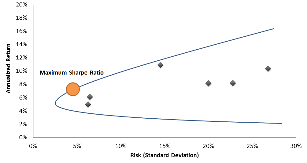
The "orange dot" is the point where you make the most money with the minimum amount of risk. The blue curve, or the Efficient Frontier, represents the performance of every different combination of possible assets. The black dots are individual stocks and bonds, which will always do worse than an optimally diversified portfolio.
Once you know where the "orange dot" is, the theory suggests that you always keep that portfolio mix intact. If you want to increase your return, you should just take out a loan to increase your exposure. Vice versa, if you want to take less risk, you should lend out some money (e.g., put some in a savings account) rather than invest it. This forms the "Capital Market Line".
Capital Market Line Illustration
.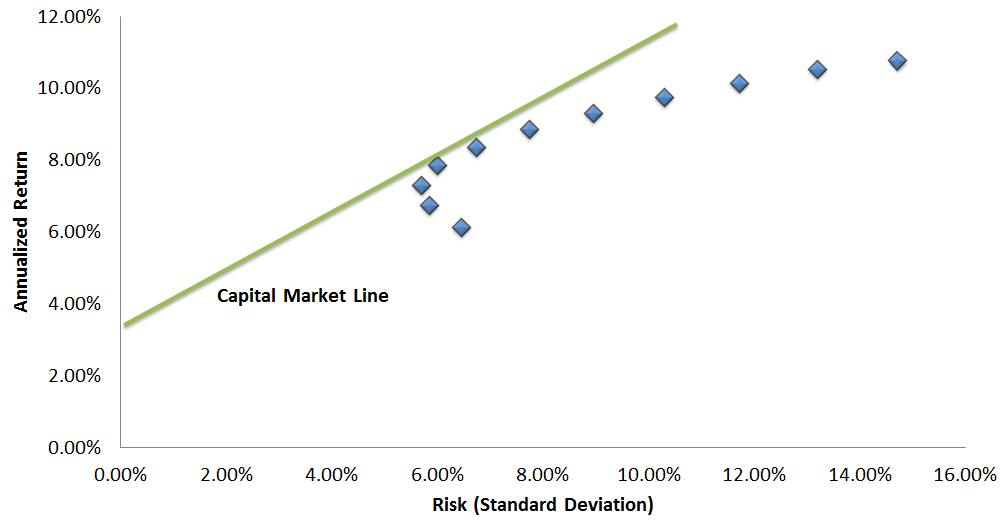
Importantly, the Capital Market Line assumes that you can leverage your portfolio at the risk-free rate, and we will assume this is the case in a later example. For the skeptics out there, feel free to reference an example of how this is really possible.
With that framework in mind, we can move back to the real world of 1954, when bond yields were about 2.8% and about to enter into a 30 year bear market.
How Diversification Worked From 1954 through 1982
By October of 1981, bond yields rose to a peak of 15.13% as the US faced the Volcker crisis and the worst period of runaway inflation of the past century. Whenever you hear pundits talking about the "30 year bond bull market", it started right when this period ended.
So how did bonds and stocks fare? (Note that we are using 10yr Treasury Bonds as the benchmark due to data availability)
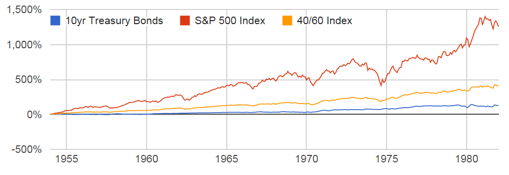
Performance of 10yr Treasury Bonds vs. S&P 500, January 1954 to January 1982
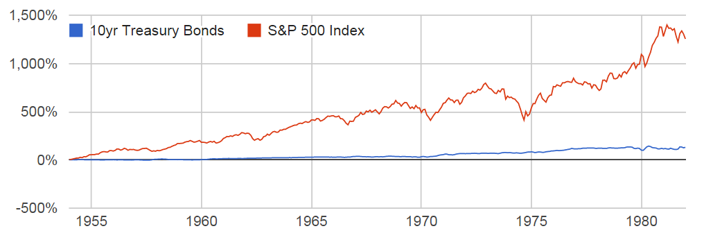
At first glance, this seems as you might expect. Bonds returned 3% per year, while stocks returned 10% per year. After taking inflation into account, bonds actually had a slightly negative overall return.
So the answer seems simple, right? In a bond bear market, you should just own stocks. Well, not so fast. Let's take a look at the Efficient Frontier during this timeframe to identify the mix with the highest Sharpe Ratio. This is limited to just the S&P 500 Index and the 10yr Treasury Bond Index, for simplicity.
Efficient Frontier, January 1954 to January 1982
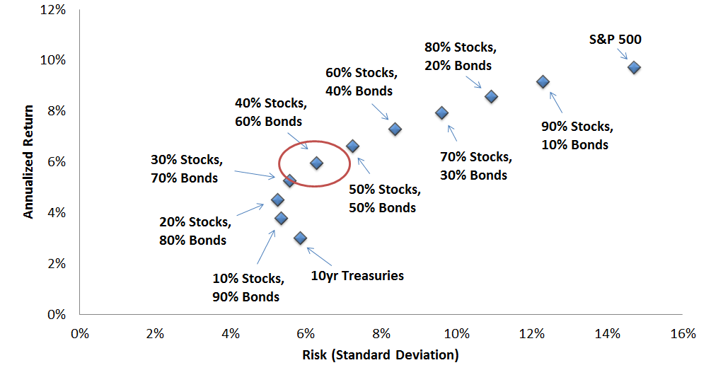
Now, this is interesting. The optimally diversified portfolio still included 60% bonds. In fact, the 60% bond portfolio had a Sharpe ratio of 0.95, compared to 0.66 for stocks alone - in other words, it was actually much, much better.
How is this possible?
The answer is simple, if a little counterintuitive. Holding assets which perform very differently than one another, like stocks and bonds, helps to smooth out your return. This "smoothing" effectively reduces your risk - or the chance that you will lose money in any given year. Even if one of the assets performs badly overall, it can be beneficial to own it anyway.
Performance of 10yr Treasury Bonds vs. S&P 500 vs. 40% Stock/60% Bond Mix, January 1954 to January 1982
Clearly, the yellow line is much smoother, but it is pretty hard to make a fair comparison of the performance. To make this easier, we return to the Capital Market Line: we can introduce some leverage into the 40/60 Index to "multiply" its riskiness (rebalanced monthly). Note that this assumes leverage is "free", which would not be true in real life, but there is a huge amount of leeway given the dramatic difference in Sharpe Ratios.
Performance of 10yr Treasury Bonds vs. S&P 500 vs. Leveraged 40% Stock/60% Bond Mix, January 1954 to January 1982
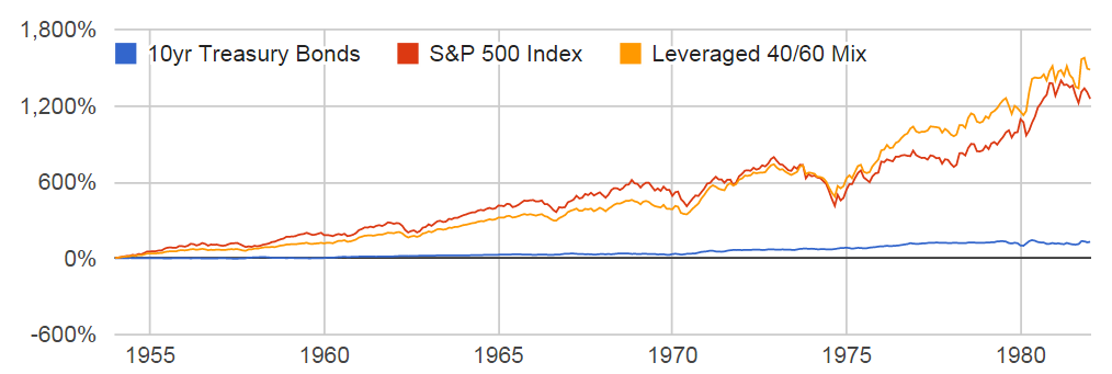
Now the effect is certainly more pronounced. The leveraged portfolio performed comparably to the S&P 500 but with about 30% less risk (as measured by standard deviation).
We can even zoom in to the period when interest rates were rising the fastest to see if the leveraged mix still kept up. From January 1979 to January 1982, the Fed Funds Rate rose from 10% to nearly 19%.
Performance of 10yr Treasury Bonds vs. S&P 500 vs. Leveraged 40% Stock/60% Bond Mix, January 1979 to January 1982
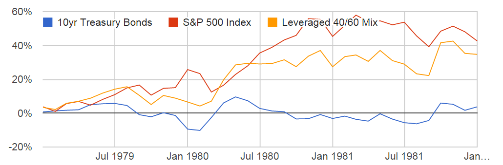
Impressively, in perhaps the worst bond bear market in history, the leveraged mix still nearly matched the overall performance of the stock market.
For skeptics who are concerned bonds may experience a much worse pullback than shown here, take a look at this extensive history of the bond market. In short, because interest rates tend to move slowly and bonds continuously pay out coupons, it is very rare to have an extended period of net bond losses. The more likely scenario is many years of breakeven performance, as happened over this stretch.
Let's pause here for a moment. If this analysis is meaningful, it means that even if we exactly repeat the very worst, no good, inflationary, rising interest rate environment in US history, you should still be holding a portfolio mix that includes 60% bonds.
Conclusion: Expanding the View and Understanding the Limits
Now, there are many potential caveats to this perspective that need to be addressed. First, this is a particular snapshot in time, and no one knows exactly how markets will behave next. Bonds could collapse like they never have before, while stocks rocket to the moon. However, there is reason to believe these results are not a one-time anomaly.
If you rerun the data for the entire period from 1954 to 2015, the optimal portfolio mix comes out to be 30% stocks and 70% bonds (as show in this article). Given that now encompasses 60 years, there is strong reason to believe that bonds will continue to be a large part of the optimally diversified portfolio. Perhaps it will be closer to 50% than 70%, but it almost certainly will be much higher than 0%.
Next, this analysis made a strong assumption about leverage being available and cheap to build into a portfolio. With the rise of financial derivatives like futures and options contracts, this is already a reality for any major financial institution. There are also now a number of firms, including the authors of this article, which specialize in using these kinds of techniques for individuals.
Finally, this analysis was limited to two very specific asset classes, while the universe of investments is obviously much, much larger. If you were to use longer duration bonds, for example, these ratios would certainly change. There is also the possibility of adding in lots of other kinds of assets, like real estate or commodities. However, the purpose of this analysis is not to give you a final and absolute recommendation. Rather, it is to examine and sternly refute the notion that bonds are no longer an effective part of a well-diversified portfolio when interest rates are rising.
For more advice on specific portfolio recommendations in line with this thinking, keep on the lookout for our next article.
Disclosure
This information does not constitute investment advice or an offer to invest or to provide management services and is subject to correction, completion and amendment without notice. Hedgewise makes no warranties and is not responsible for your use of this information or for any errors or inaccuracies resulting from your use. Hedgewise may recommend some of the investments mentioned in this article for use in its clients' portfolios. Past performance is no indicator or guarantee of future results. Investing involves risk, including the risk of loss. All performance data shown prior to the inception of each Hedgewise framework (Risk Parity in October 2014, Momentum in November 2016) is based on a hypothetical model and there is no guarantee that such performance could have been achieved in a live portfolio, which would have been affected by material factors including market liquidity, bid-ask spreads, intraday price fluctuations, instrument availability, and interest rates. Model performance data is based on publicly available index or asset price information and all dividend or coupon payments are included and assumed to be reinvested monthly. Hedgewise products have substantially different levels of volatility and exposure to separate risk factors, such as commodity prices and the use of leverage via derivatives, compared to traditional benchmarks like the S&P 500. Any comparisons to benchmarks are provided as a generic baseline for a long-term investment portfolio and do not suggest that Hedgewise products will exhibit similar characteristics. When live client data is shown, it includes all fees, commissions, and other expenses incurred during management. Only performance figures from the earliest live client accounts available or from a composite average of all client accounts are used. Other accounts managed by Hedgewise will have performed slightly differently than the numbers shown for a variety of reasons, though all accounts are managed according to the same underlying strategy model. Hedgewise relies on sophisticated algorithms which present technological risk, including data availability, system uptime and speed, coding errors, and reliance on third party vendors.